

A bar chart is a graphical representation of data where values are visualized using bars. It is used to clearly present and compare categories.
The bar chart can be used in LSS projects in all DMAIC phases. However, the purpose differs depending on the phase. In the Define phase, it is primarily used for prioritizing problems. In the Measure phase, it helps identify noticeable influencing factors. In the Analyze phase, these anomalies are further investigated to narrow down possible root causes. In the Improve phase, the bar chart is used to evaluate the effectiveness of solutions. In the Control phase, it helps to verify the sustainability of the improvement.
Prioritizing Problems
In the Define phase, the bar chart is used for prioritization. When there are multiple problems, types of errors, or reasons for complaints, it can be made visible which focus occurs most frequently or causes the greatest impact. This allows determining which topic should be addressed first in the project.
Identifying Influencing Factors
In the Measure phase, the bar chart is used to investigate possible influencing factors on the prioritized problem. By comparing categorical features, it becomes visible in which groups, areas, or conditions there are noticeable differences. The purpose here is to identify relevant influencing factors and narrow them down for further analysis.
Narrowing Down Root Causes
In the Analyze phase, the anomalies identified in the Measure phase are further investigated. Possible causes — for example, from an Ishikawa diagram — are examined one level deeper and further narrowed down with the bar chart. The purpose here is to work out the most likely root causes from noticeable influencing factors.
Evaluating the Effectiveness of Solutions
In the Improve phase, the bar chart is used to evaluate the effectiveness of solutions. After implementing a measure, it can be checked whether the noticeable influencing factors improve initially and whether this subsequently has a positive effect on the original problem. This makes it visible whether the chosen solution is actually effective.
Verifying the Sustainability of Improvement
In the Control phase, the bar chart is used to verify the sustainability of the improvement. It can be reviewed again whether the previously noticeable categories have remained stable and whether the achieved improvement still exists. This allows assessing whether the implemented solution remains effective in the long term.
The purpose of a bar chart is to make differences between individual categories clearly and directly comparable. It is used to display frequencies, quantities, or metrics side by side, for example, and to quickly identify deviations or anomalies.
In AlphadiTab, such comparisons can be directly visualized and used for further analysis.
e.g., machine, product, shift
Averages, sums, or frequencies
Without assumptions about distributions

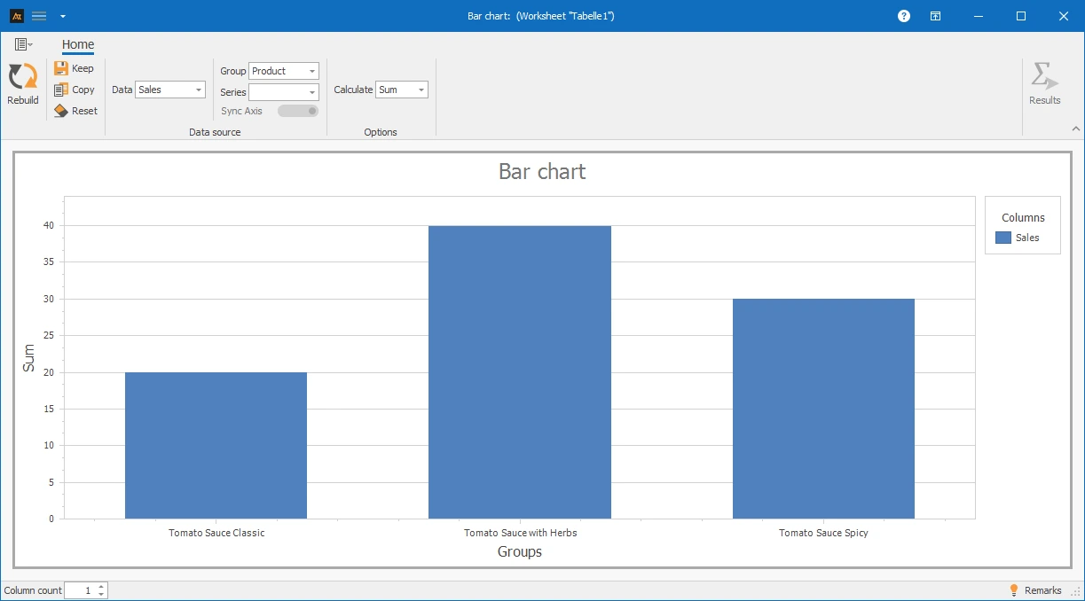
A sales representative wants to find out which tomato sauce variant sells best. For this purpose, the sales figures of the products “Classic”, “with herbs” and “spicy” are compared.
A bar chart is used for the evaluation, which clearly compares the number of units sold. This makes it easy to quickly see which variant has the highest demand.
Explanation of the graphic:
In a bar chart, categories are displayed on one axis, while the corresponding values are represented by the height of the bars. The higher a bar is, the greater the corresponding value. This allows differences between individual categories to be quickly visually captured.
Interpretation:
It is noticeable that the tomato sauce “with herbs” is sold most frequently. The “spicy” variant is in the middle range, while “Classic” has the lowest sales volume.
Preparation
-
Determine the categories to be compared (e.g., classic tomato sauce, herb, spicy)
- Define the frequency to be displayed (e.g., number of units sold)
 Use in AlphadiTab
- Select the bar chart tool in the Measure phase.
- Select the "Sales" column for data.
- Select the "Product" column for group.
- Select the "Sum" calculation method.
- Generate the chart with the "Create New" button.
Interpretation
- Compare the bar heights
- Identify the highest and lowest bar
General Consideration
For Known Specifications
For bar charts, various forms of representation are available. Depending on whether one or more data series as well as additional groups or series are selected, the representation in the chart changes. Data can thus be visualized as individual bars, grouped, or broken down by series and specifically compared with each other. All the following forms of representation are based on the same file, but differ in the selection of the columns used. The respective procedure is described in the individual tiles.
| Delivery time in days_Location A | Delivery time in days_Location B | Delivery time in days_Location C | Process status | Product |
|---|---|---|---|---|
| 4 | 9 | 3 | Before | Window |
| 5 | 4 | 6 | Before | Window |
| 6 | 7 | 4 | Before | Window |
| 4 | 9 | 2 | Before | Window |
| 2 | 4 | 2 | Before | Window |
| 8 | 9 | 6 | Before | Door |
| 6 | 4 | 6 | Before | Door |
| 8 | 9 | 5 | Before | Door |
| 5 | 8 | 3 | Before | Door |
| 8 | 3 | 5 | Before | Door |
| 3 | 4 | 3 | After | Window |
| 1 | 3 | 1 | After | Window |
| 2 | 2 | 2 | After | Window |
| 3 | 3 | 3 | After | Window |
| 2 | 4 | 1 | After | Window |
| 1 | 4 | 1 | After | Door |
| 3 | 2 | 2 | After | Door |
| 3 | 5 | 3 | After | Door |
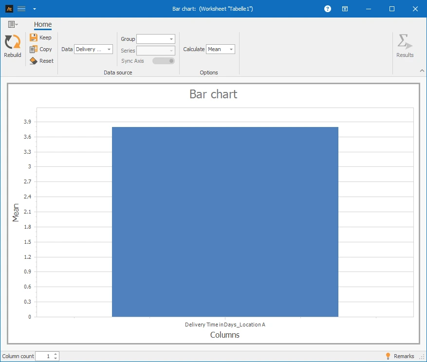
✓One data series: Column A⌄
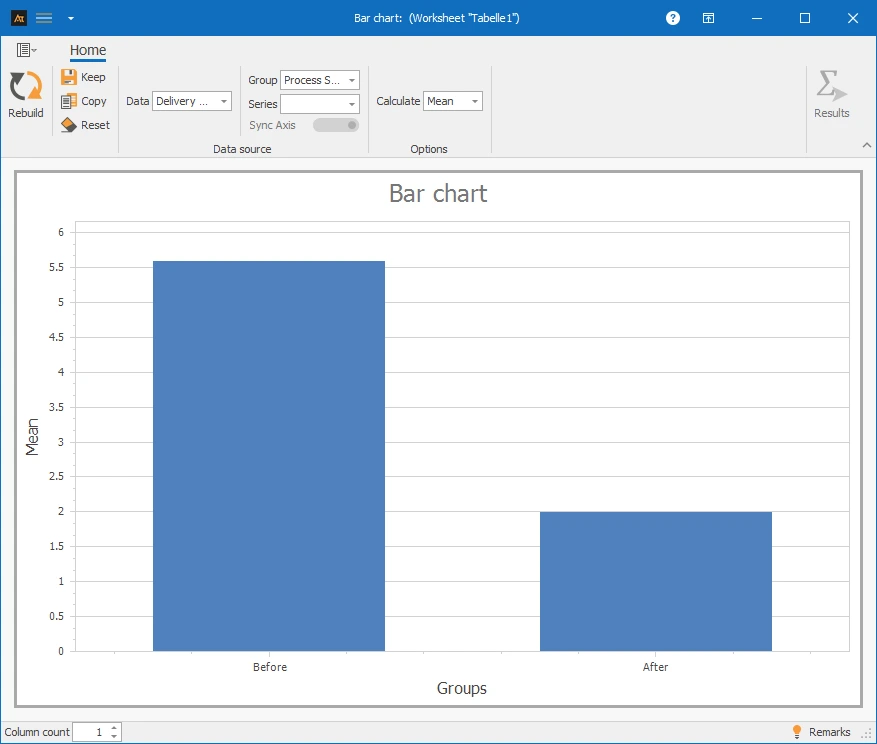
✓One data series and group: Column A and D⌄
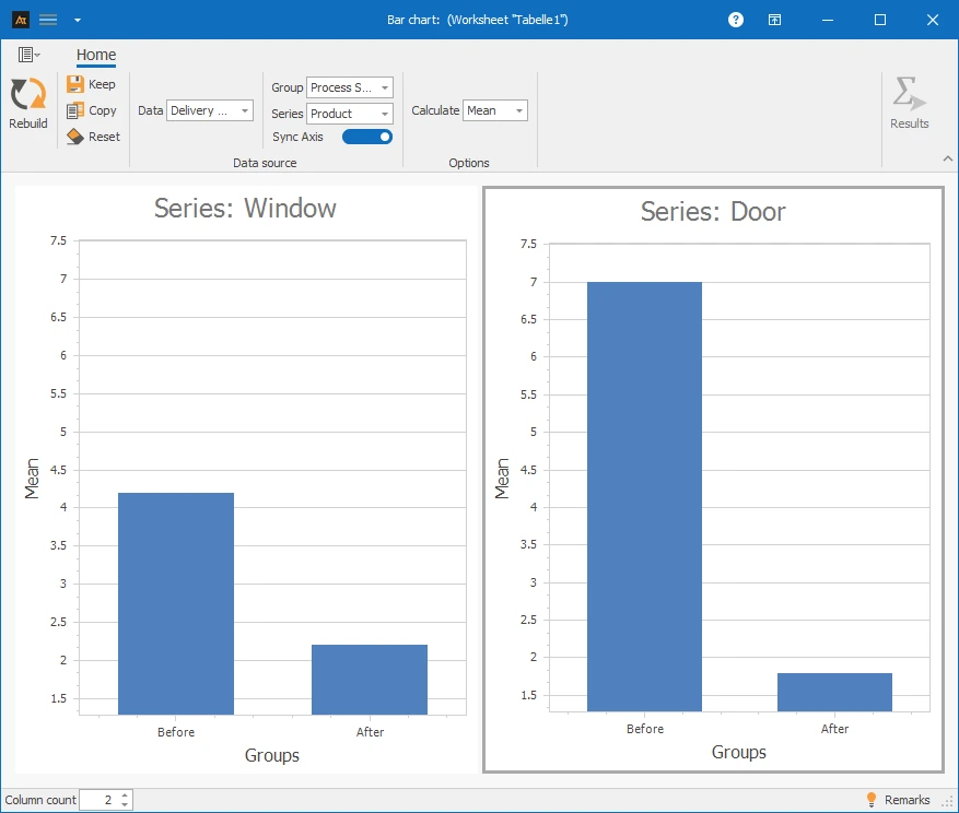
✓One data series with group and series: Column A, D and E⌄
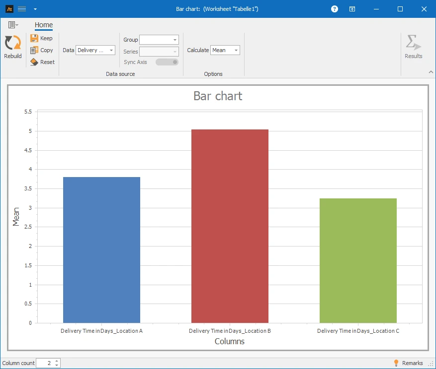
✓Multiple data series: Column A–C⌄
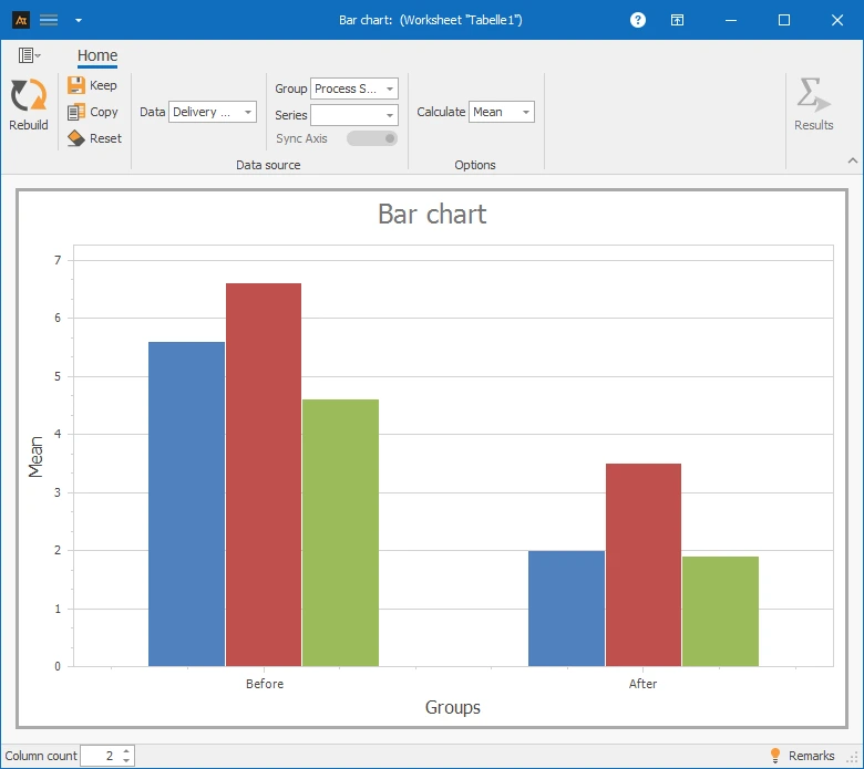
✓Multiple data series with group: Column A–D⌄
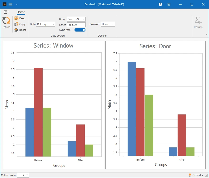
✓Multiple data series with group and series: Column A–E⌄
At least one quantitative data series with at least one data point (countable or measurable data).
Development old vs. new formulation
In development, a new formulation is being tested. The goal is to check whether the average viscosity of the new formulation differs from the previous one.
For evaluation, a bar chart is created in AlphadiTab, which compares the mean viscosities for the categories “Old” and “New” and allows for a direct comparison.
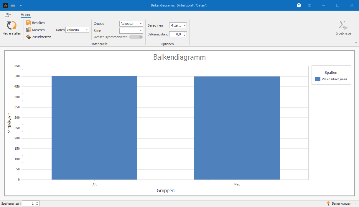
The bar chart created in AlphadiTab shows the average viscosity of the old and new formulation in direct comparison.
The bar heights of both categories are at a very similar level. No significant difference between the means is discernible.
→ From this, it can be deduced that the new formulation is comparable to the previous one in terms of viscosity.
Analysis of test results
In quality assurance, the test results of produced parts are recorded. For each machine, it is documented whether a part meets the quality requirements (good part) or not (bad part).
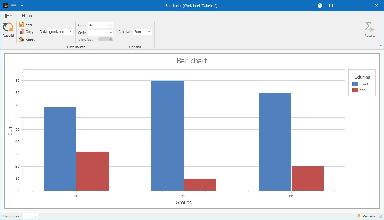
The goal is to identify differences in quality performance between the machines and to identify noticeable deviations. For evaluation, a bar chart is created in AlphadiTab, which compares the number of good and bad parts for machines M1, M2, and M3.
The bar chart created in AlphadiTab shows the distribution of good and bad parts per machine in direct comparison.
Machine M2 has the highest number of good parts with a very low number of bad parts, showing the best quality performance. Machine M1 has the highest number of bad parts in comparison, while M3 is in the middle range.
→ This clearly shows that the machines differ in their quality performance, and particularly M1 should be considered noticeable and further analyzed.
Check frequency of downtimes
In production, machine downtimes are systematically recorded. For each machine, it is documented how often downtimes occur and which production hall it is assigned to.
The goal is to identify which machines and in which halls downtimes occur particularly frequently in order to derive targeted improvement measures.
For evaluation, a bar chart is created in AlphadiTab that shows the number of downtimes per machine, separated by production hall.
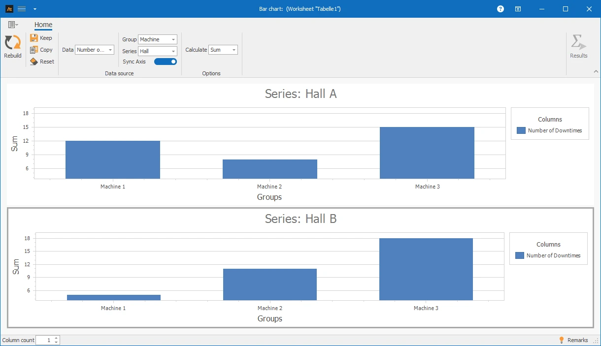
The bar chart created in AlphadiTab shows the frequency of downtimes per machine, differentiated by production halls A and B.
Machine 3 has the highest downtime numbers in both halls and is therefore particularly noticeable. Overall, more downtimes occur in Hall B than in Hall A. Additionally, Machine 2 shows a significant increase in downtimes in Hall B compared to Hall A.
→ From this, it can be deduced that Machine 3 and Production Hall B should be prioritized for investigation to identify the causes of the increased downtimes.
Analysis of Ticket Volume by Location
In the IT service desk, requests are processed at multiple locations. To better manage the workload, an analysis should be conducted to determine how many tickets are generated at each location.
The goal is to identify differences in ticket volume and pinpoint locations with high workload.
For evaluation, a bar chart is created in AlphadiTab that compares the number of processed tickets per location.
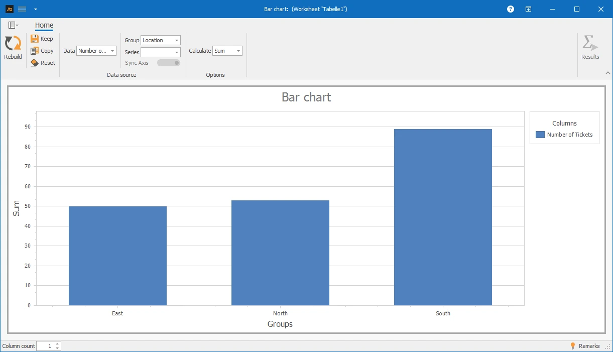
The bar chart created in AlphadiTab shows the ticket volume for the East, North, and South locations in direct comparison.
The South location has the highest number of processed tickets and thus the greatest workload. The North and East locations are at a similar, significantly lower level.
→ This shows that the workload differs between locations, and particularly the South location should be prioritized to ensure a balanced distribution of resources.
Sales quota by region
In sales, sales opportunities are processed in different regions. The goal is to analyze whether sales quotas differ between regions and which regions perform particularly well or poorly.
For evaluation, a bar chart is created in AlphadiTab that compares the average sales quotas of products A and B by region.
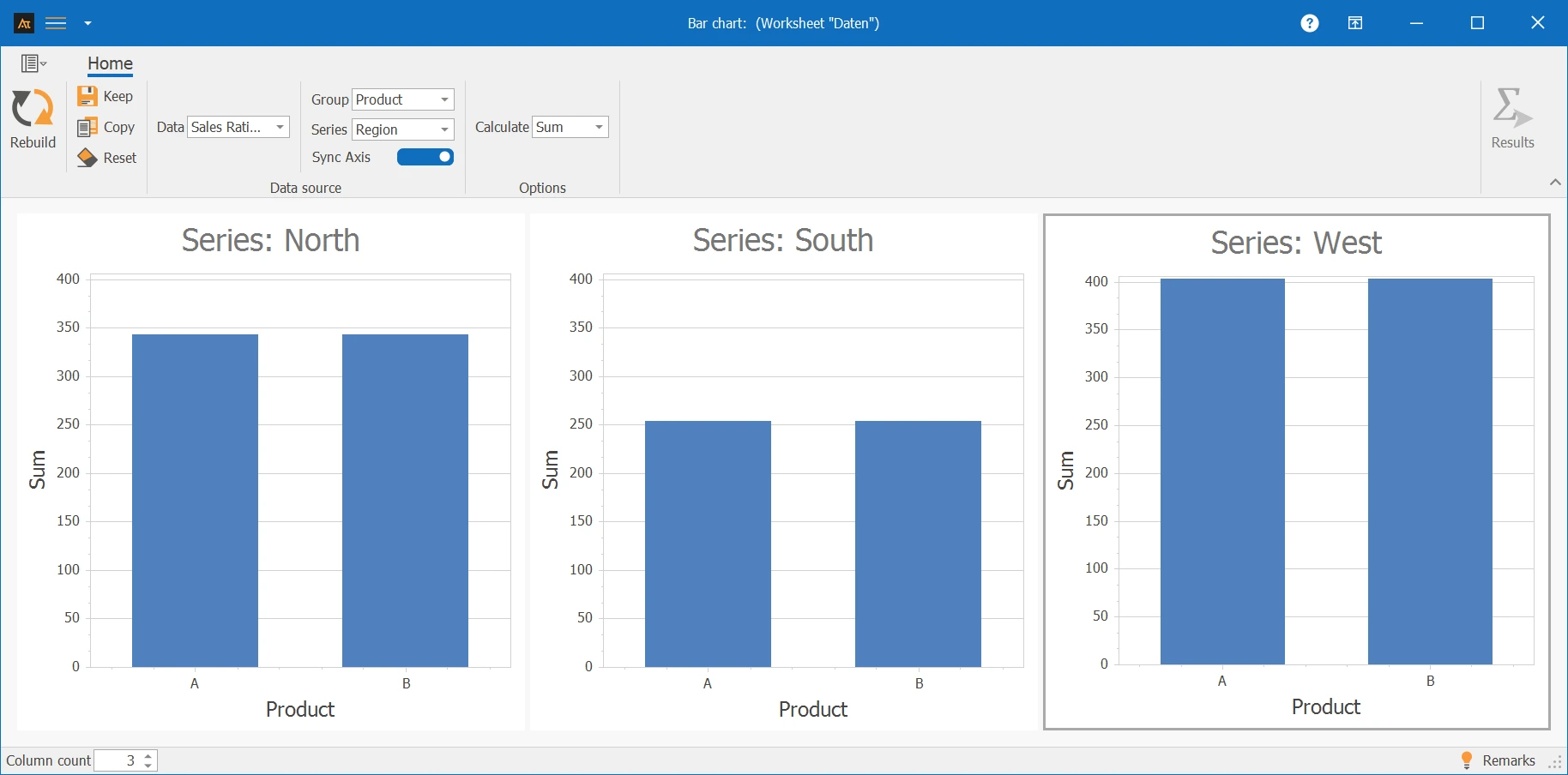
The bar chart created in AlphadiTab shows the sales quotas of the North, South, and West regions in direct comparison.
The West region has the highest sales quotas for both products, showing the best performance. The South region has the lowest sales quotas overall, while the North is in the middle range.
Within the individual regions, the sales quotas of products A and B differ only slightly.
→ From this, it can be deduced that the South region, in particular, should be analyzed more closely, while the West region can serve as a reference for successful sales strategies.
Delivery time by logistics center
In logistics, customer orders are processed through multiple logistics centers. The goal is to analyze whether the delivery volume differs between locations and how the workload is distributed.
For evaluation, a bar chart is created in AlphadiTab that compares the average number of deliveries for the North, South, and West locations.
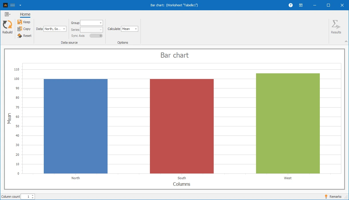
The bar chart created in AlphadiTab shows that the average delivery quantities are at a similar level at all locations.
→ From this, it can be deduced that the workload of the logistics centers is evenly distributed overall and there are no significant differences in delivery volume.
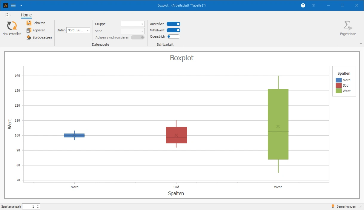
Since a bar chart only represents averages, differences in data dispersion remain unconsidered. For a more detailed analysis, a box plot can be used additionally to compare both position and dispersion.
Box plot comparison:
Supplier Comparison
In purchasing, materials are sourced from multiple suppliers. The goal is to evaluate which suppliers deliver particularly reliably on time.
For evaluation, a bar chart is created in AlphadiTab that compares the number of on-time deliveries per supplier.
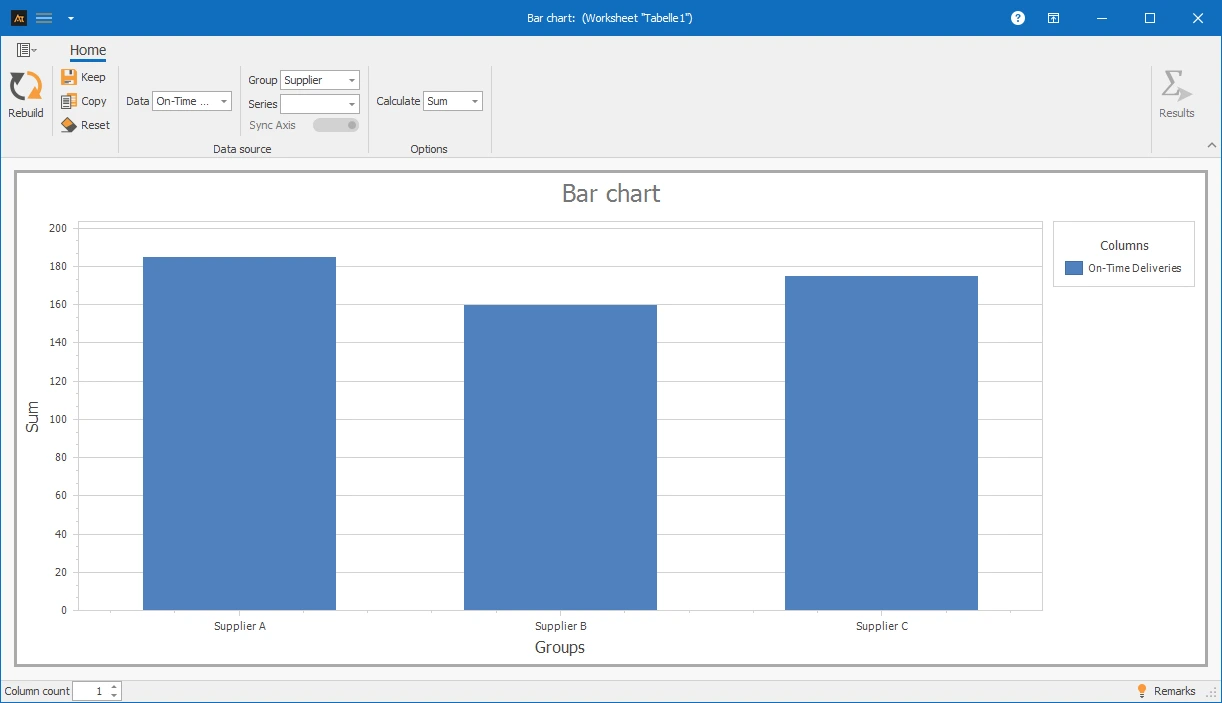
The bar chart created in AlphadiTab shows that Supplier A has the highest number of on-time deliveries.
Supplier B is significantly lower, while Supplier C reaches a medium level.
→ This shows that Supplier A currently offers the highest delivery reliability, while Supplier B should be considered critical and further reviewed.
Forecast deviation
In production planning, a monthly production quantity is set for a production line. After the end of each month, the actual produced quantity is recorded.
The goal is to analyze deviations between planned and actual production and to evaluate the plan fulfillment over the year.
For evaluation, a bar chart is created in AlphadiTab, comparing the planned and actual production quantities from January to December.
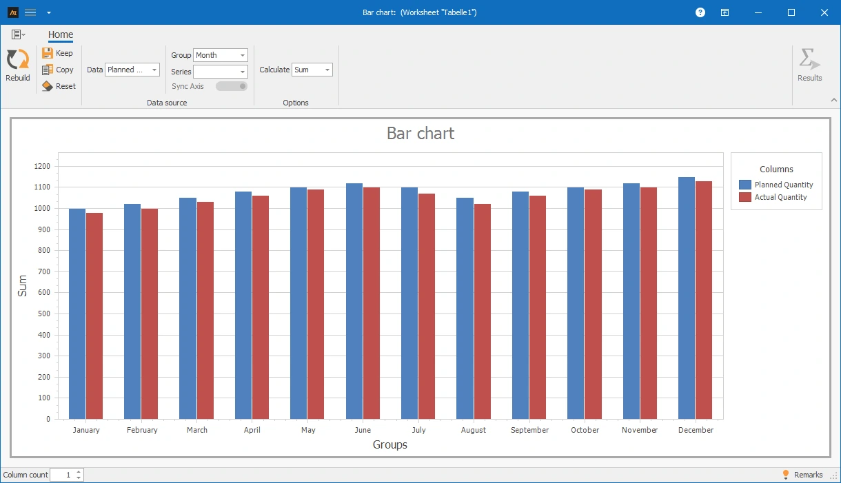
The bar chart created in AlphadiTab shows that the actual production quantity is slightly below the plan throughout the year.
The deviations are relatively constant, with slightly larger differences at the beginning of the year and in the summer months.
→ From this, it can be deduced that there is a systematic under-fulfillment of the plan, which should be further analyzed and optimized within the framework of production planning.
Group: Nominal feature, which is represented on the x-axis in the bar chart.
Data: Discrete or continuous variable, which is represented on the y-axis in the bar chart.
Bar: Graphical element whose height represents the value of the displayed variable.
Series: Related values per category, e.g., plan and actual or different groups.