


The box plot (also: box-whisker plot or box chart) is a graphical representation form of descriptive statistics. It visualizes the distribution of a continuous measurement compactly in a single graphic: Measures of location such as the median, measures of dispersion such as the interquartile range (IQR), as well as the shape of the distribution and existing outliers can be directly read.
The box represents the middle 50 % of all measurements – that is, the range between the 25th and the 75th percentile. The line within the box marks the median. The so-called whiskers (antennas) extend up to 1.5 times the IQR; values outside are displayed individually as outliers and should be specifically checked.
A particular strength of the box plot lies in the direct comparison of several groups: If several box plots are displayed side by side, differences in location, dispersion, and outlier behavior can be recognized at a glance – for example, between machines, shifts, or product variants.
The box plot can be used in LSS projects in all DMAIC phases. The purpose of use varies depending on the phase.
Visualize the initial situation
In the Define phase, the box plot is used to make the current distribution of the target variable visible. This allows you to see at a glance how wide the spread is and whether there are already outliers - an important basis for problem description.
Identify spread and outliers
In the Measure phase, the box plot helps to quantify the spread of the measurements and make outliers visible. When comparing multiple groups - such as machines or shifts - the box plot directly shows where there are differences in location or spread.
Analyze influencing factors
In the Analyze phase, the box plot is used to statistically narrow down possible influencing factors. By comparing box plots of different groups, it can be seen which factor (e.g., supplier, location, shift) shows a noticeable deviation in distribution.
Check the effectiveness of measures
In the Improve phase, the box plot is used to visualize the before-and-after comparison. It shows whether not only the median but also the spread and outlier behavior have improved after the measure.
Monitor the stability of the improvement
In the Control phase, the box plot confirms whether the achieved improvement has remained stable. A renewed comparison of the distributions shows whether location and spread have been sustainably improved and no new outliers have occurred.
The box plot is a graphical tool for displaying the distribution of a measurement. It not only shows the position and spread of the data but also makes outliers visible. The compact representation allows different datasets to be quickly compared with each other, for example, before and after a process improvement or between different machines, shifts, or material batches.

During the production of tomato sauce, viscosity measurements are regularly carried out. To get an initial overview of the distribution, a boxplot is created. This shows at a glance how symmetrically or skewed the data is distributed and whether there are any possible outliers.
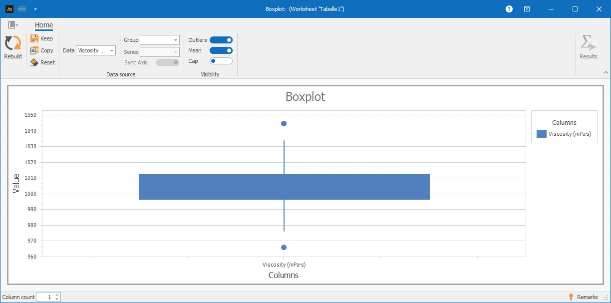
Explanations of the results:
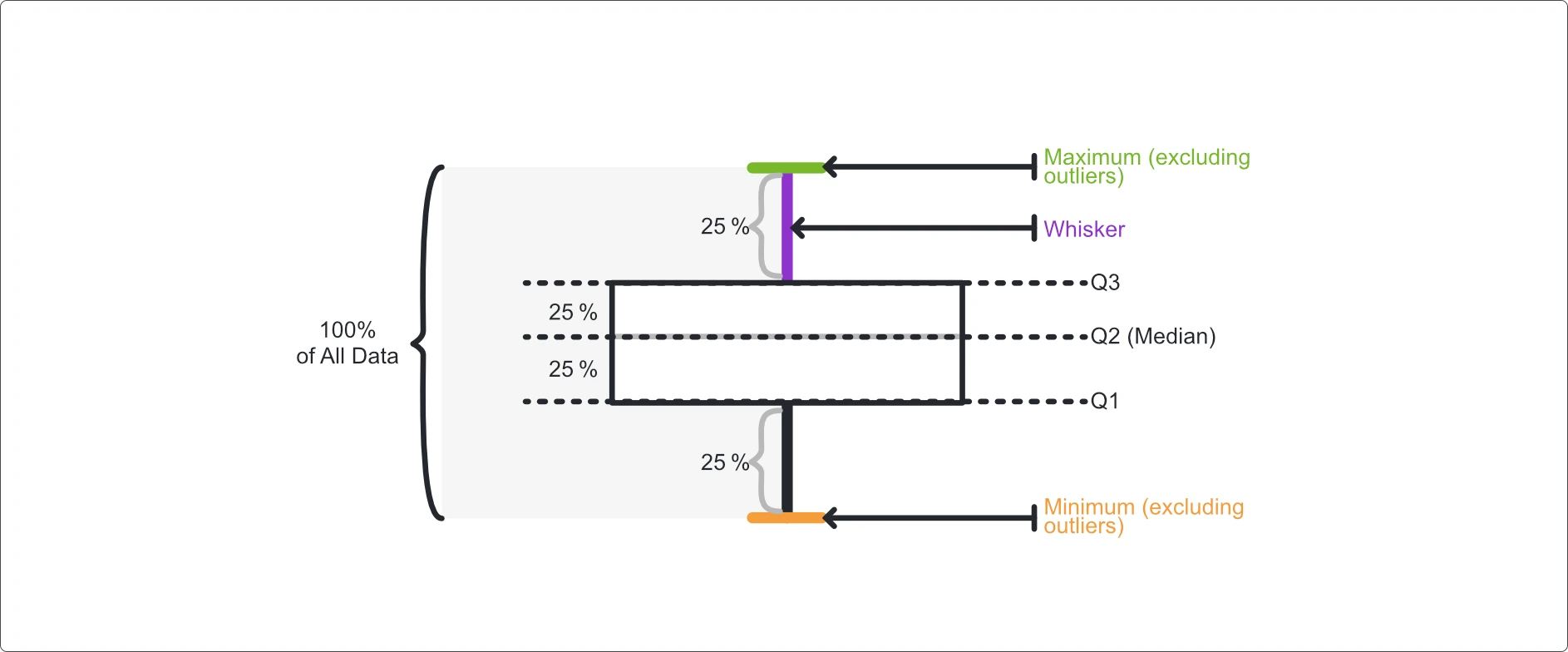
A boxplot consists of several elements that together describe the distribution of the data:
- Median: The line inside the box shows the middle value of the data.
- Box (Interquartile Range): It includes the middle 50 % of all values, i.e., the range between the 25 % and the 75 % percentile.
- “Whiskers” (Antennas): These lines show the range of values outside the box. Typically, a whisker extends up to 1.5 times the interquartile range.
- Outliers: Values outside the whiskers are shown as individual points.
Preparation
- Select a continuous measurement and collect data (e.g., viscosity).
 Use in AlphadiTab
- Select the Boxplot tool in the Measure phase.
- Select data “Viscosity”.
- Generate chart with the “Create New” button.
Interpretation
- Is the median centrally located in the box? → Symmetrical distribution.
- Is the box significantly shifted or unevenly wide? → Indication of skewness.
- Are there outliers? → Check data, analyze causes if necessary.
- Are multiple boxplots displayed? → Compare median, box width, and whisker length between groups.
General Consideration
With Known Specifications
With Multiple Boxplots
For box plots, various display forms are available. Depending on whether one or more data series as well as additional groups or series are selected, the display in the chart changes. All the following display forms are based on the same file, but differ in the selection of the columns used.
| Delivery time in days_Location A | Delivery time in days_Location B | Delivery time in days_Location C | Process status | Product |
|---|---|---|---|---|
| 4 | 9 | 3 | Before | Window |
| 5 | 4 | 6 | Before | Window |
| 6 | 7 | 4 | Before | Window |
| 4 | 9 | 2 | Before | Window |
| 2 | 4 | 2 | Before | Window |
| 8 | 9 | 6 | Before | Door |
| 6 | 4 | 6 | Before | Door |
| 8 | 9 | 5 | Before | Door |
| 5 | 8 | 3 | Before | Door |
| 8 | 3 | 5 | Before | Door |
| 3 | 4 | 3 | After | Window |
| 1 | 3 | 1 | After | Window |
| 2 | 2 | 2 | After | Window |
| 3 | 3 | 3 | After | Window |
| 2 | 4 | 1 | After | Window |
| 1 | 4 | 1 | After | Door |
| 3 | 2 | 2 | After | Door |
| 3 | 5 | 3 | After | Door |
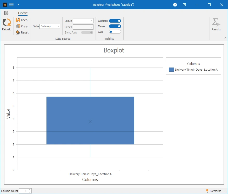
✓One data series: Column A⌄
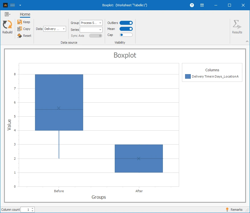
✓One data series and group: Column A and D⌄
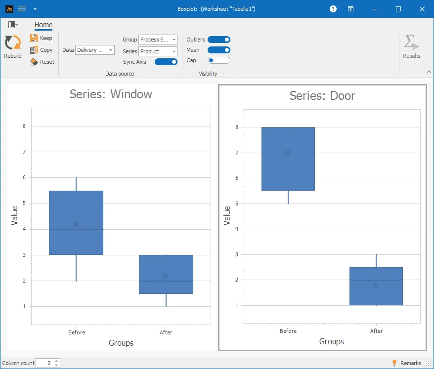
✓One data series with group and series: Column A, D, and E⌄
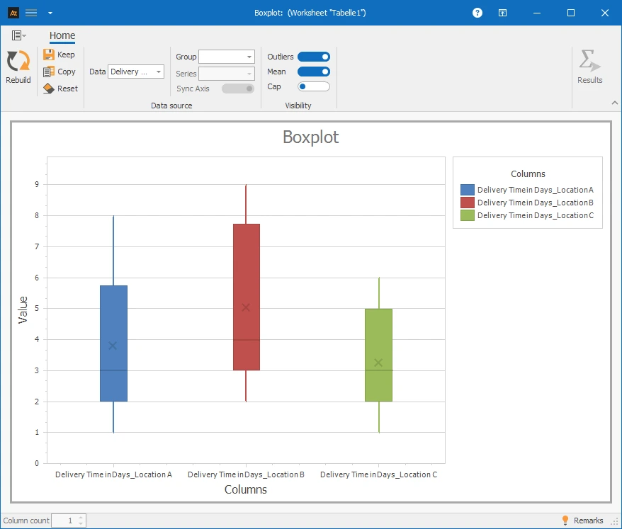
✓Multiple data series: Column A–C⌄
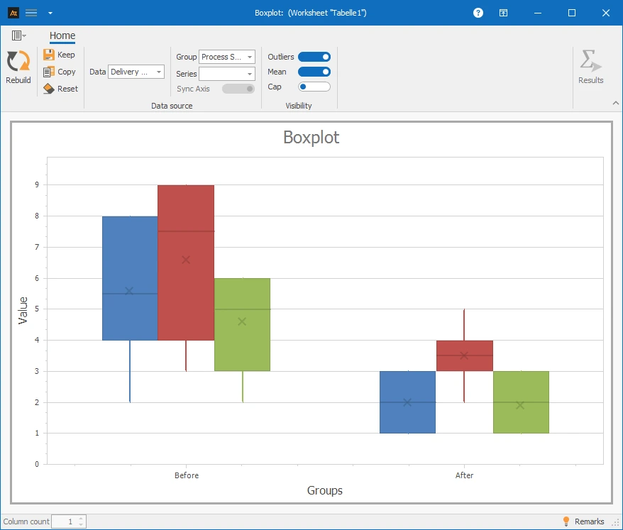
✓Multiple data series with group: Column A–D⌄
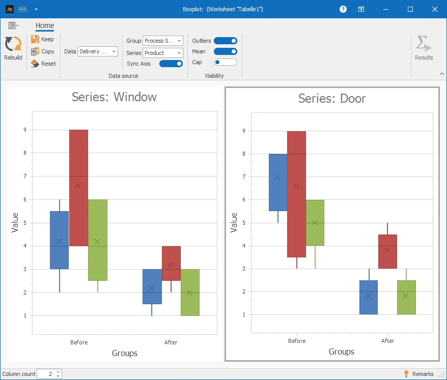
✓Multiple data series with group and series: Column A–E⌄
- At least quantitative data (countable or measurable data).
- An appropriate measuring instrument, as outliers can often arise due to measurement errors.
Development old vs. new formulation
In development, a new formulation is being tested. The boxplot is used to check whether the viscosity of the new formulation is distributed similarly to the previous formulation.
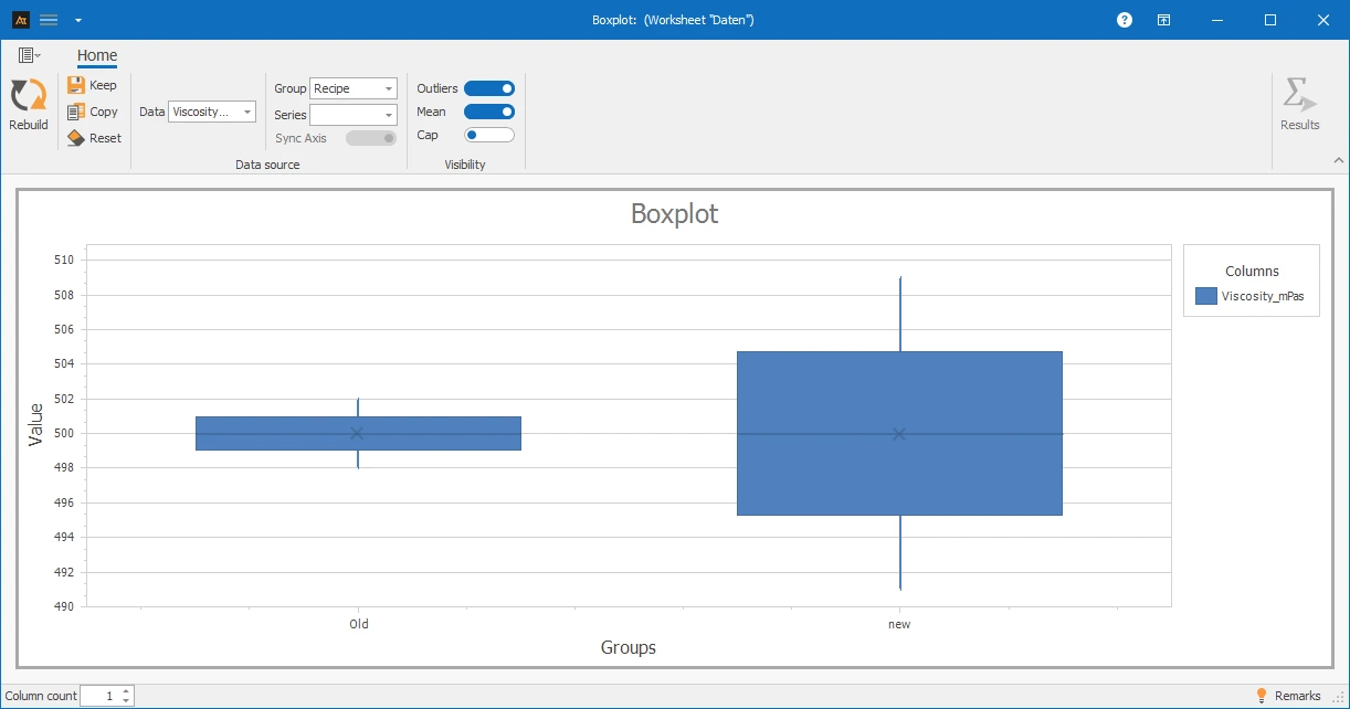
The boxplot shows that the position of the viscosity in the old and new formulation hardly differs, as the medians are almost at the same height. However, the new formulation shows significantly greater dispersion, which can be seen in the wider box and longer whiskers.
This suggests that the new formulation achieves comparable viscosity values on average, but has worse dispersion.
Production / Quality Assurance
In quality assurance, it was found that individual viscosity values were outside the expected range. It should now be checked whether this behavior occurs in all production lines or only in individual lines.
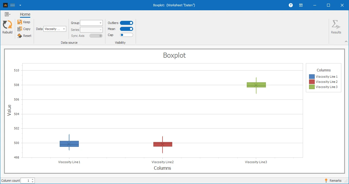
The boxplot shows that production lines 1 and 2 have a similar position and spread of viscosity. Production line 3, on the other hand, differs significantly in position, as the median is higher than in the other lines.
The spread is comparable across all three lines.
Processing Time for IT Tickets by Location
Requests are processed at multiple locations in the IT service desk. Although the same service processes apply, the conditions may differ between locations, for example, due to different ticket types, time zones, or organizational procedures. A box plot is used to check whether the distribution of ticket processing times differs between locations.
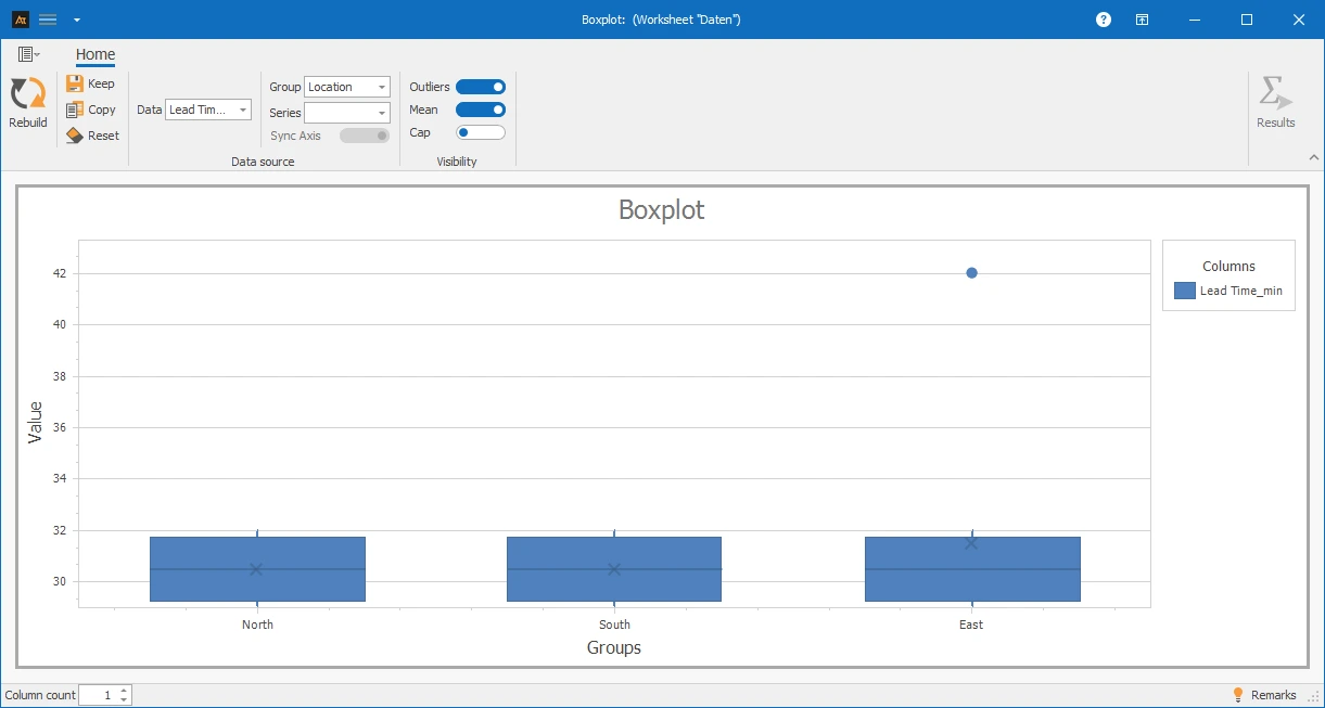
In the box plot, the medians of the processing times at all locations are at a similar level. At the same time, a single outlier is noticeable at the East location.
This shows that the average processing times do not differ significantly between locations, but there are occasional exceptionally long processing times. The box plot makes these outliers clearly visible without significantly changing the central position.
Sales Quota by Region
In sales, sales opportunities are processed in several regions. Although the same products are offered, market conditions, customer types, and competitive intensity may differ. A box plot is used to examine whether the distribution of the sales quota differs between the regions.
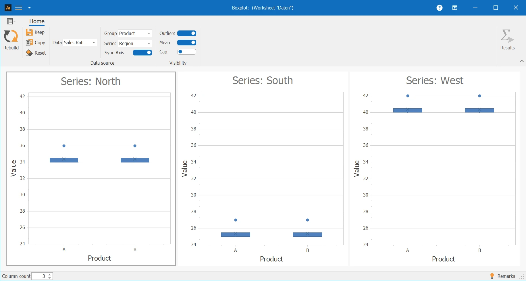
The box plot shows significant differences in the level of sales quotas between the regions. The West region has overall higher sales quotas, while the South region shows lower values. The dispersion within the regions is comparable.
The box plot is particularly suitable here for clearly presenting regional differences in sales performance without evaluating individual deals or people. It is noticeable that the whiskers are identical to the boxes. This occurs when the measurements are very similar and, for example, no decimal places are present due to the resolution of the measuring instrument.
Delivery time after logistics center
In logistics, customer orders are processed through multiple logistics centers. Although the same processes and systems are used, delivery times may vary due to different workloads, infrastructure, or regional conditions. A boxplot is used to examine whether the distribution of delivery times differs between logistics centers.
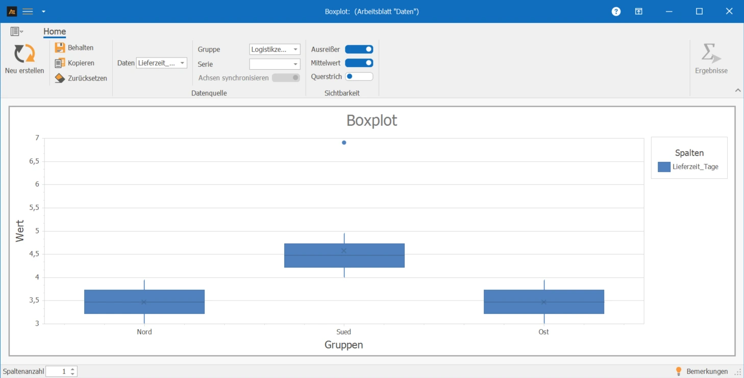
In the boxplot, the medians of the lead times at all locations are at a similar level. At the same time, a single outlier is noticeable at one location.
This shows that the typical lead times between locations do not differ significantly, but occasionally exceptionally long processing times occur. The boxplot makes these outliers clearly visible without significantly changing the central location of the data.
Supplier Comparison
In purchasing, materials are sourced from various suppliers. A boxplot is used to examine whether the distribution of delivery times or quality metrics differs between suppliers.
Delivery Reliability [%] indicates how often deliveries are made on time. A delivery is considered on time if it arrives within the agreed delivery window. Delivery reliability is calculated as the percentage of on-time deliveries.
Delivery reliability is calculated for each week, e.g.:
Delivery Reliability [%] = (on-time deliveries / total deliveries) × 100
For the boxplot, delivery reliability is calculated over several calendar weeks. Each data point corresponds to a supplier's delivery reliability in a week. The boxplot thus shows the distribution of delivery reliability over time and allows for a comparison between suppliers.
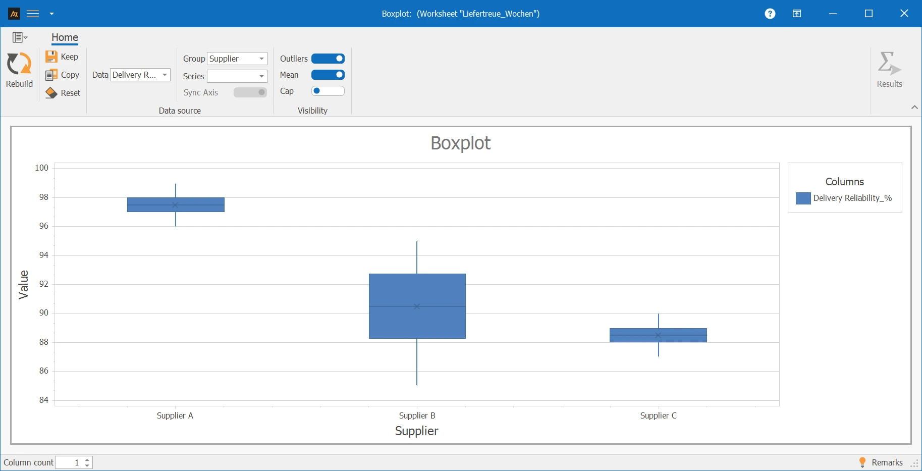
The boxplot shows differences in the level and spread of delivery reliability between suppliers. Supplier A has high delivery reliability with low variation, reflected in a high median and a narrow box.
Supplier C also shows low variation but has lower average delivery reliability. Supplier B has the greatest variation and shows slightly better delivery reliability than Supplier C but worse than Supplier A.
Forecast deviation
In production planning, demand forecasts are created. A boxplot is used to analyze whether the distribution of forecast deviations differs between different products or planning periods.
The forecast deviation results from the comparison between the planned demand and the actual demand. To present the deviation comparably, it is given in percentage.
The calculation is as follows:
Forecast deviation [%] = (planned demand − actual demand) / actual demand × 100
- A positive value means that the demand was overestimated.
- A negative value means that the demand was underestimated.
- A value close to 0 % indicates a very accurate forecast.
The percentage representation allows forecast deviations to be compared independently of absolute quantities and clearly displayed in the boxplot.
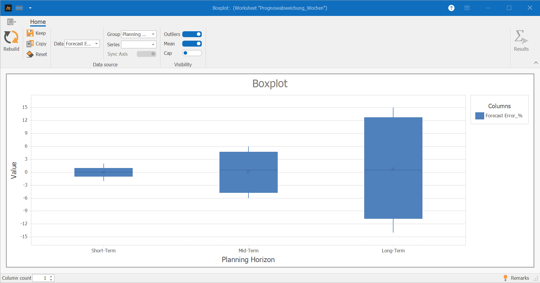
The boxplot shows significant differences in the position and spread of the forecast deviation between the planning horizons. Short-term planning shows a low spread and a position close to 0 %.
In medium-term planning, both the spread and the deviation from the target value are greater. Long-term planning shows the greatest spread as well as significant positive and negative deviations. The boxplot thus makes it visible that forecast uncertainty increases significantly with the planning horizon.
Median: Central value of the sorted data.
Quartiles: Values that divide the data into four equal parts.
Interquartile Range (IQR): Difference between the 75% and 25% percentiles.
Whisker: Range that covers the data outside the box.
Outliers: Data points that lie outside the typical range of values.
Mean
General Quartile Formulas
Given a sorted data series with n data values.
Position of the Quartiles
Position Q1:
Position Q2 (Median):
Position Q3:
Decomposition of Position r
The position r can be decomposed into the number before the decimal point (here N) and the decimal place (here p):
Interpolation Formula for Calculating the Quartiles
If r is not an integer:
With x(N) is meant the N-th value of the sorted data series.
If r is an integer:
Example with n = 10
Data series: x₁ = 3, x₂ = 4, x₃ = 5, x₄ = 7, x₅ = 8, x₆ = 10, x₇ = 10, x₈ = 11, x₉ = 14, x₁₀ = 15
Position of Q1
Interpolation with x₂ = 4 and x₃ = 5:
Result