


The histogram is a graphical tool for representing the frequency distribution of a continuous measurement. It shows how measurements are distributed over classes (bins) and allows an initial assessment of the distribution shape (e.g., symmetric, skewed, multimodal).
By displaying the frequencies, different datasets can be quickly compared with each other, for example, before and after a process improvement or between different machines, shifts, or material batches.
The histogram can be used in LSS projects in all DMAIC phases. The purpose of use varies depending on the phase.
Show distribution of the initial situation
In the Define phase, the histogram is used to make the current distribution of the target variable visible. This allows you to see where the measurement values are concentrated and whether the distribution already shows noticeable shapes – an important basis for problem description.
Analyze distribution shape and dispersion
In the Measure phase, the histogram helps to analyze the distribution shape of the measurement values. When comparing multiple groups – such as machines or shifts – the histogram shows whether there are differences in location, width, or shape of the distribution.
Use distribution differences as an indication of causes
In the Analyze phase, the histogram is used to make distribution differences between groups visible. Multimodal or highly skewed distributions can provide clues to different causes or mixing processes.
Check improvement of the distribution
In the Improve phase, the histogram is used to visualize the before-and-after comparison. It shows whether the distribution shape, location, and width have improved after the measure.
Confirm stability of the distribution
In the Control phase, the histogram confirms whether the achieved improvement of the distribution has remained stable. A renewed comparison shows whether location, width, and shape have been sustainably improved.
The histogram is a graphical tool for representing the frequency distribution of a continuous measurement. It shows how measurements are distributed over classes (bins) and allows an initial assessment of the distribution shape (e.g., symmetric, skewed, multimodal). By displaying frequencies, different datasets can be quickly compared with each other, for example, before and after a process improvement or between different machines, shifts, or material batches.

During the production of tomato sauce, viscosity measurements are regularly carried out. To get an initial overview of the distribution, a histogram is created. This shows at a glance whether the data is more symmetrically or skewed distributed and whether clusters or unusual edge areas can be identified.
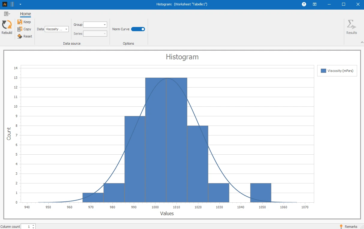
Explanations of the results:
A histogram consists of several elements that together describe the distribution of the data:
- Classes (Bins): Intervals into which the measurements are divided.
- Bar height: Number (absolute frequency) or proportion (relative frequency) of values within a class.
- Class width: Width of the intervals (has a strong influence on the appearance).
- Distribution shape: Indications of symmetry, skewness, multimodality, and "long" tails.
Preparation
- Select a continuous measurement and collect data (e.g., viscosity).
 Use in AlphadiTab
- Select the histogram tool in the Measure phase.
- Select data „viscosity“.
- Generate chart with the „Create new“ button.
Interpretation
- Is the distribution approximately symmetrical? → Indication of „balanced“ distribution.
- Is the distribution significantly skewed (right/left)? → Indication of asymmetric process / mixtures / limits / disturbances.
- Are there multiple frequency peaks (multimodal)? → Indication of different causes/clusters (e.g., layers, machines, material batches).
- Are there noticeable edge classes with few values or gaps? → Check data (measurement resolution, rounding, special cases, process jumps).
- Are multiple histograms displayed? → Compare location (typical range), dispersion (width of distribution), and shape (skewness/multimodality) between groups.
General Consideration
With known specifications
With multiple histograms
For the histogram, various forms of representation are available. Depending on whether one or more data series as well as additional groups or series are selected, the representation in the chart changes. All the following forms of representation are based on the same file, but differ in the selection of the columns used. The respective procedure is described in the individual tiles.
| Delivery time in days_Location A | Delivery time in days_Location B | Delivery time in days_Location C | Process status | Product |
|---|---|---|---|---|
| 4 | 9 | 3 | Before | Window |
| 5 | 4 | 6 | Before | Window |
| 6 | 7 | 4 | Before | Window |
| 4 | 9 | 2 | Before | Window |
| 2 | 4 | 2 | Before | Window |
| 8 | 9 | 6 | Before | Door |
| 6 | 4 | 6 | Before | Door |
| 8 | 9 | 5 | Before | Door |
| 5 | 8 | 3 | Before | Door |
| 8 | 3 | 5 | Before | Door |
| 3 | 4 | 3 | After | Window |
| 1 | 3 | 1 | After | Window |
| 2 | 2 | 2 | After | Window |
| 3 | 3 | 3 | After | Window |
| 2 | 4 | 1 | After | Window |
| 1 | 4 | 1 | After | Door |
| 3 | 2 | 2 | After | Door |
| 3 | 5 | 3 | After | Door |
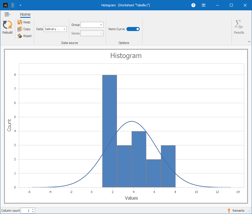
✓One data series: Column A⌄
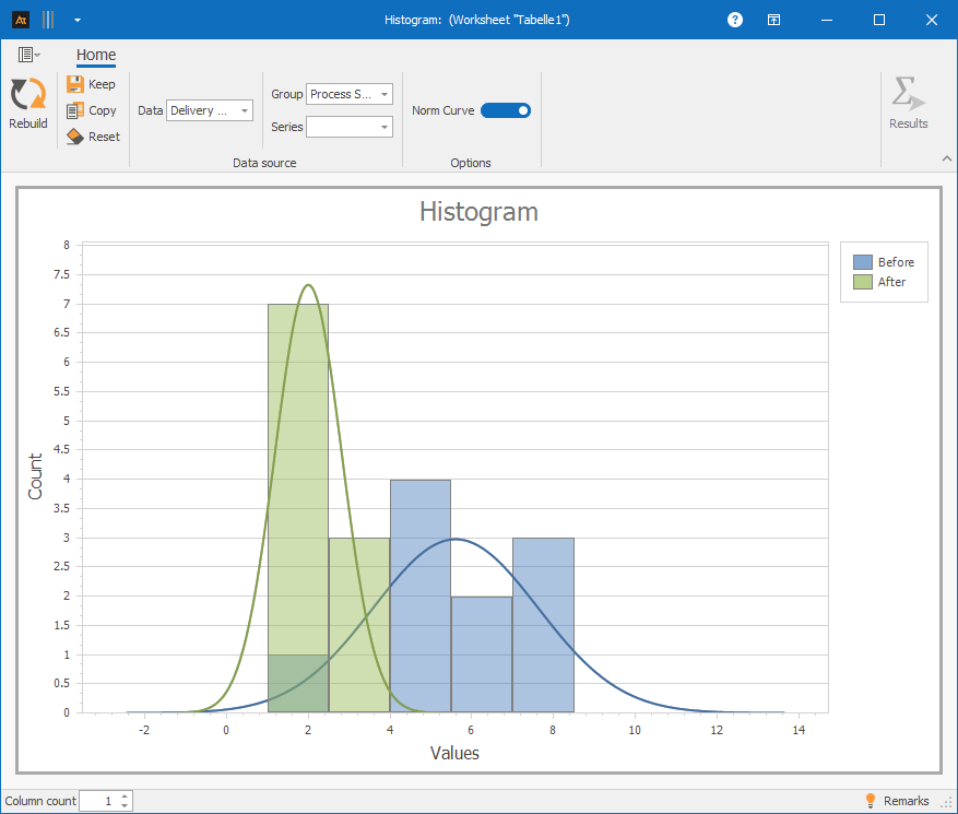
✓One data series and group: Column A and D⌄
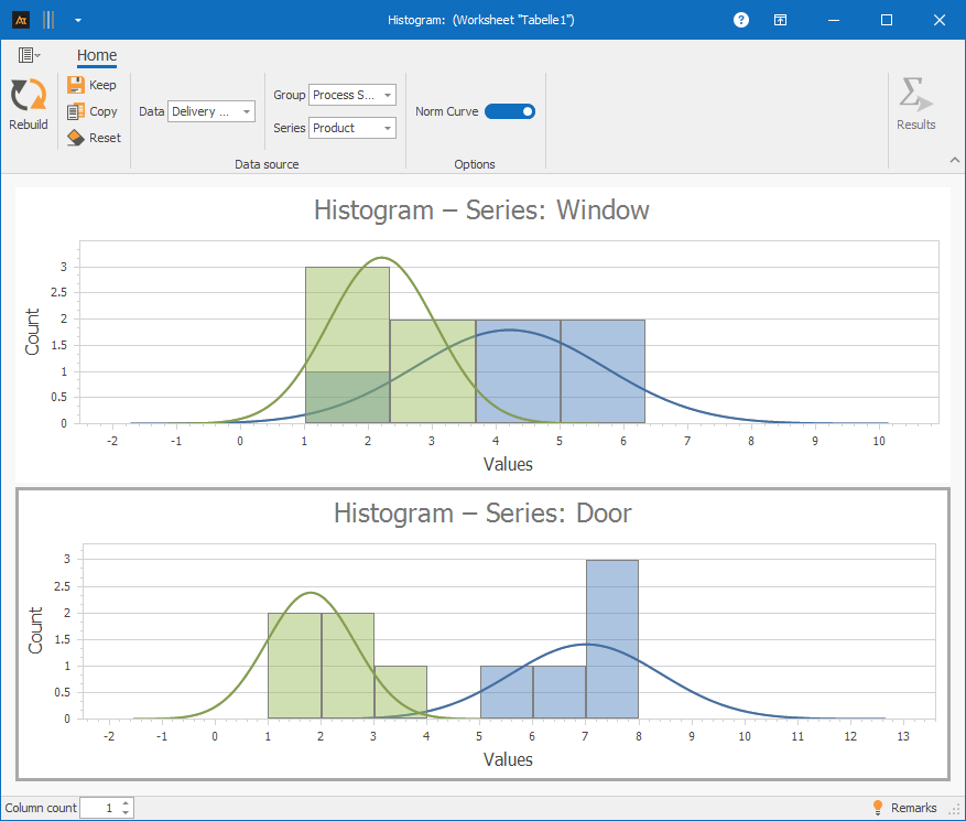
✓One data series with group and series: Column A, D and E⌄
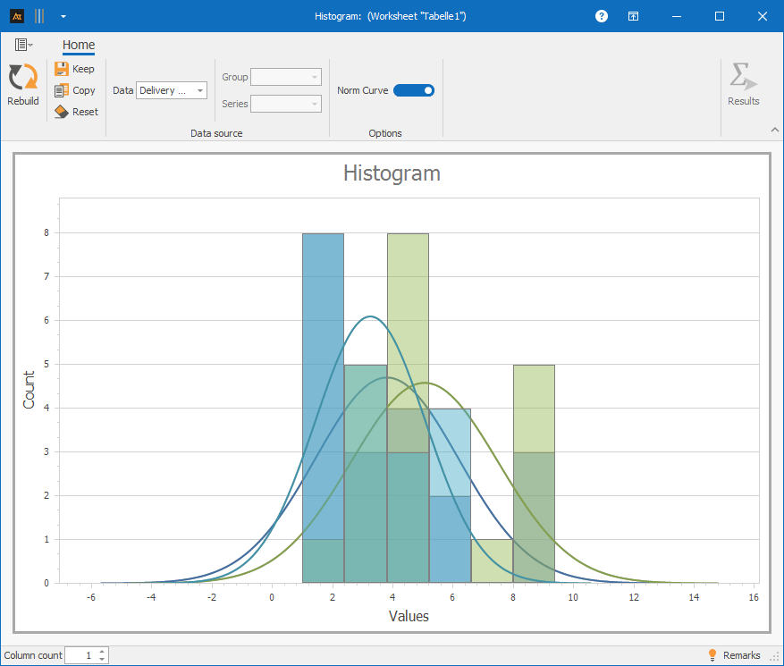
✓Multiple data series: Column A–C⌄
At least quantitative data (countable or measurable data).
An appropriate measuring instrument, as outliers can often result from measurement errors.
Development old vs. new formulation
In development, a new formulation is being tested. A histogram is used to check whether the distribution of the viscosity of the new formulation differs from the previous one or whether both formulations show similar distribution behavior.
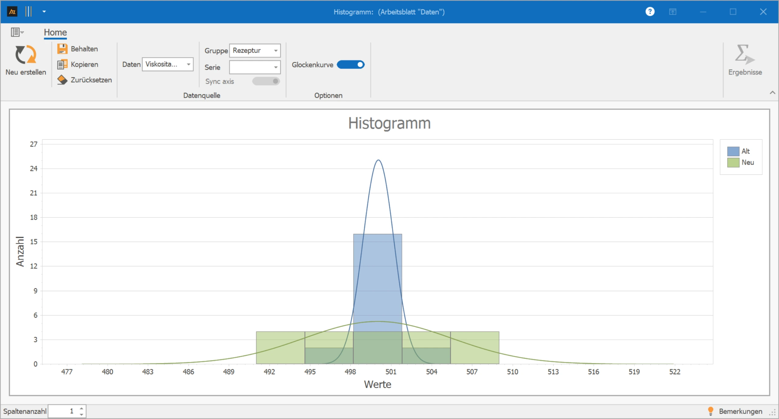
The histogram shows that the distributions of the viscosity of the old and new formulations largely overlap in the typical value range. The main areas of frequencies lie in similar classes, so no significant difference in the position of the distribution can be seen.
However, it is noticeable that the distribution of the new formulation is wider. The frequencies are spread over more classes, indicating a greater dispersion of the viscosity values.
Lead time of an order
In quality assurance, it was found that individual viscosity values were outside the expected range. A histogram should be used to check whether this behavior occurs in all production lines or whether individual lines differ.
You can download the data here: production-lines.xlsx
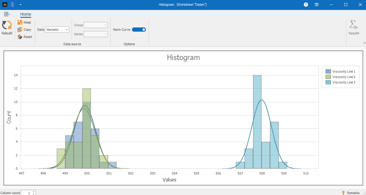
The histogram shows that production lines 1 and 2 have a similar distribution shape and a comparable typical range of viscosity values. The frequencies are concentrated in the same classes, which suggests similar process behavior.
The distribution of production line 3, on the other hand, is shifted, as the focus of the frequencies is in higher classes. The dispersion is comparable for all three lines, but individual marginal classes in line 3 show isolated values, which may indicate special process conditions or disturbances.
Response Time Requests
Requests are processed at multiple locations in the IT service desk. Although uniform service processes apply, the conditions may differ between locations. A histogram is used to investigate whether the distribution of ticket processing times differs.
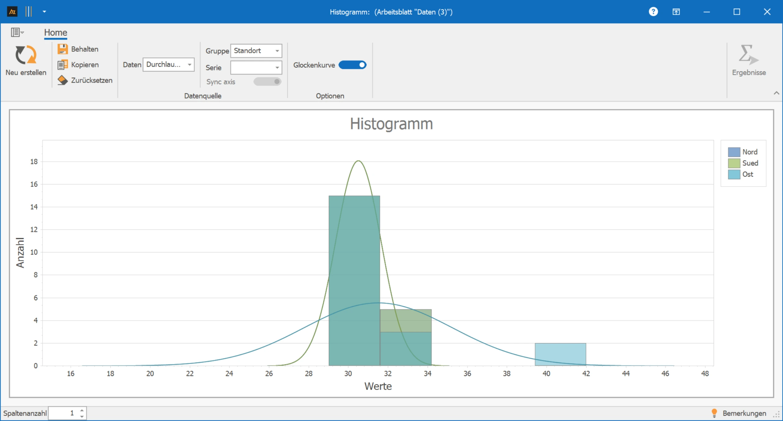
In the histogram, the main areas of processing times at all locations are in a similar value range. This shows that the typical processing times do not differ significantly between locations.
At the same time, a marginal class with very long processing times is noticeable at one location. These few values influence the distribution at the margin without significantly changing the typical processing range. The histogram makes these exceptional cases visible and shows that they are more likely isolated cases rather than a general location problem.
Sales Quota by Region
In sales, sales opportunities are processed in several regions. Different market conditions and competitive intensities can affect the sales quota. A histogram is used to check whether the distributions differ between regions and products.
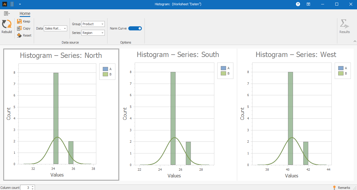
The histogram shows significant differences in the distribution of sales quotas between the regions. In the West region, frequencies are concentrated in higher classes, while in the South region, values are more often in lower classes.
The distributions of the two products are identical in all regions, so neither category A (blue) nor category B (green) can be distinguished in the histogram. A better tool in this case is the box plot.
Delivery time after logistics center
In logistics, customer orders are processed through multiple logistics centers. Despite the same processes, delivery times may vary. A histogram is used to analyze whether the distributions of delivery times differ between the logistics centers.
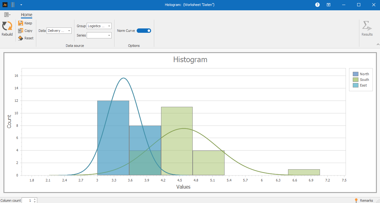
In the histogram, the typical delivery times of all logistics centers are in a similar range of values. The frequencies are concentrated in comparable classes, which suggests similar standard processes.
However, in one logistics center, a marginal accumulation with longer delivery times is noticeable. These few values indicate special load situations or individual cases.
Supplier Comparison
In purchasing, materials are sourced from various suppliers. A histogram is used to examine whether the distribution of delivery reliability differs between suppliers. Delivery reliability is calculated as the percentage of on-time deliveries.
Delivery Reliability [%] indicates how often deliveries are made on time. A delivery is considered on time if it arrives within the agreed delivery window. Delivery reliability is calculated as the percentage of on-time deliveries.
For each week, delivery reliability is calculated, e.g.:
Delivery Reliability [%] = (on-time deliveries / total deliveries) × 100
For the histogram, delivery reliability is calculated over several calendar weeks. Each data point corresponds to the delivery reliability of a supplier in a week.
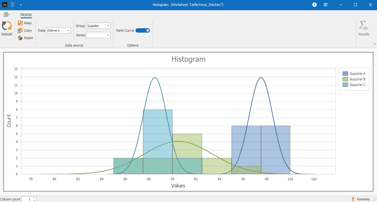
The histogram shows differences in the distribution of delivery reliability between suppliers. Supplier A shows a strong concentration in high percentage classes, indicating stable and high delivery reliability.
Supplier C also shows a relatively narrow distribution, but with a focus on lower classes. The distribution of Supplier B is significantly broader and shows isolated very low values – an indication of less stable performance with greater fluctuations.
The histogram thus shows that the usual delivery times hardly differ, while individual exceptions should be specifically analyzed.
Forecast deviation
In production planning, demand forecasts are created. A histogram is used to analyze how the distribution of forecast deviations differs between different planning horizons.
The forecast deviation results from the comparison between the planned demand and the actual demand. To present the deviation comparably, it is given in percentage.
Forecast deviation [%] = (planned demand − actual demand) / actual demand × 100
- A positive value means that the demand was overestimated.
- A negative value means that the demand was underestimated.
- A value close to 0 % indicates a very accurate forecast.
By presenting it as a percentage, forecast deviations can be compared independently of absolute quantities and clearly displayed in the histogram.
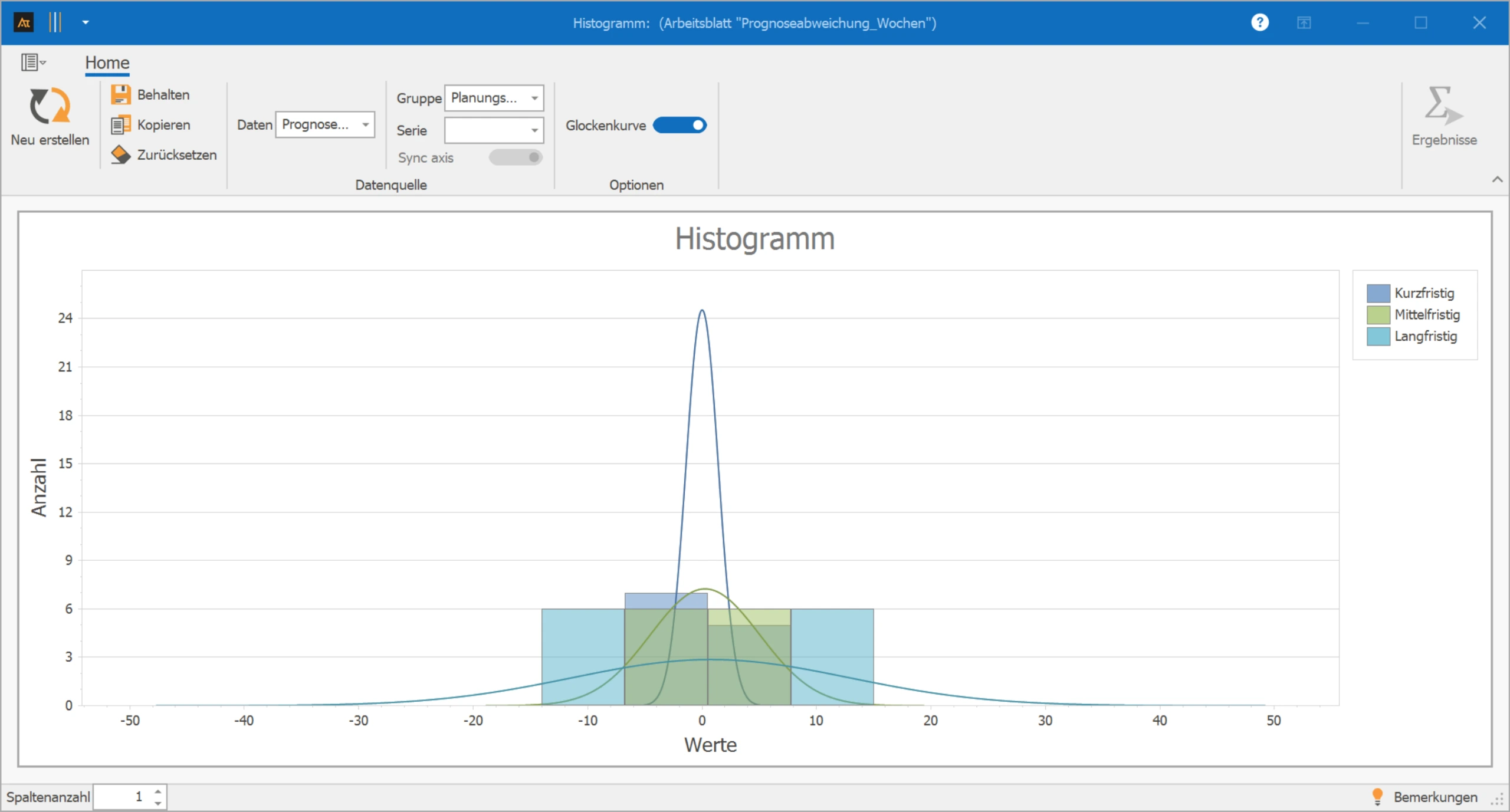
The histogram shows that short-term planning has a narrow distribution of forecast deviation with a focus near 0 %. This indicates a high forecast accuracy in the short planning horizon.
In medium-term planning, the distribution is wider and the focus is further from 0 %. Long-term planning shows the widest distribution as well as significant positive and negative deviations – the forecast uncertainty increases significantly with the planning horizon.
Class (Bin): Interval into which measurements are divided for frequency counting.
Class width: Width of an interval (e.g., 0.5 Pa·s).
Absolute frequency: Number of values in a class.
Relative frequency: Proportion of values in a class (absolute frequency / n).
Density (optional): Relative frequency related to class width (for comparison with different class widths).
Skewness / Multimodality: Shape characteristics of the distribution (asymmetric or multiple centers of accumulation).