


The individuals chart is used to monitor processes with individual values over time. The goal is to detect unusual changes in the process early, before deviations occur. This allows for systematic analysis of causes, building process knowledge, and avoiding unnecessary interventions.

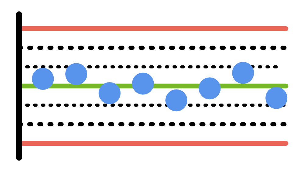
In the production of tomato sauce, the filling quantity of each individual jar is continuously measured. The goal is to check whether the process remains stable over time or if unusual changes occur. Each measurement is displayed in chronological order on the individuals chart.
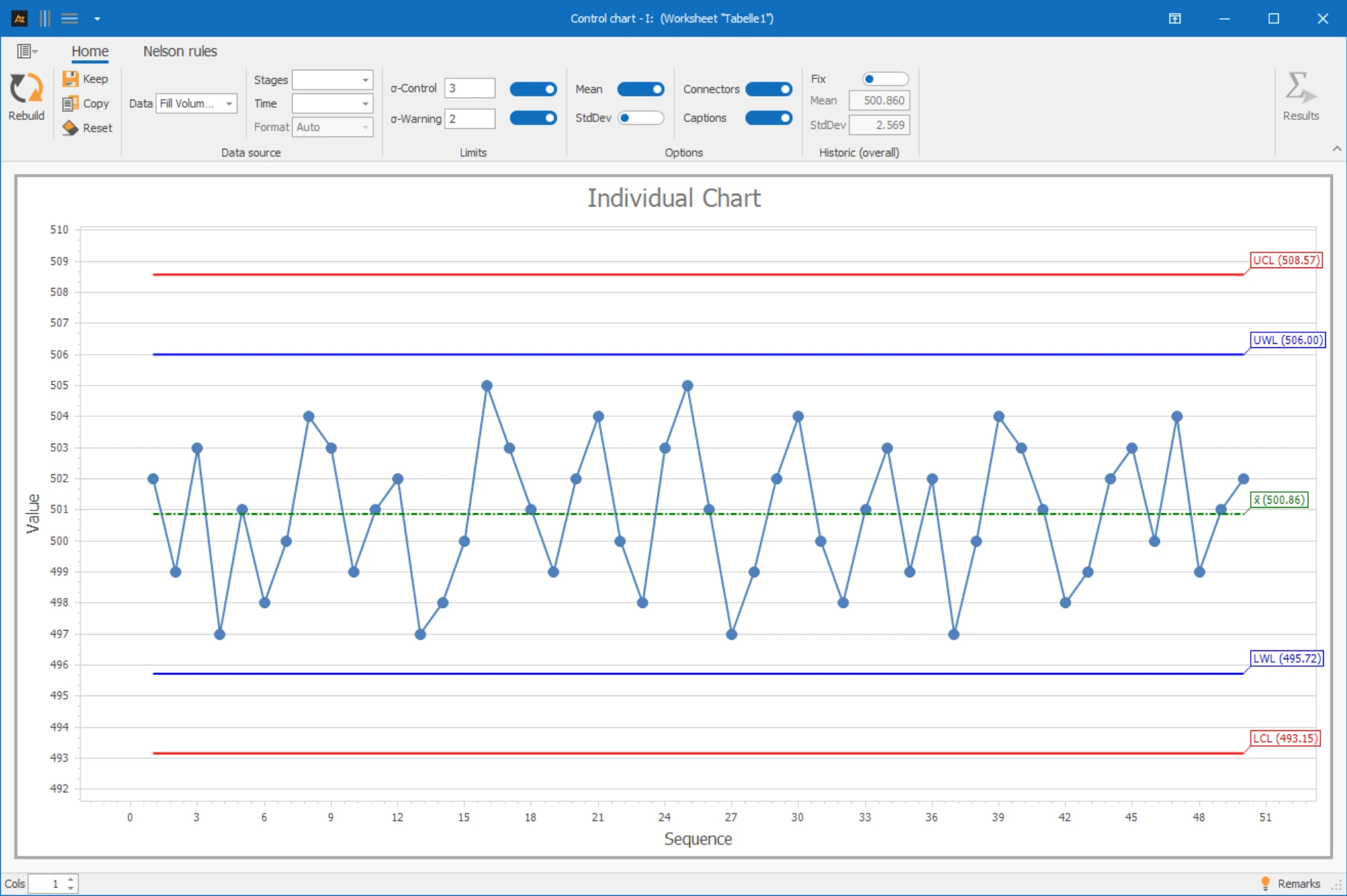
Interpretation of the results:
There are no points outside the control limits and no noticeable patterns are visible. The process is stable – there is no reason to intervene.
Explanations of the graphic:
- The points show the individual filling quantities in chronological order.
- The center line corresponds to the average filling quantity.
- The control limits are three standard deviations from the mean.
Preparation
- Select an appropriate measurement (e.g., filling quantity, temperature, pH value).
- Ensure that the data is available as individual values in chronological order.
- Check whether different process phases should be considered separately.
- Determine which Nelson rules should be activated.
 Use in AlphadiTab
- Select the Measure Phase or Control Phase tool individuals chart.
- Select the column for data.
- Generate the chart with the “Create New” button.
Interpretation
- Are points outside the control limits?
- Are non-random patterns recognizable (trends, shifts, cycles)?
- Is the process stable, or are interventions required?
Historical values
If historical values are known, they can be used as a fixed reference. If none are available, the centerline and control limits are estimated from the current data.
Sections
Sections are useful if the process has been deliberately changed. Separate centerlines and control limits are calculated for each section.
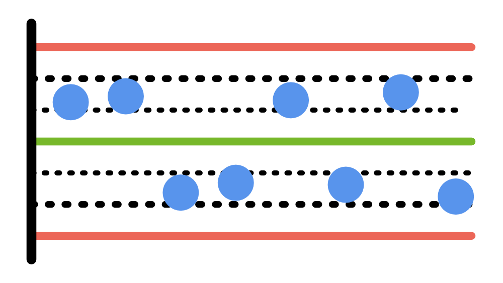
Non-random patterns are detected with the tests:
Control Charts
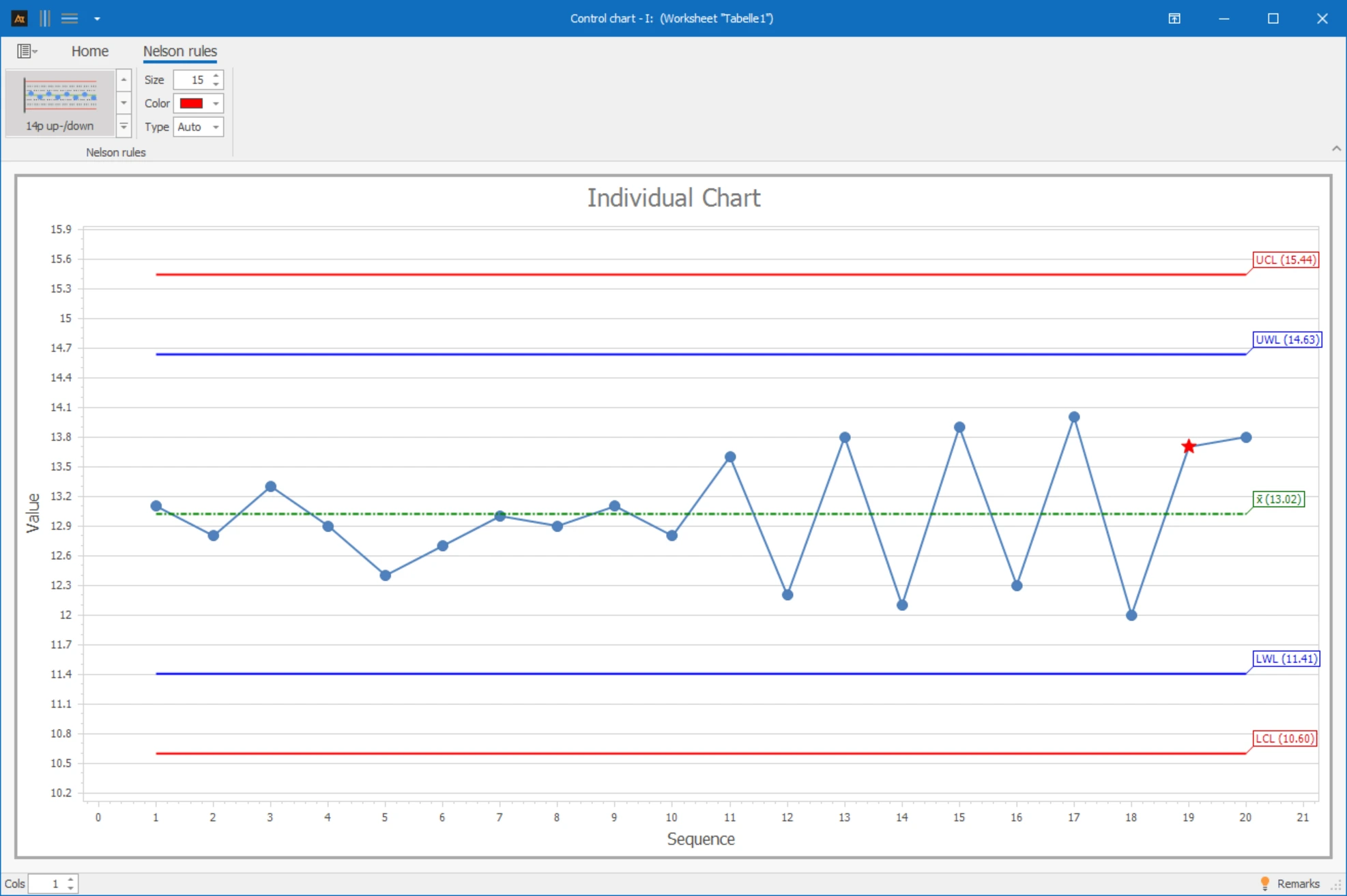
Response time of the IT helpdesk
Tickets are processed in the IT service desk. The response times are regularly evaluated to monitor the stability of the service processes.
Interpretation
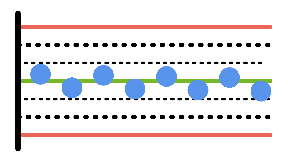
Initially, the measurements scatter randomly. As the process continues, a clear alternating pattern is noticeable: the values rise and fall regularly over several points. This alternating pattern is not random and indicates a systematic cause.
→ Alternating pattern – systematic cause, investigate process.
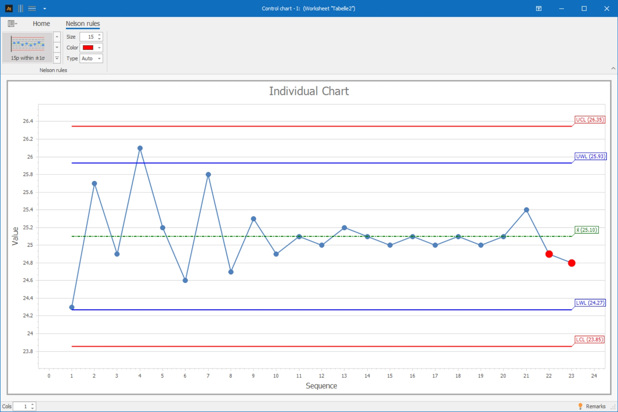
Sales Quota by Region
In sales, the sales quota is regularly evaluated to monitor closing performance. It is based on a sufficient number of offers per period, so the values can be considered approximately continuous.
Interpretation
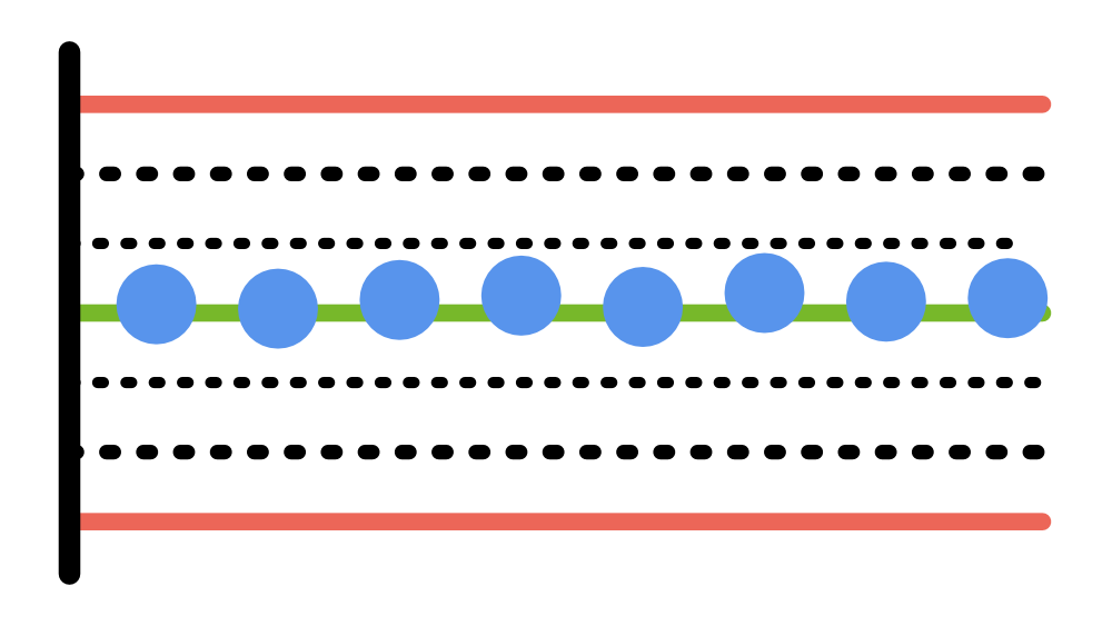
Initially, the measurements scatter randomly. However, over time, the values are very close together for an extended period. This unusually low dispersion is not random.
→ Noticeably low dispersion – systematic cause, investigate.
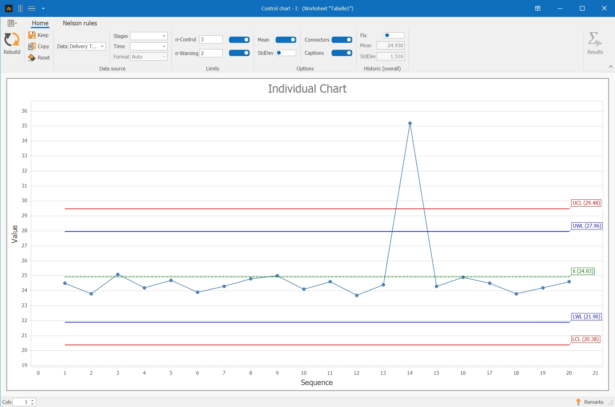
Delivery time after logistics center
In the logistics sector, the delivery time of customer orders is continuously recorded. The goal is to check whether the process is stable over time or if there are any anomalies.
Interpretation
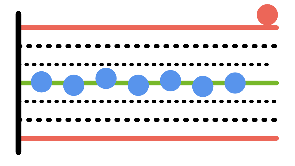
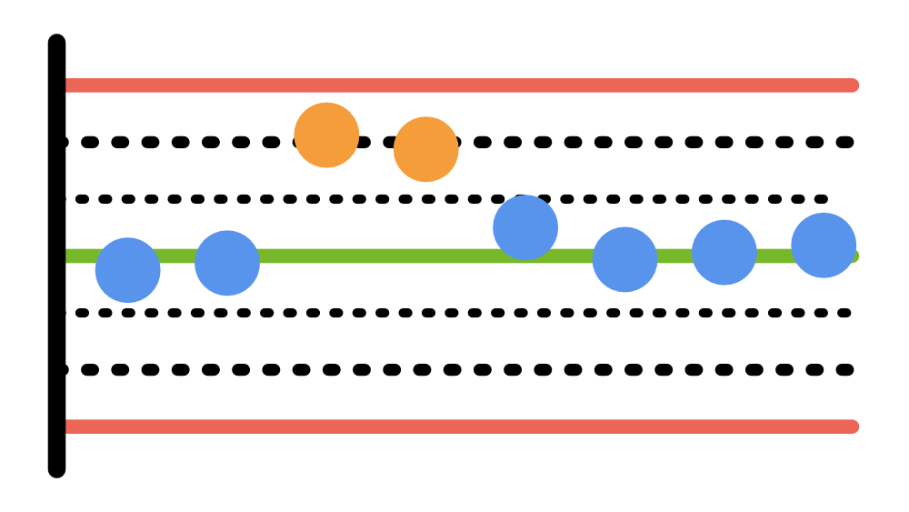
A measurement is significantly outside the control limits. The cause is known: a full closure on the A7. The process is not stable at this time, but there is an explainable special cause.
→ Outlier due to known special cause (A7 closure) – no further investigation needed.
Supplier Comparison
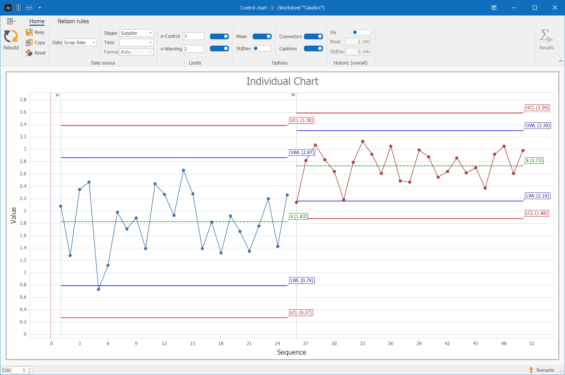
In purchasing, the rejection rate per delivery is continuously recorded. During the observation period, there was a switch from Supplier A to Supplier B. The goal is to check whether the process remains stable after the change.
Interpretation
After the supplier change, a significant shift in the level of the rejection rate is noticeable. The values are generally higher, indicating a systematic change.
→ Level shift after supplier change – analyze in context.
Forecast deviation
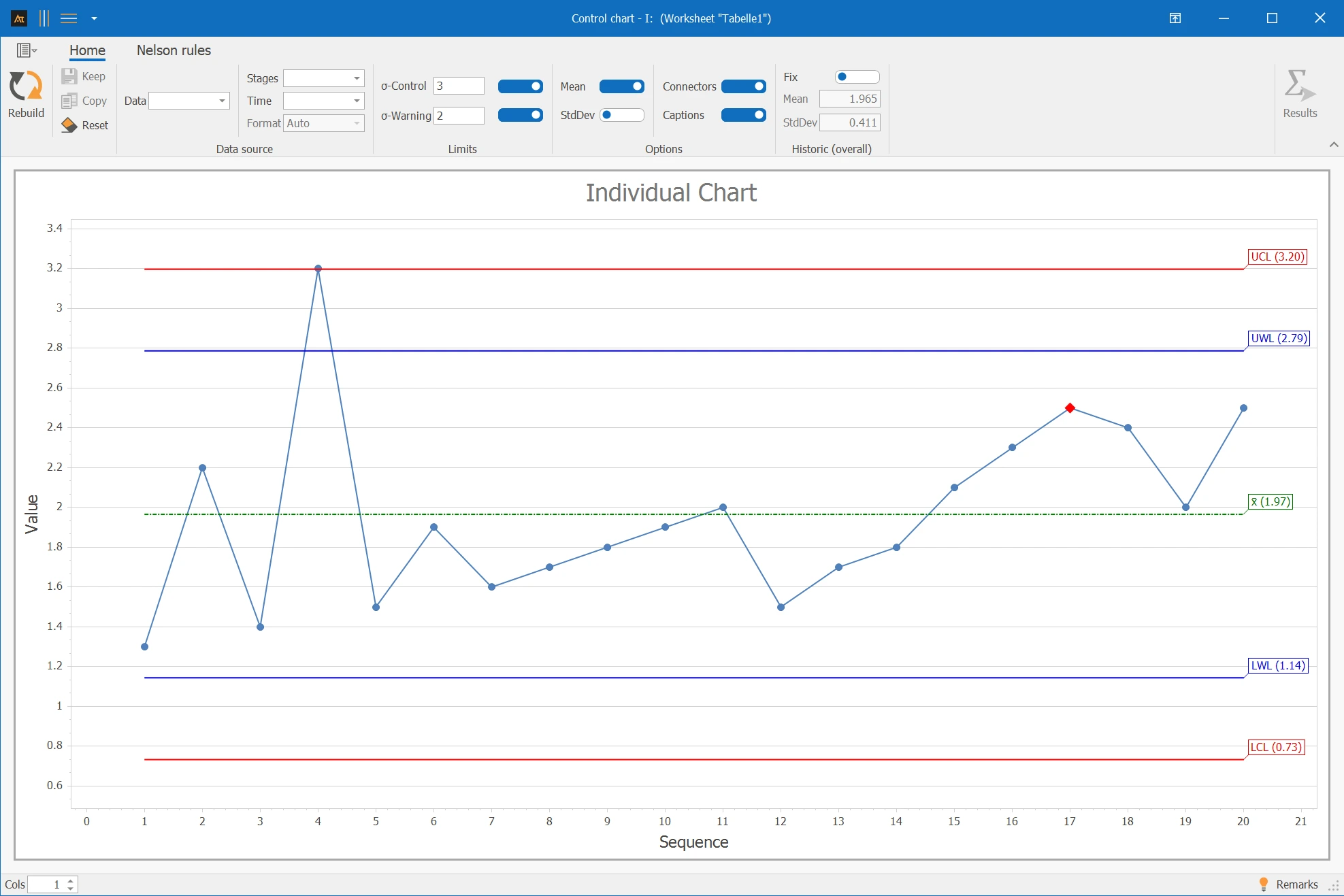
In production planning, the forecast deviation is regularly recorded to monitor the quality of demand planning. Over time, it should be checked whether the behavior of the process changes.
Interpretation
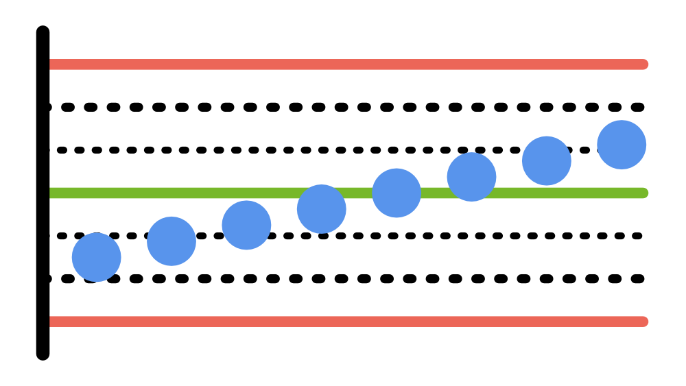
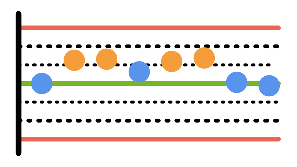
An outlier and an upward trend are recognizable. This indicates a systematic change – the process is not stable.
→ Outlier + upward trend – process unstable, investigate.
I (Individual): Individual values displayed in chronological order.
Average: Average of the measurements and central level of the process.
Standard deviation: Measure of the dispersion of the measurements around the average.
Control limits (UCL / LCL): Limits within which the random fluctuation of a stable process is expected (typically ±3σ).
Warning limits (UWL / LWL): Limits within the control limits for early detection of anomalies (typically ±2σ).
Sigma control: Factor for calculating the control limits (typically 3σ).
Sigma warning: Factor for calculating the warning limits (typically 2σ).
Nelson rules: Statistical tests for detecting non-random patterns in the process flow.
Fix (historical values): Preset values for average and standard deviation used as a fixed reference for calculating the limits.
Step values: Representation of piecewise constant process levels, e.g., during changes in the process
Mean
With xi = i-th individual observation