


The np-chart is used to monitor a process over time based on quantities. The process is described by a key figure that indicates the number of certain events within a constant total amount. It shows whether this number is within the expected range or if noticeable changes occur in the process.
This can be, for example, the number of NIO parts in production, the number of sales in distribution, or the number of delayed deliveries. The goal is to detect changes early, systematically analyze possible causes, build process knowledge, and avoid unnecessary interventions.

In the filling of tomato sauce, it is checked per shift how many jars have a crooked or incomplete label. The goal is to determine whether the number of non-conforming units remains stable over time.
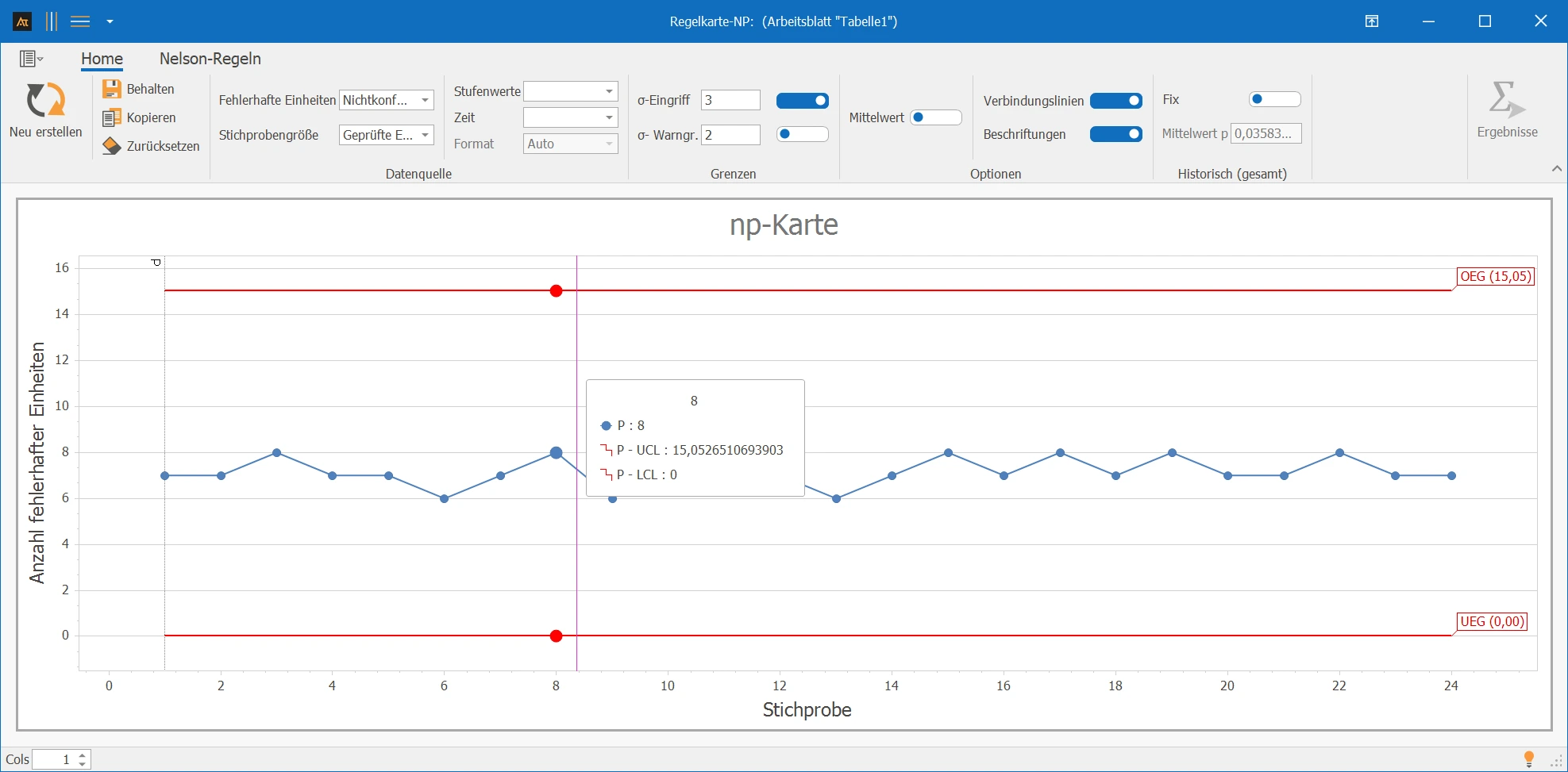
Interpretation of the Results:
There are no points outside the control limits, and no noticeable patterns are visible. The number of defective labels fluctuates randomly around the centerline. The process can thus be assessed as stable.
Explanations of the Graphic:
- The points show the number of units with the considered property per subgroup in chronological order.
- The centerline corresponds to the average number of these units.
- The control limits are calculated from the average process level and the constant subgroup size. With a constant subgroup size, they usually run horizontally.
Preparation
- Define a clear binary classification.
- Ensure constant subgroup size.
- Record the number of nonconforming units per subgroup.
 Use in AlphadiTab
- Select the np-chart tool in the Measure Phase or Control Phase.
- Enter the number of nonconforming units and sample size.
- Generate the chart with the "Create New" button.
Interpretation
- Are points outside the control limits?
- Are non-random patterns recognizable?
Historical values
If historical reference values are known, they can be used as a fixed basis. The centerline and control limits then remain constant.
Sections
Sections are useful if the process has been deliberately changed, e.g., after a supplier change or a process adjustment. Separate centerlines and control limits are calculated for each section.
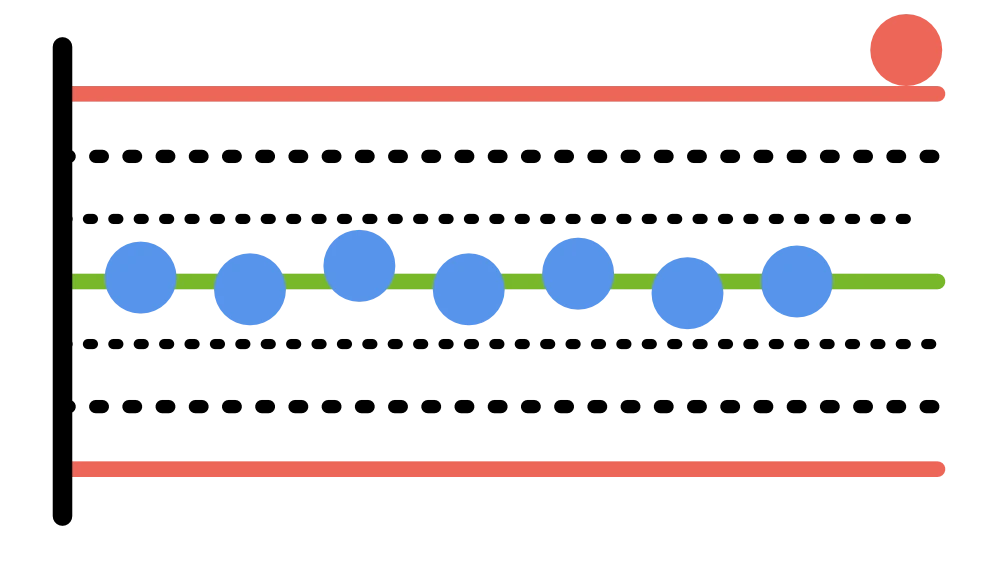
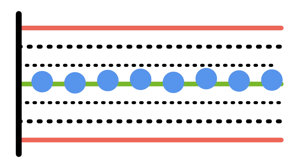
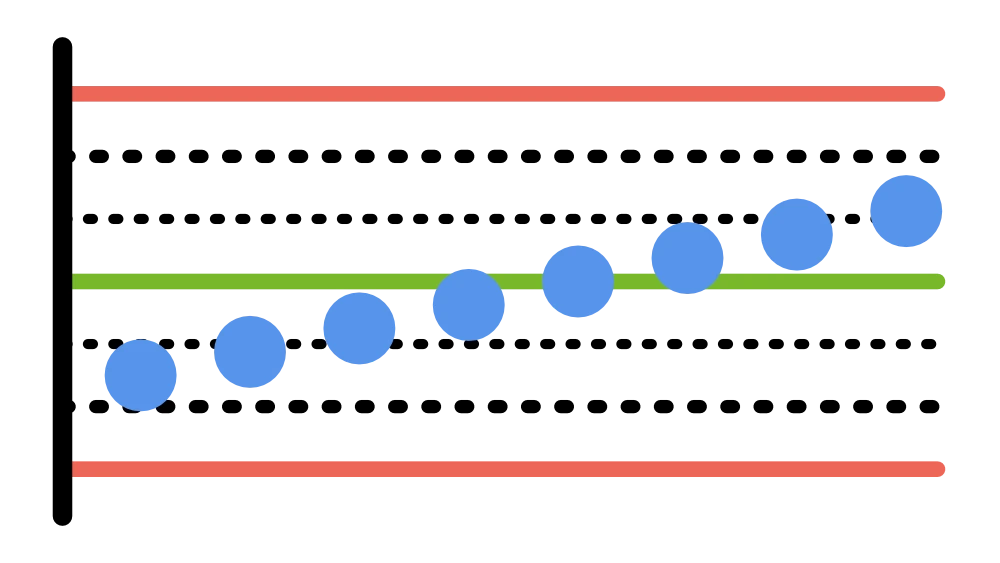
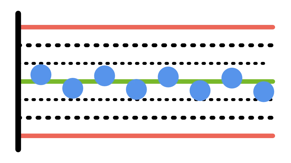
Non-random patterns are detected with the tests:
Number of first-resolved inquiries
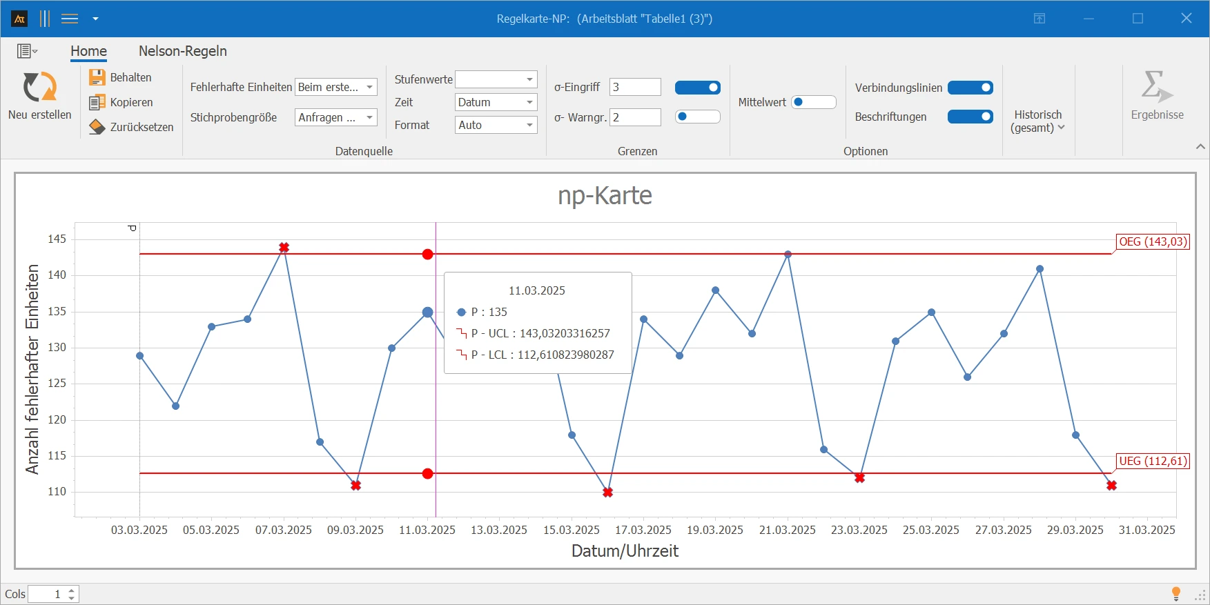
In IT service, it is evaluated daily how high the number of inquiries is that are resolved at the first contact. The np-chart helps to assess whether this number remains stable over time or if anomalies such as trends or shifts occur.
Interpretation
There are several points outside the control limits. The process is unstable and should be examined more closely.
→ Several points outside the limits – process unstable, check causes.
Number of offers with missing mandatory information
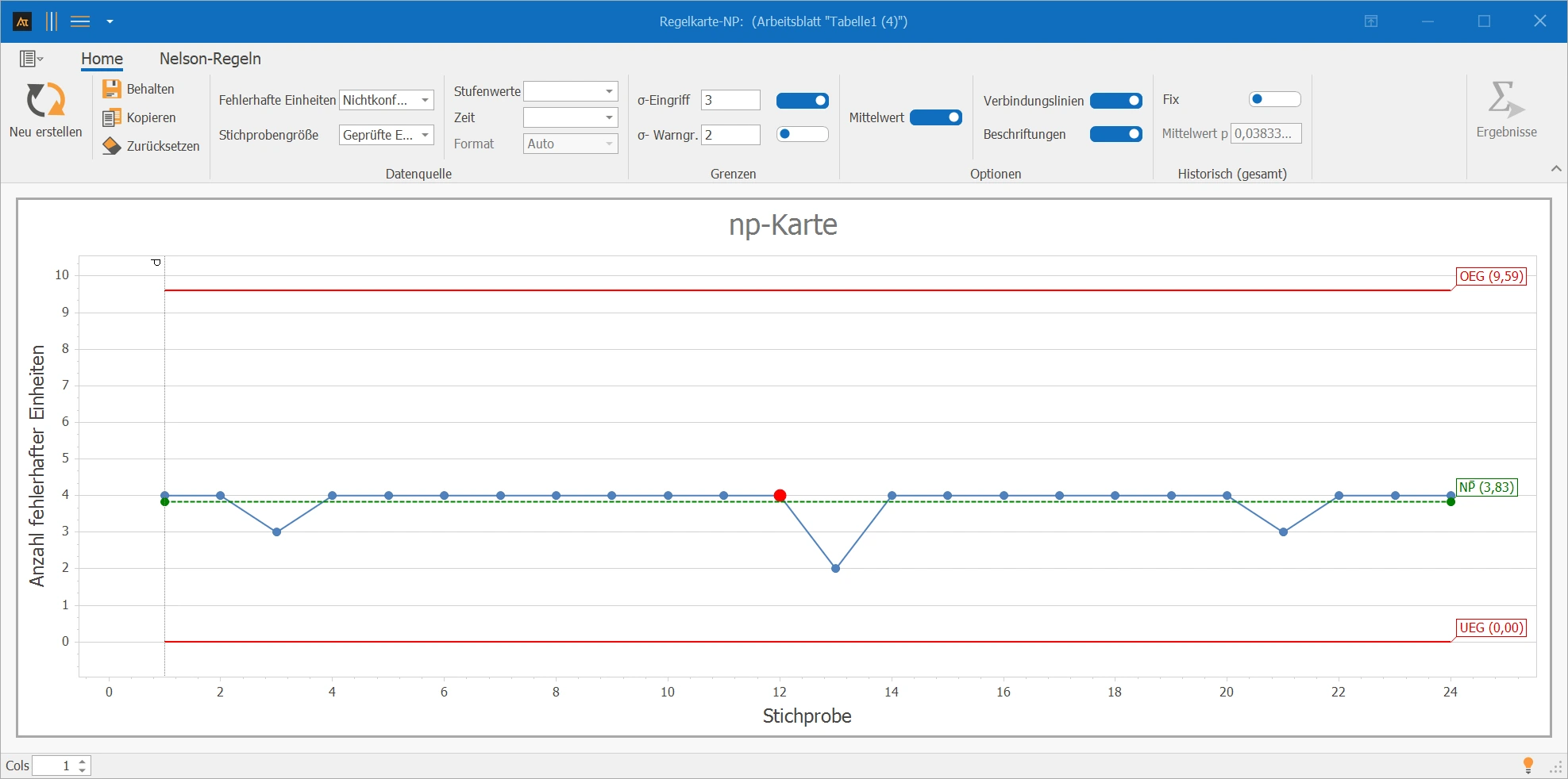
In sales, it is checked monthly how many offers are missing mandatory information. This allows tracking whether the number of incomplete offers remains consistently stable.
Interpretation
The numbers are unusually close together. Such a low dispersion is often not random for a real process and may indicate standardized rework, too coarse classification, or a peculiarity in the inspection system. Additionally, nine points are on the same side of the centerline.
→ Noticeably low dispersion + 9 points on one side – question inspection system/classification.
Number of shipments with transport damage
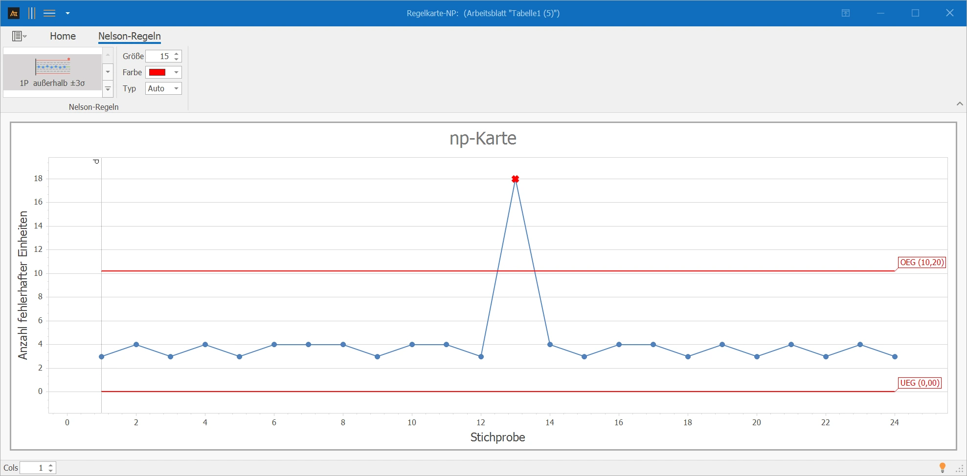
In the logistics sector, it is evaluated per tour how many shipments arrive with visible transport damage. The goal is to identify extraordinary loads early.
Interpretation
An outlier is recognizable; the 13th tour is affected. A rear-end collision was reported by the driver for this tour. The deviation can thus be explained by a known special cause and does not indicate a permanent change in the process.
→ Outlier due to known special cause (accident) – no new basic pattern.
Number of Goods Receipts with Blocking Note
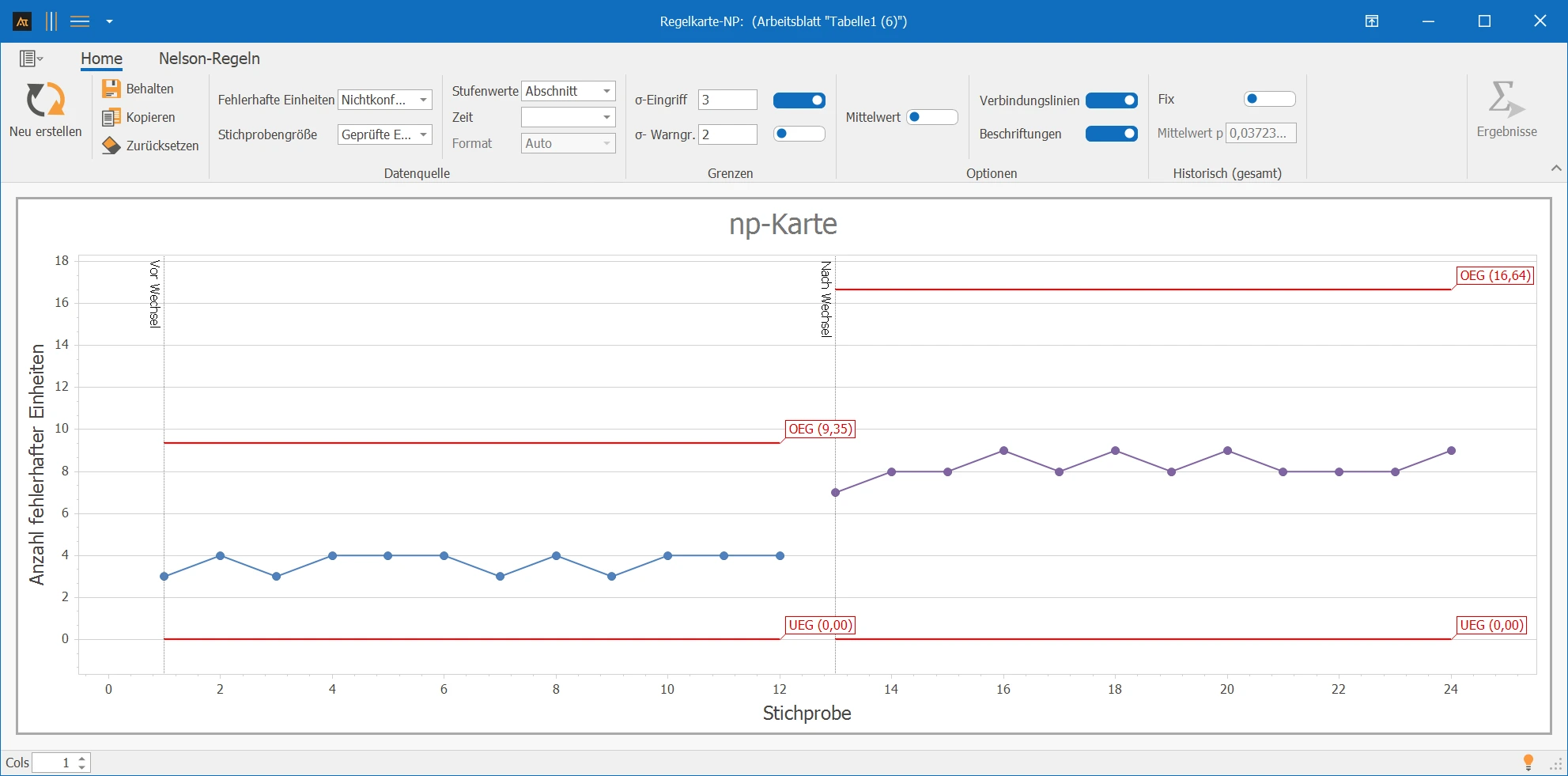
In purchasing, the number of goods receipts with a blocking note is monitored. During the observation period, there was a switch from Supplier A to Supplier B, so two sections are useful.
Interpretation
After the supplier change, the number of goods receipts with a blocking note is at a noticeably higher level. The separate consideration of the sections shows that the process level has changed. The change should be evaluated in the context of the supplier change.
→ Level shift after supplier change – evaluate sections separately.
Number of Positions with Critical Forecast Error
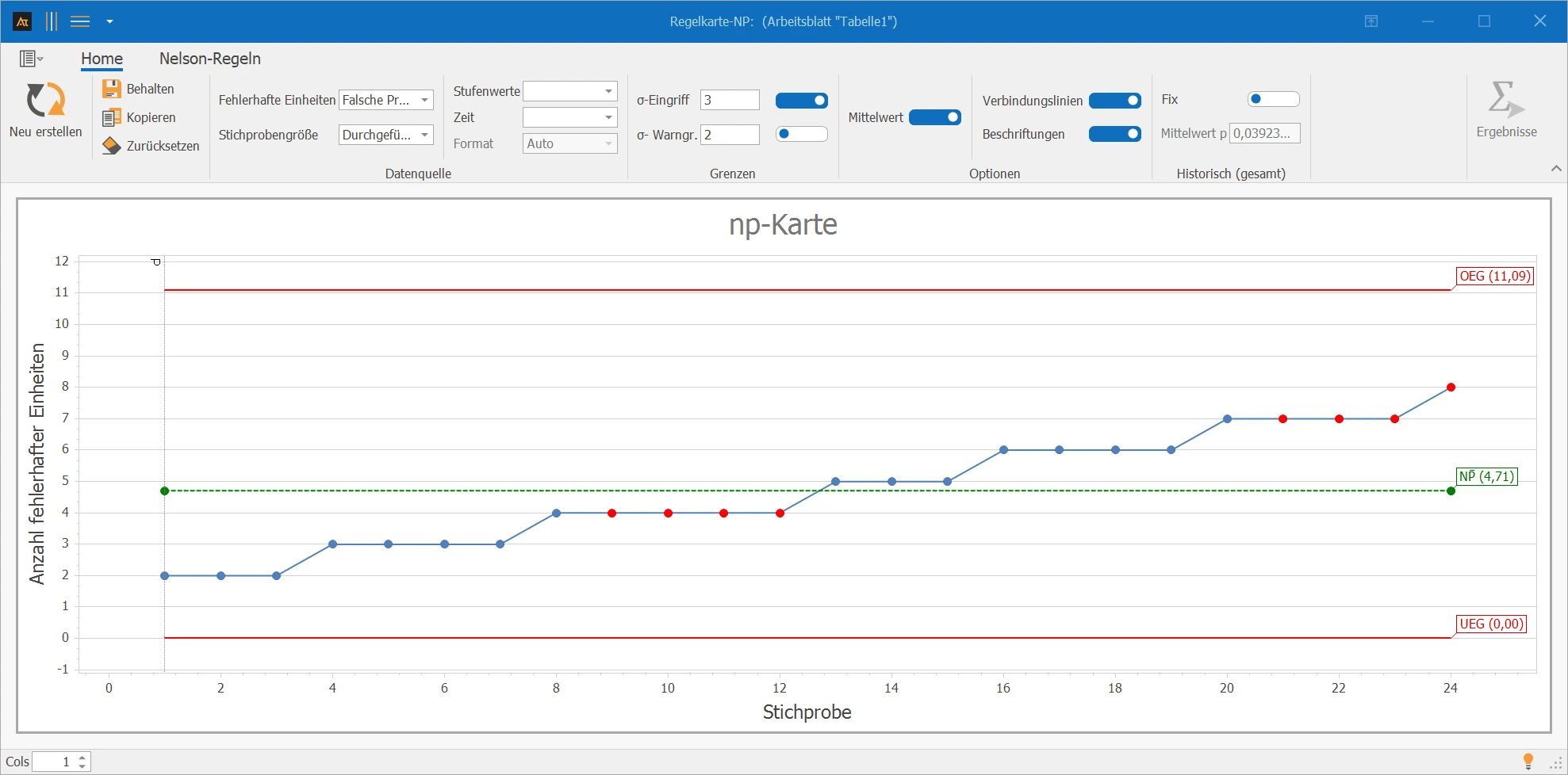
In production planning, each planning cycle evaluates how many positions exceed a defined forecast error threshold. The np-chart shows whether the number of problematic positions changes over time.
Interpretation
Over the period, an increasing trend in the number of incorrect forecasts is noticeable. Since the values also decrease again in between, no trend is signaled according to the Nelson rules. However, the development should still be monitored professionally.
→ Slightly increasing trend, but no Nelson rule violated – continue to monitor.
With the historical fix, np̄ is replaced by the given reference value np.