


The pie chart shows at a glance how a whole is divided into its parts. Each segment represents a category – its size corresponds to the percentage of the total value.
The pie chart can be used in LSS projects in all DMAIC phases. The purpose of use varies depending on the phase.
Show shares in the initial situation
In the Define phase, the pie chart is used to make the distribution of the problem across categories visible (e.g., types of errors, areas). This allows you to quickly see which category has the largest share of the problem.
Measure and compare shares
In the Measure phase, the pie chart helps to represent the distribution of count data across categories. This makes it visible which category has the largest share of the total volume.
Use share differences as an indication of causes
In the Analyze phase, the pie chart is used to make share differences between groups visible. Deviating shares can provide clues to possible causes.
Check change in shares
In the Improve phase, the pie chart is used to check whether the shares of the categories have changed after a measure.
Confirm stability of improved shares
In the Control phase, the pie chart confirms whether the improved shares have remained stable.
The pie chart is used to graphically represent parts of a whole. It shows how a total value is distributed across different categories – and thus answers the question of what percentage individual categories contribute to the overall result.
Suitable for discrete groups such as product variants, types of errors, or locations
Visualizes how much individual categories contribute to the total value
Particularly clear when the sum forms a meaningful "whole" and the number of segments remains manageable
You can download the data here: tomato-sauce-sales.xlsx
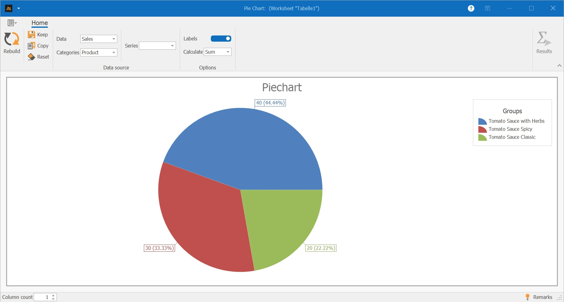
In sales, the sales figures of various tomato sauce products are recorded. The number of units sold of the variants: Classic Tomato Sauce, Herb Tomato Sauce, and Spicy Tomato Sauce are examined. A pie chart is used for evaluation, showing the share each product variant has in total sales.
Explanations of the results:
The pie chart shows the distribution of sales figures among the three tomato sauce variants: herb, spicy, and classic.
- The Herb tomato sauce has the largest share of total sales at 44.44 %.
- The Spicy variant reaches a share of 33.33 %.
- The Classic tomato sauce has the smallest sales share at 22.22 %.
Explanations of the graphic:
The pie chart clearly shows the relative contribution each product variant makes to total sales.
Preparation
-
Define the categories to be compared (e.g., classic tomato sauce, herb, spicy)
- Collect the data (e.g., sales for the categories)
 Use in AlphadiTab
- Select the pie chart tool in the Measure phase.
- Select the “sales” column for data.
- Select the “product” column for category.
- Select „sum“ for calculation method.
- Generate the chart with the „create new“ button.
Interpretation
- Compare the shares of the individual categories
- Identify the category with the largest share of the total value
For the pie chart, various display forms are available. Depending on whether one or more data series as well as additional groups or series are selected, the display in the chart changes.
| Delivery time in days_Location A | Delivery time in days_Location B | Delivery time in days_Location C | Process status | Product |
|---|---|---|---|---|
| 4 | 9 | 3 | Before | Window |
| 5 | 4 | 6 | Before | Window |
| 6 | 7 | 4 | Before | Window |
| 4 | 9 | 2 | Before | Window |
| 2 | 4 | 2 | Before | Window |
| 8 | 9 | 6 | Before | Door |
| 6 | 4 | 6 | Before | Door |
| 8 | 9 | 5 | Before | Door |
| 5 | 8 | 3 | Before | Door |
| 8 | 3 | 5 | Before | Door |
| 3 | 4 | 3 | After | Window |
| 1 | 3 | 1 | After | Window |
| 2 | 2 | 2 | After | Window |
| 3 | 3 | 3 | After | Window |
| 2 | 4 | 1 | After | Window |
| 1 | 4 | 1 | After | Door |
| 3 | 2 | 2 | After | Door |
| 3 | 5 | 3 | After | Door |
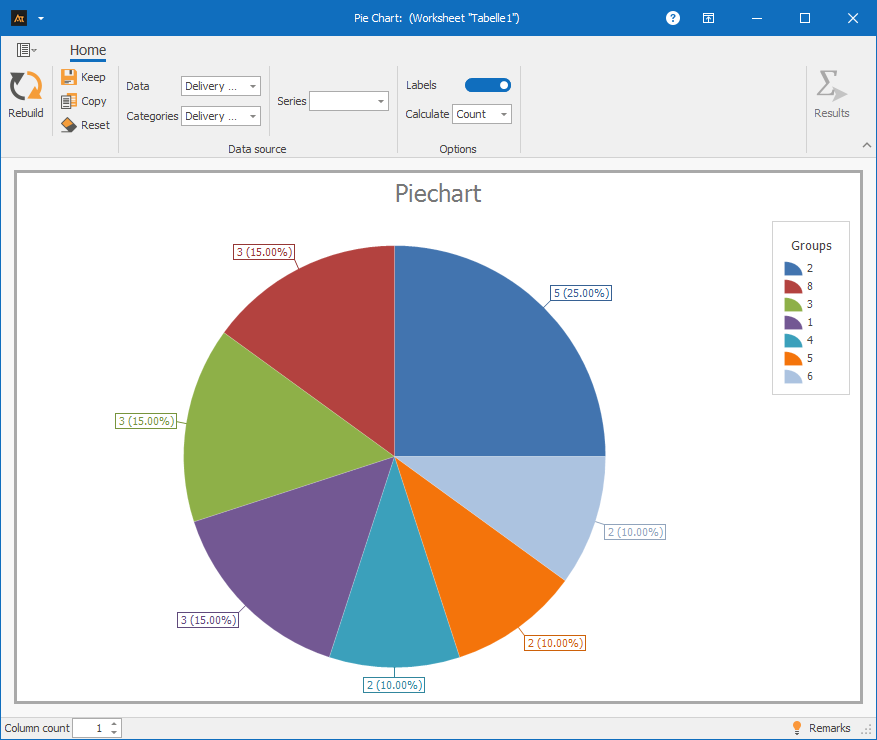
✓One data series: Column A with the same group⌄
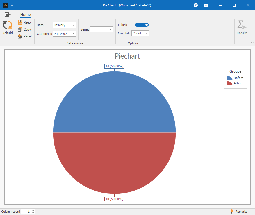
✓One data series and group: Column A and D⌄
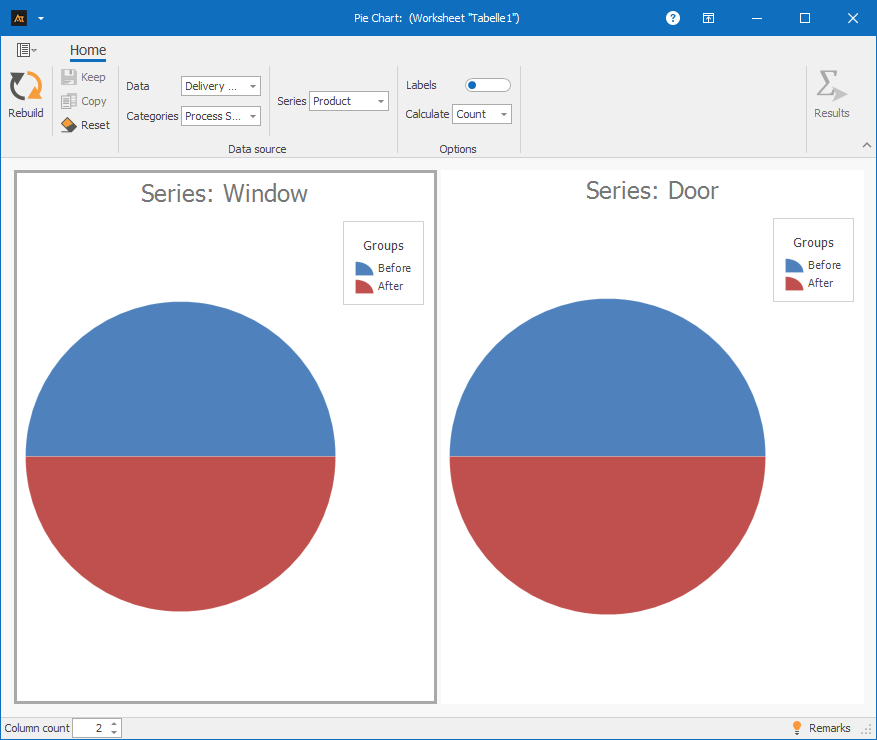
✓One data series with group and series: Column A, D, and E⌄
A grouping variable for dividing the data.
Development old vs. new formulation
In development, a new formulation is being tested. As part of the data collection, it is documented how often the old and the new formulation were used. A pie chart is used to show the proportion of the old and new formulation in the total number of trials conducted.

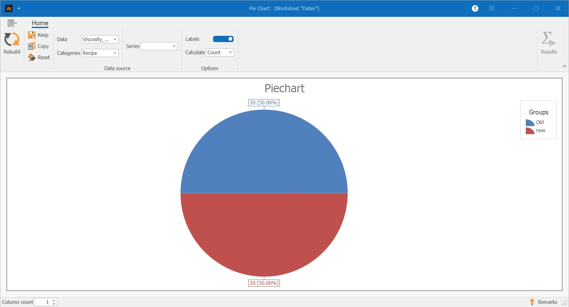
The pie chart shows the proportion of the old and new formulation in the total number of trials conducted. The old and new formulations were used equally often – each formulation accounts for 50 % of the total data collection.
Measure the quality of test results
In quality assurance, the test results of the produced parts are recorded. For each machine, it is documented whether a tested part meets the quality requirements (good part) or does not meet them (bad part).
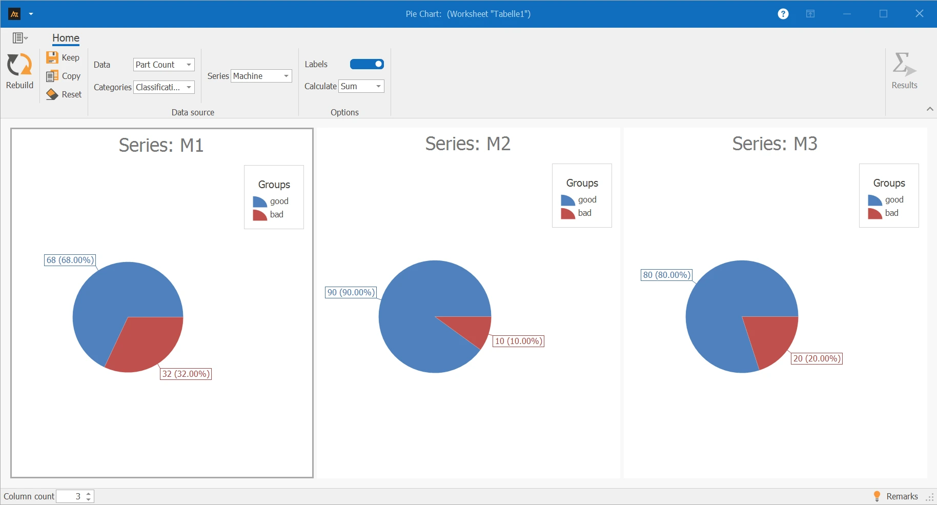
The pie charts show for the machines M1, M2, and M3 the proportion of good and bad parts in the total number of tested pieces.
- For Machine M2, the proportion of good parts is the highest at 90 %.
- Machine M3 has a good part proportion of 80 %.
- For Machine M1, the proportion of bad parts is the highest at 32 % in comparison.
Check frequency of downtimes
In production, machine downtimes are systematically recorded. For each machine, it is documented how often downtimes occur. Additionally, each machine is assigned to a production hall. A pie chart is used to show the share of each machine in the total number of downtimes.
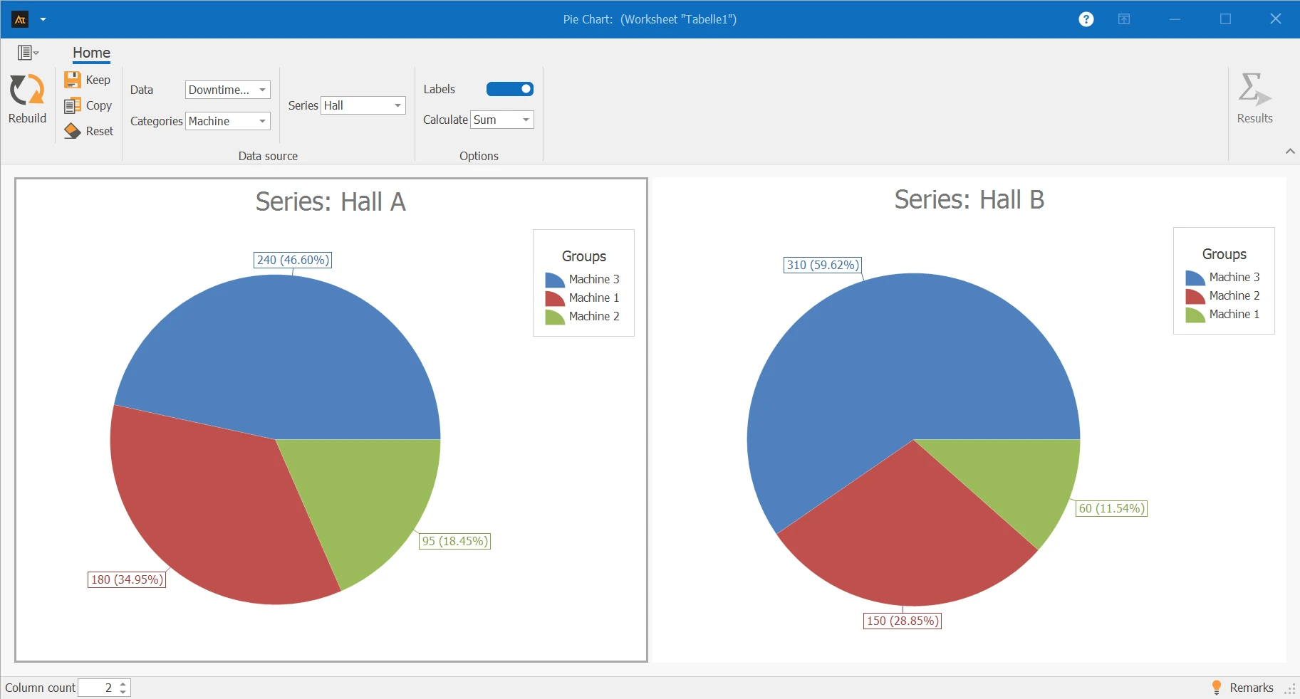
The pie charts show for Halls A and B the share of each machine in the total number of downtimes within the respective hall. In Hall A and Hall B, the largest share of downtimes is accounted for by Machine 3.
Shares of Processed IT Tickets
Requests are processed at several locations in the IT service desk. To get an overview of the workload, it is evaluated how many tickets were processed per location. A pie chart is used to show the share of processed tickets per location.
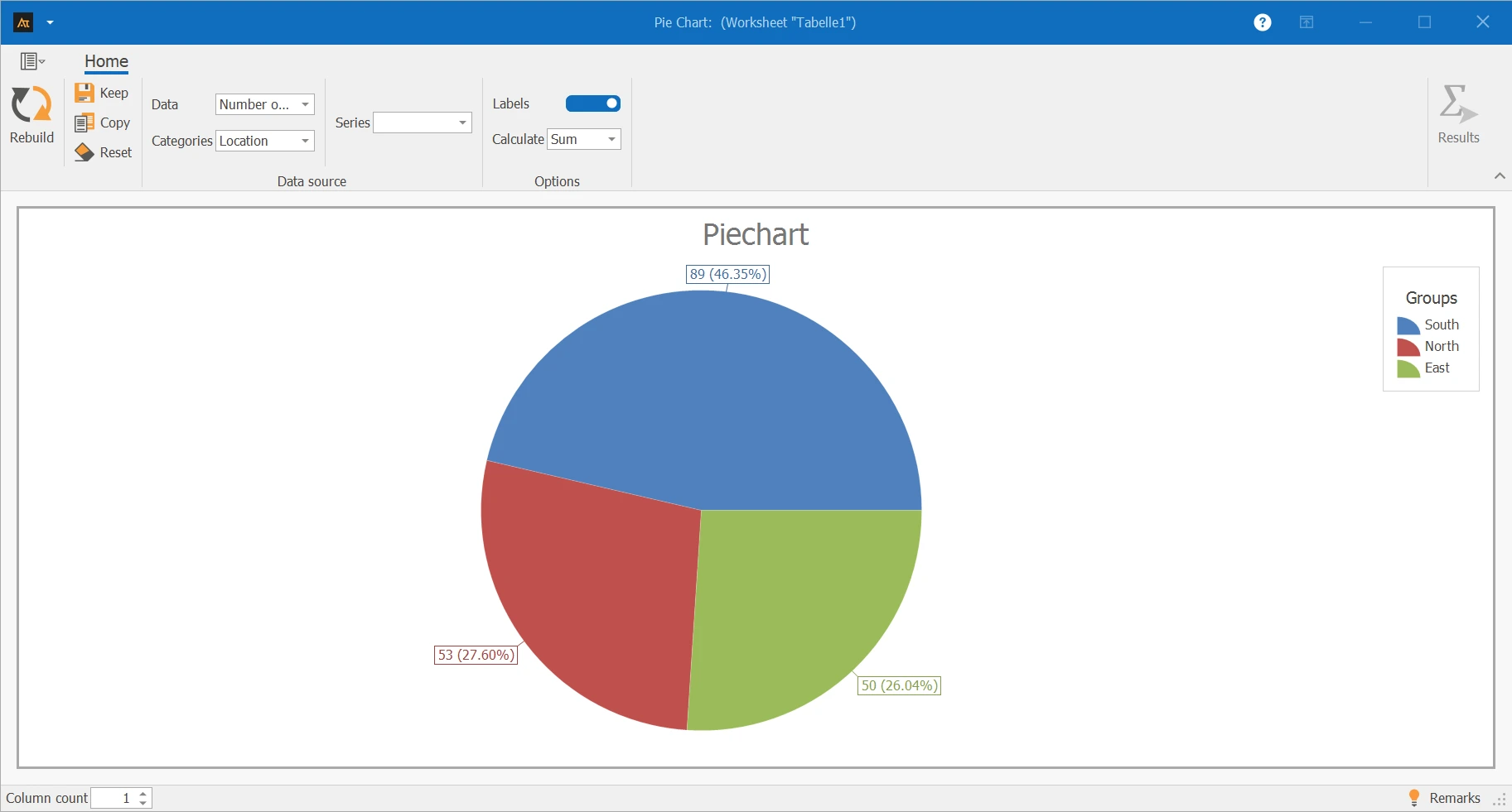
The pie chart shows the shares of processed IT tickets at the locations South, North, and East. The location South has the largest share with 46.35 %. The locations North and East contribute approximately equal shares with 27.60 % and 26.04 % respectively.
Sales Quota by Region
In sales, sales completions for products A and B are recorded in the regions North, South, and West. For each region, it is evaluated what share the two products have in the total sales volume of the respective region.
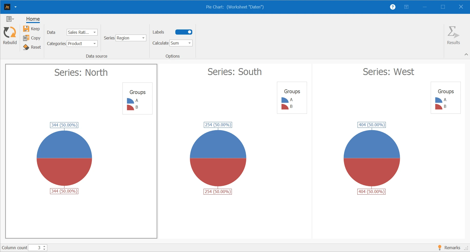
The pie charts show the share of products A and B for the regions North, South, and West. In all three regions, the distribution is identical: Product A and Product B each account for 50 % of the sales completions.
Deliveries to logistics center
In logistics, customer orders are processed through multiple logistics centers. To get an overview of the order distribution of the logistics centers, it is evaluated how many deliveries were processed per logistics center.
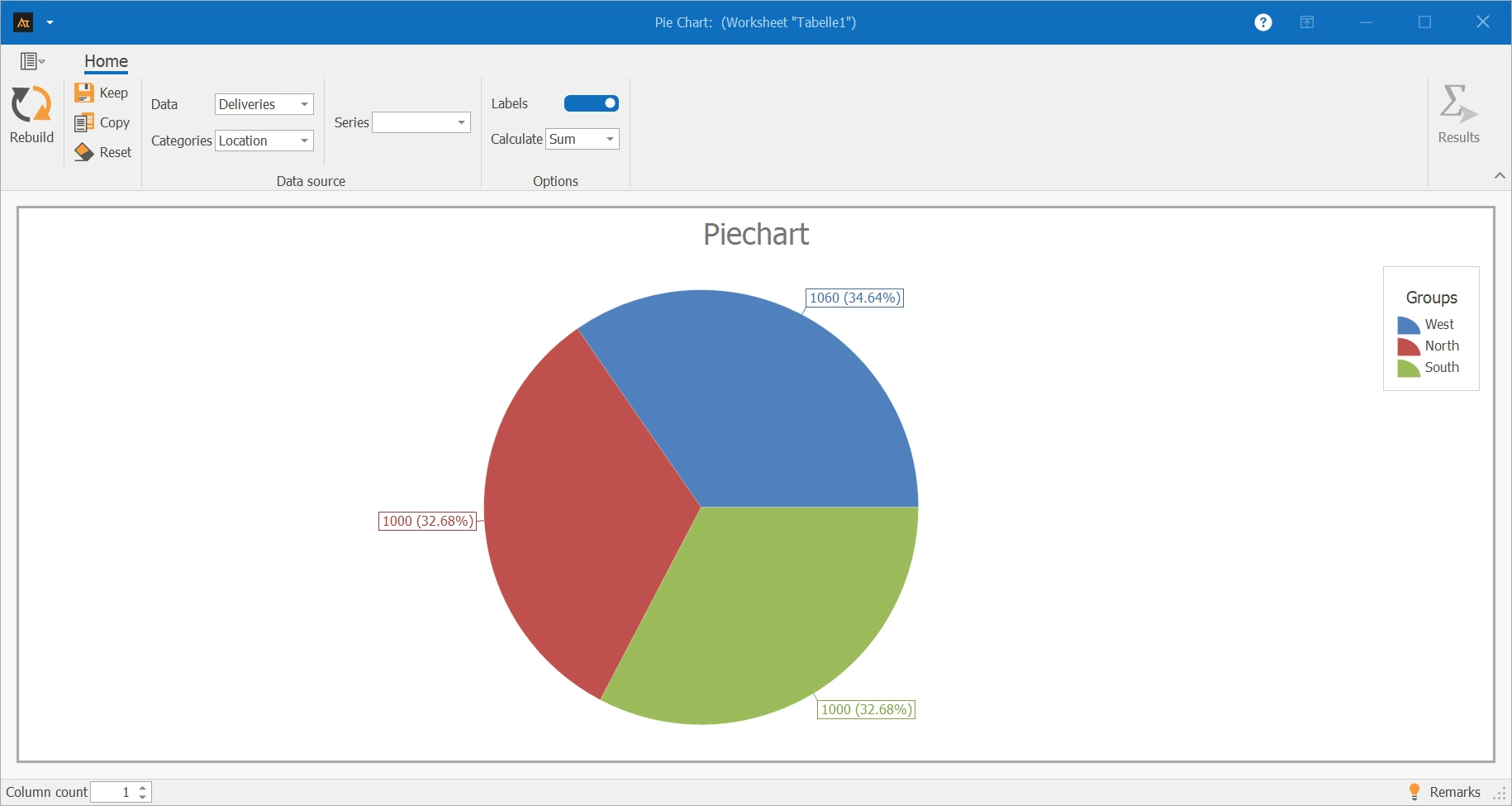
The pie chart shows the shares of the logistics centers West, North, and South. The logistics center West has the largest share with 34.64 %. The centers North and South contribute similar shares with 32.68 % each.
Supplier Comparison
In purchasing, materials are sourced from multiple suppliers. For a defined period, it is evaluated what share the individual suppliers have in the total number of on-time deliveries.
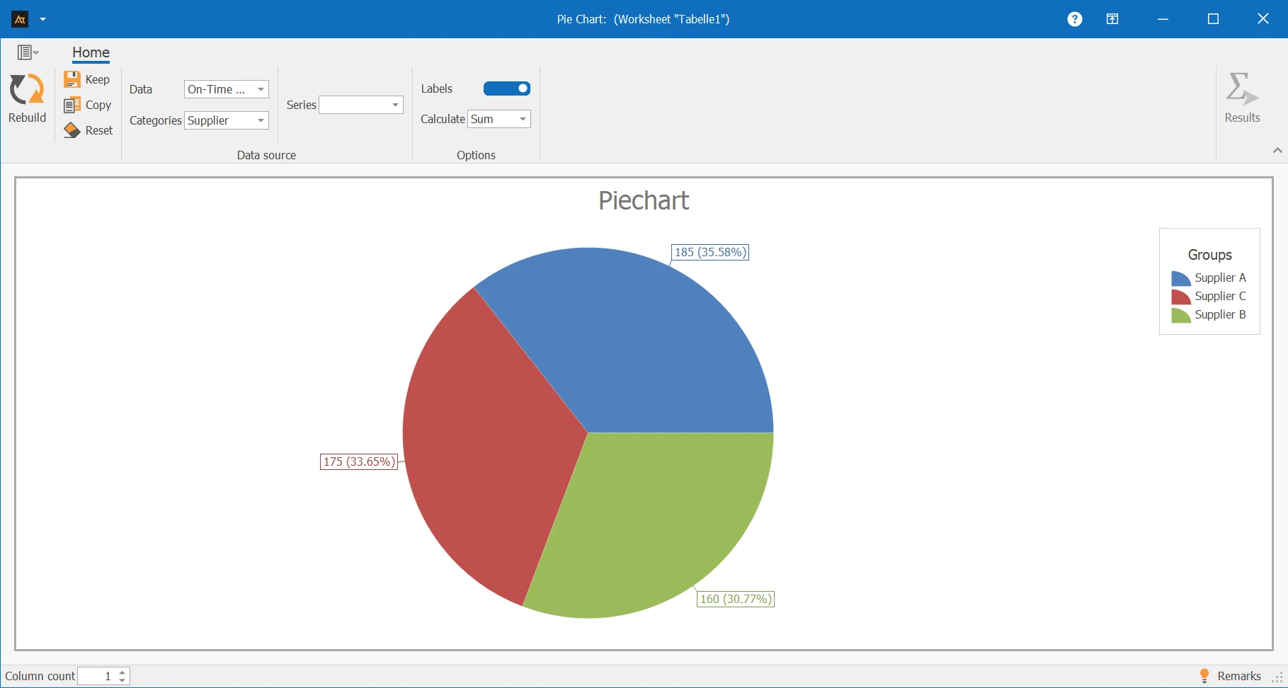
The pie chart shows the shares of Suppliers A, B, and C in all on-time deliveries. Supplier A has the largest share with 35.58 %, followed by Supplier C with 33.65 %, while Supplier B contributes the smallest share with 30.77 %.
Forecast deviation
In production planning, the actually produced total quantity of a year is considered. The production quantity is assigned to the individual months. A pie chart is used to show the share of each month in the total annual production.
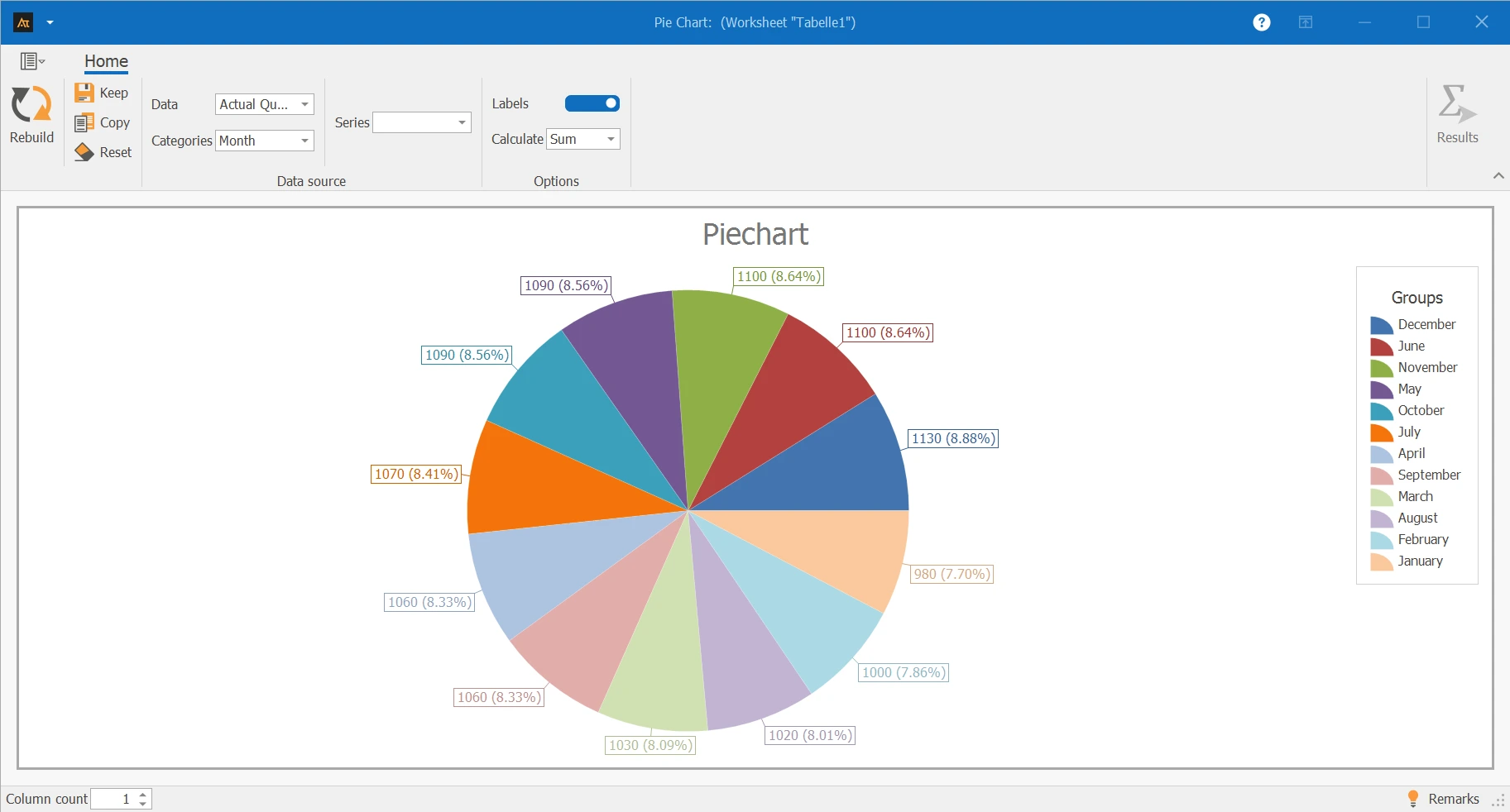
The pie chart shows the shares of each month in the total produced annual quantity. The monthly shares are at a similar level. Individual months like December and June show slightly higher shares, while January shows a somewhat lower share. Overall, the annual production is distributed relatively evenly across the months.
Pie chart: Chart for representing portions of a common whole.
Category: Subset of the total value represented as a pie slice.
Share: Relative contribution of a category to the total value, usually given in percentage.
Total value: Sum of all represented categories to which the shares refer.
Label: Display of the absolute values and/or percentage shares of the categories.
Count: Counts the number of data entries per category.
Sum: Adds the numerical data values per category.