


Regression analysis is used for the graphical and computational description of the relationship between two variable quantities. It answers the question of whether, in which direction, and with which model a target variable can be described by an influencing variable.
Each point in the diagram represents a value pair from an influencing variable (x) and a target variable (y). Additionally, a regression model is calculated that mathematically describes the course of the data.
Regression analysis is particularly suitable for:
- the investigation of influencing factors on a target variable
- continuous measurements (e.g., time, temperature, quantity, viscosity)
- the description and evaluation of a relationship with a regression model
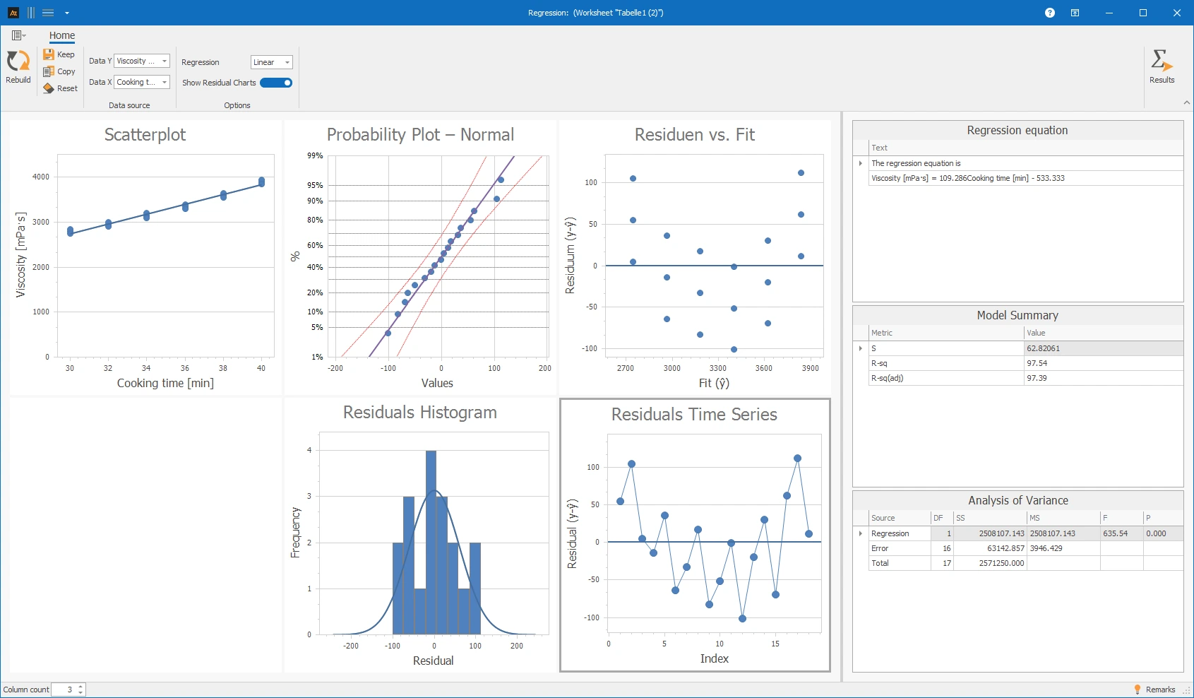
In the development department for new tomato sauces, it is being investigated how the cooking time affects the viscosity of the product. For this purpose, tomato sauces with different cooking times are produced in several test series. For each test series, the cooking time and the resulting viscosity are measured and recorded as a pair of values. Regression analysis is used to investigate which model describes the relationship between cooking time and viscosity in the measurement data.
The basic relationship is known professionally: Longer cooking evaporates water, which generally results in a higher viscosity of the tomato sauce.

Interpretation of the results:
The scatter plot shows a clear positive relationship between cooking time and viscosity. As the cooking time increases, the viscosity of the tomato sauce increases. The regression equation describes this relationship through a linear model. The model shows how much the viscosity increases on average when the cooking time increases.
The model summary shows a high R-squared. Thus, the model explains a large part of the variation in viscosity. The adjusted R-squared is also close to the R-squared, making the linear model plausible for this example. The analysis of variance shows a small p-value. This suggests that the relationship between cooking time and viscosity is statistically significant.
The residual plots appear overall unremarkable. In the residuals vs. fit plot, the points scatter mostly randomly around 0. The probability plot and the histogram show no strong deviations from an approximately normal distribution. No clear trend is visible in the residual time series.
Overall, the linear regression model describes the relationship between cooking time and viscosity well in this example.
Explanations of the results:
The output of the regression analysis consists of the scatter plot with regression line, the regression equation, the model summary, the analysis of variance, and optionally the residual plots.
The scatter plot shows the measured values as points. The regression line describes the calculated relationship between the independent variable x and the dependent variable y.
The regression equation describes this relationship mathematically. It can be used to estimate the dependent variable within the considered data range.
The model summary shows metrics for model quality. S describes the typical deviation of the measured values from the regression line. R-squared shows what proportion of the variation is explained by the model. R-squared (adj.) is the adjusted R-squared and takes into account the number of model terms.
The analysis of variance shows how the variation of the data is distributed over regression, error, and total variation. The p-value helps assess whether the relationship is statistically detectable.
The residual plots show the deviations between measured values and model values. The residuals should scatter as randomly as possible around 0. Noticeable patterns may indicate that the model does not fully describe all relationships.
- The points should lie approximately on a straight line.
- Strong curvatures or S-shaped patterns argue against a normal distribution.
- Individual distant points may indicate outliers.
- The points should scatter randomly around the zero line.
- A curve suggests that a linear model does not adequately describe the curvature.
- A funnel shape suggests that the variation is not constant.
- Individual distant points may be outliers.
- The distribution should be approximately symmetrical around 0.
- A strongly skewed distribution may indicate outliers or an unsuitable model.
- Multiple peaks may indicate that different groups or process states have been mixed.
- The points should fluctuate randomly around 0.
- An increasing or decreasing trend indicates a temporal change.
- Recurring patterns may indicate cycles, batches, or process changes.
- Long sequences of only positive or only negative residuals show that the model systematically over- or underestimates certain areas.
In regression analysis, you can select various models and outputs:
| Selection in Tool | Model Type | General Equation |
|---|---|---|
| Linear | Polynomial of degree 1 | y = a₀ + a₁x |
| Quadratic | Polynomial of degree 2 | y = a₀ + a₁x + a₂x² |
| Cubic | Polynomial of degree 3 | y = a₀ + a₁x + a₂x² + a₃x³ |
| Polynomial of degree 4 | Polynomial of degree 4 | y = a₀ + a₁x + a₂x² + a₃x³ + a₄x⁴ |
| Polynomial of degree 5 | Polynomial of degree 5 | y = a₀ + a₁x + a₂x² + a₃x³ + a₄x⁴ + a₅x⁵ |
| Polynomial of degree 6 | Polynomial of degree 6 | y = a₀ + a₁x + a₂x² + a₃x³ + a₄x⁴ + a₅x⁵ + a₆x⁶ |
The following applies:
- y = target variable
- x = influencing variable
- a₀ = intercept
- a₁ to a₆ = model coefficients
Preparation
- Define the target variable (y) (e.g., viscosity of the tomato sauce)
- Define the influencing variable (x) (e.g., cooking time)
- Ensure that both variables are quantitative measurements
- Collect data
 Use in AlphadiTab
- Select the Regression Analysis tool in the Measure Phase
- Select the cooking time column for Data X
- Select the viscosity column for Data Y
- Select the desired model for Regression, e.g., linear or polynomial of degree 2
- Optional: Display residual plots
- Confirm with Update
Interpretation
- Check if a relationship between the x and y axes is apparent
- Assess whether the regression model describes the trend sensibly
- Evaluate model metrics such as S, R-squared, and R-squared (adj)
- Examine residuals to identify anomalies or systematic patterns
General consideration
- Are the points ordered or randomly distributed?
- Is a trend of the points recognizable?
- Does the chosen regression model fit the trend?
- Is the relationship positive or negative?
- If the trend is curved: Is a higher polynomial degree technically meaningful?
- Is the dispersion of the points around the model small or large?
Note: A good regression model does not necessarily mean that one variable is the cause of the other.
- The higher the polynomial degree, the more different x-values are needed to be able to adjust the model.
- With too few different x-values, the regression model cannot be reliably calculated or interpreted.
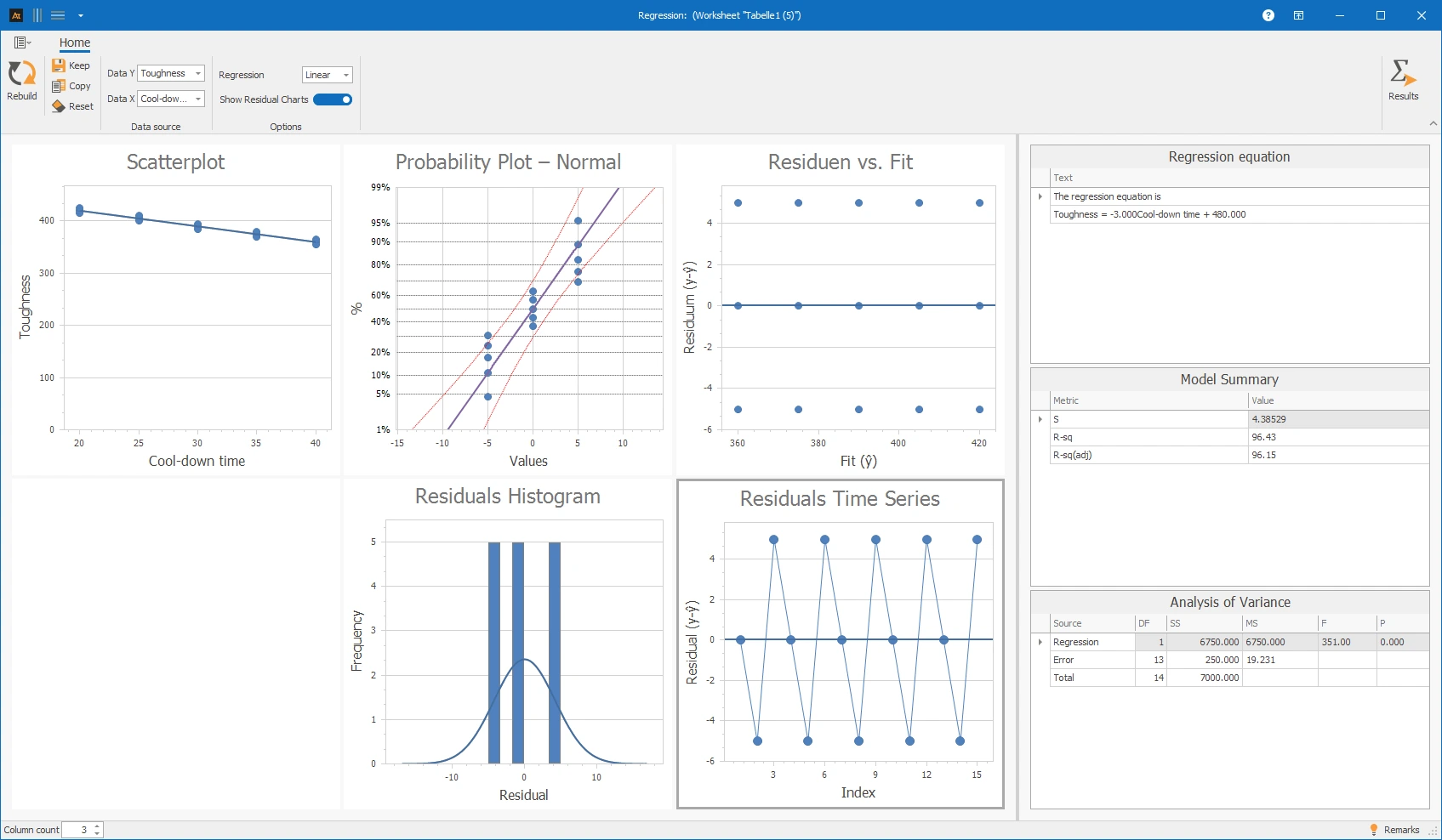
In the development of a new component, it is being investigated how the cooling time after heat treatment affects the hardness of the material. It is suspected that a longer cooling time leads to lower material hardness.
Interpretation
The regression analysis shows a negative correlation: As the cooling time increases, the material hardness decreases. However, the residual plots should be critically examined. In the Residuals vs. Fit plot, the residuals are not evenly randomly distributed but show a recurring pattern. The residual time series also appears regular and not random. This makes it clear that while the data shows a clear trend, the residuals do not appear as random measurement deviations. The model describes the correlation but should not be interpreted as an ideal example for inconspicuous residuals.
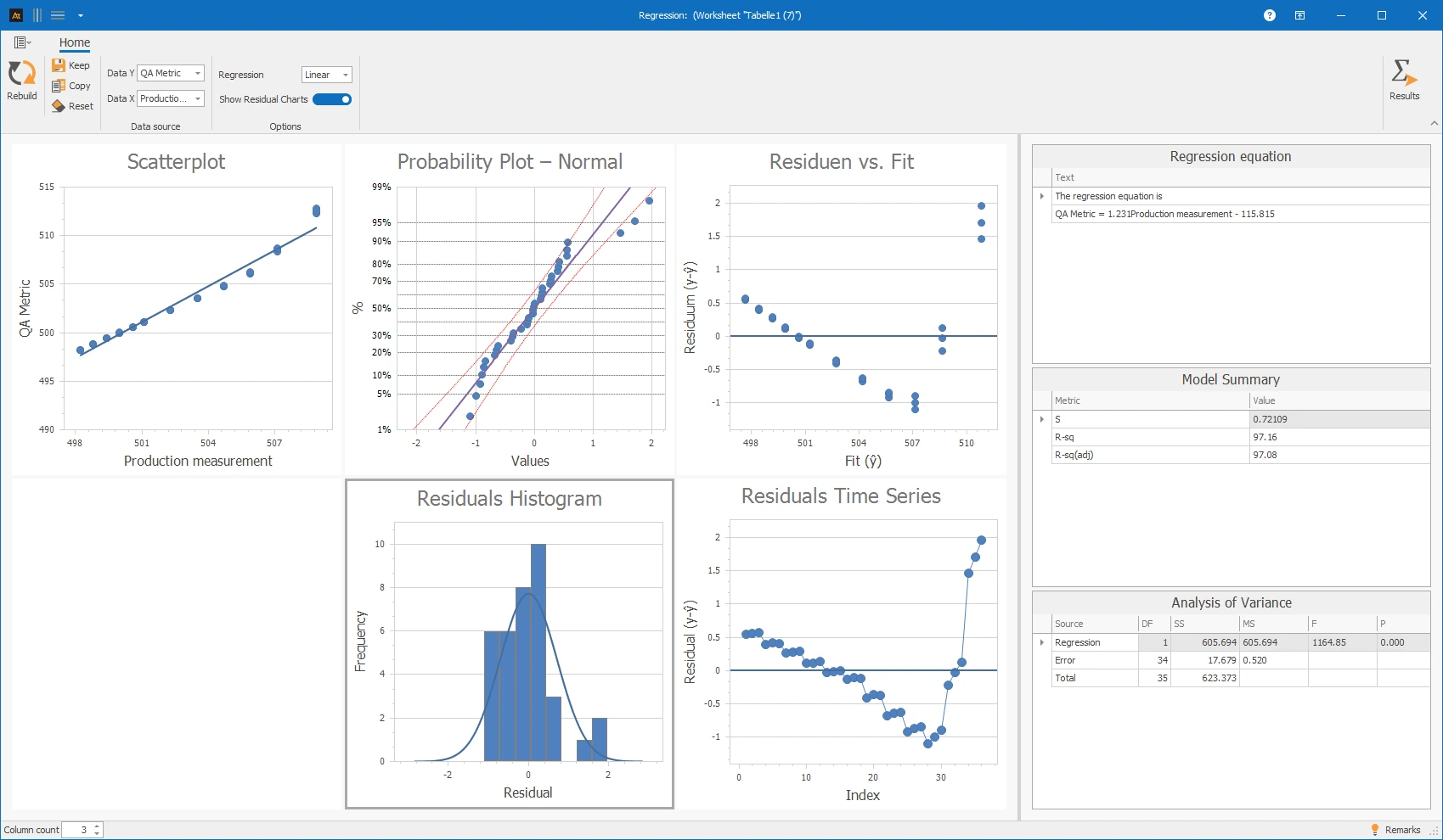
In production, a quality characteristic is measured inline, e.g., the filling quantity. In quality assurance, the same characteristic is checked again with a separate measuring instrument. To investigate whether the measurements from production and quality assurance are consistent with each other, both measurements are recorded as a value pair and presented in a regression analysis.
Interpretation
The regression analysis shows a clear positive correlation between production measurement and QA measurement. However, the residual plots indicate a systematic deviation. In the Residuals vs. Fitted plot, a curved pattern is visible: the residuals do not randomly scatter around 0 but change over the measurement range. The residual time series also shows a noticeable trend. This suggests that a simple linear model does not fully describe the relationship. In practice, it should be checked whether there is a measurement range or calibration effect.
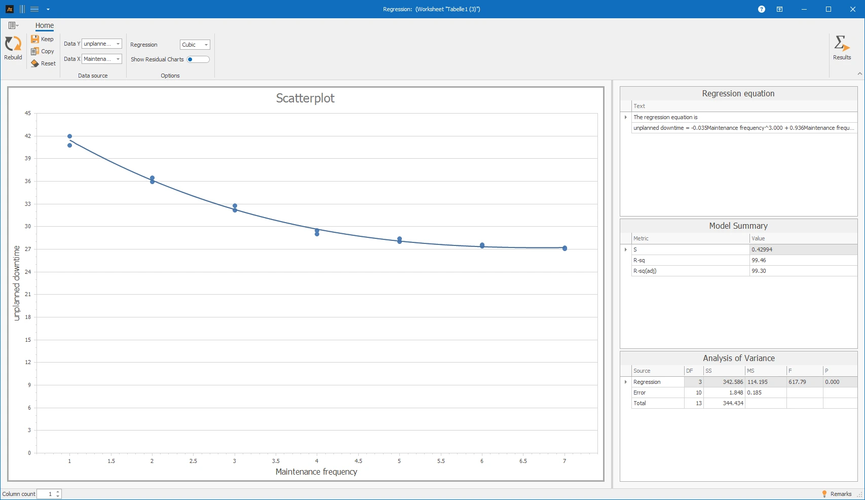
In production, it is examined how the maintenance frequency affects the unplanned downtime of machines. It is assumed that regular maintenance reduces unplanned downtimes, but this effect decreases beyond a certain maintenance frequency. For several machines, the number of maintenances per month and the unplanned downtime in the same period are recorded and documented as value pairs. Regression analysis is used to check whether there is a correlation and whether a saturation effect can be observed.
Interpretation
The regression analysis shows that with increasing maintenance frequency, the unplanned downtime initially decreases significantly. From a maintenance frequency of about 4–5 maintenances per month, the effect levels off. The cubic model visibly represents this diminishing marginal utility and describes the measured values very well. In this representation, the residual plots were deliberately not displayed, so the interpretation is based on the model progression and the result tables.
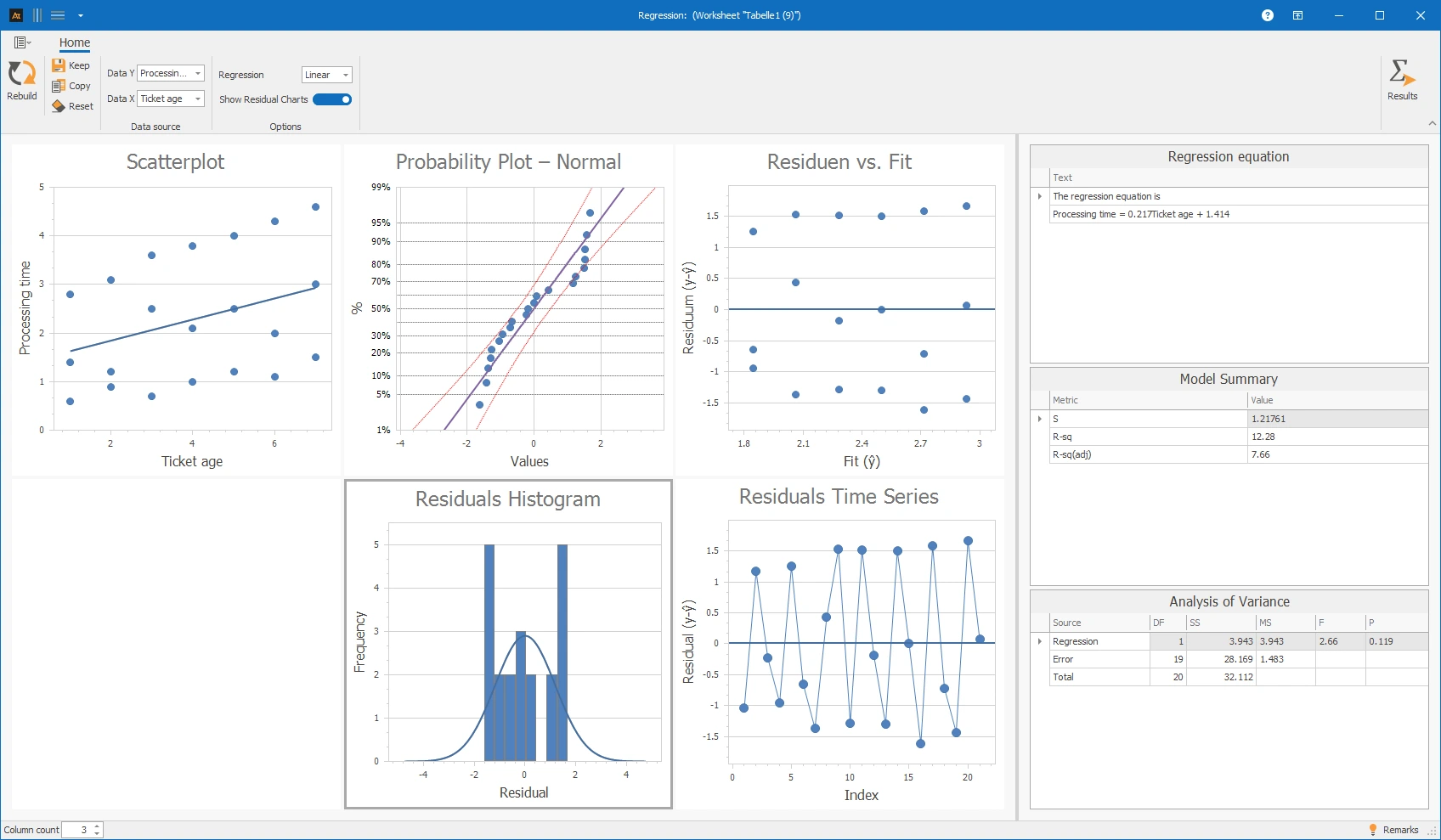
In the IT service desk, it is investigated whether the age of a ticket has an impact on the processing time. It is suspected that older tickets are often more complex or have been escalated multiple times, thus causing longer processing times. For several tickets, the ticket age at the time of processing and the actual processing time are recorded and documented as value pairs. Regression analysis is used to check whether there is a correlation between ticket age and processing time.
Interpretation
The regression analysis shows a strong dispersion of processing times across all ticket ages. The linear model explains only a small part of the dispersion; the p-value of the regression is not significant enough to derive a clear linear relationship. The residuals do not provide a clear indication that the linear model explains the dispersion meaningfully. Therefore, ticket age alone is not a suitable predictor for processing time.
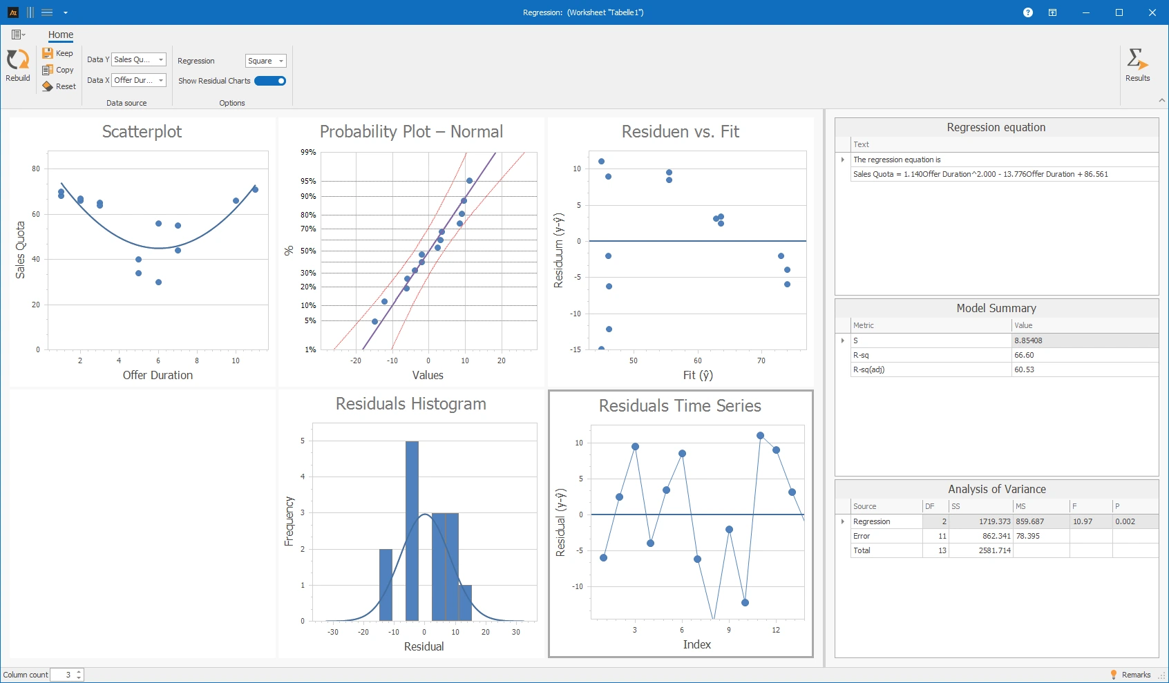
In sales, sales offers are created for customers. It should be investigated whether the duration of the offer process has an impact on the sales rate. For several offers, the offer duration (time from offer creation to decision) and the resulting sales rate are recorded and documented as value pairs. Regression analysis is used to check whether a connection between offer duration and sales rate is recognizable.
Interpretation
The regression analysis shows the connection between offer duration and sales rate. The trend is not linear; therefore, a quadratic model was used. The regression model describes a U-shaped trend: At medium offer durations, the sales rate is lower, at very short and longer offer durations higher. The model metrics show an explainable connection, but the residuals still show dispersion. Therefore, the model should be professionally reviewed and not used without context for forecasts outside the observed range. The diagram illustrates that the connection between offer duration and sales rate cannot be meaningfully described by a simple line.
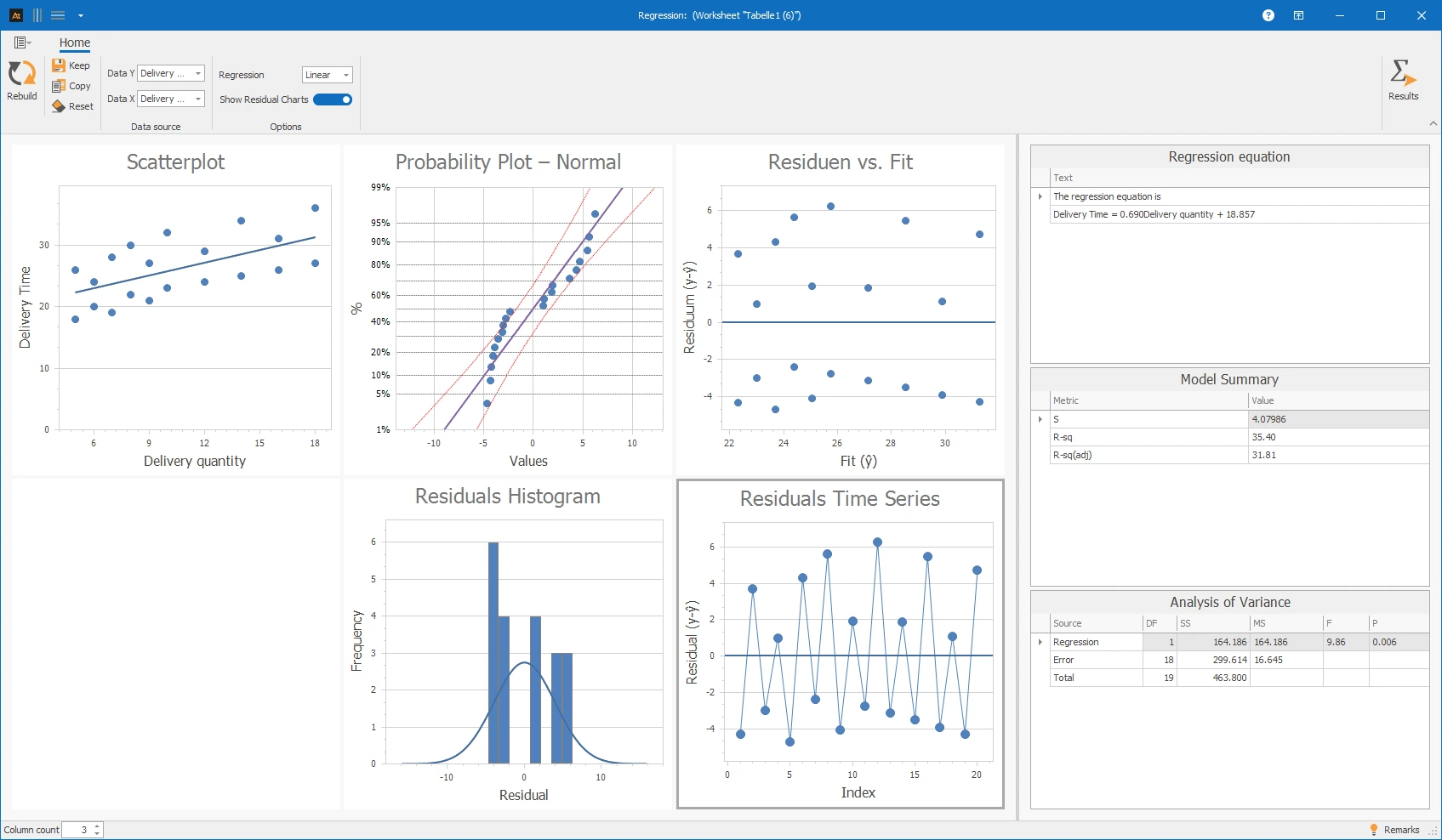
In logistics, customer orders are processed through multiple logistics centers. It should be investigated whether the delivery quantity has an impact on the delivery time. For several orders, the delivery quantity and the actual delivery time are recorded and documented as value pairs. Using regression analysis, it is checked whether a connection between delivery quantity and delivery time is recognizable.
Interpretation
The regression analysis shows only a weak to moderate correlation between delivery time and delivery quantity. The residuals scatter significantly around the zero line. In the residuals vs. fit diagram, individual larger deviations are recognizable; the scattering appears significant overall. The residual time series also shows an upward trend. This may indicate that the order of the data or other influencing factors play a role. Therefore, the delivery quantity alone only partially explains the delivery time.
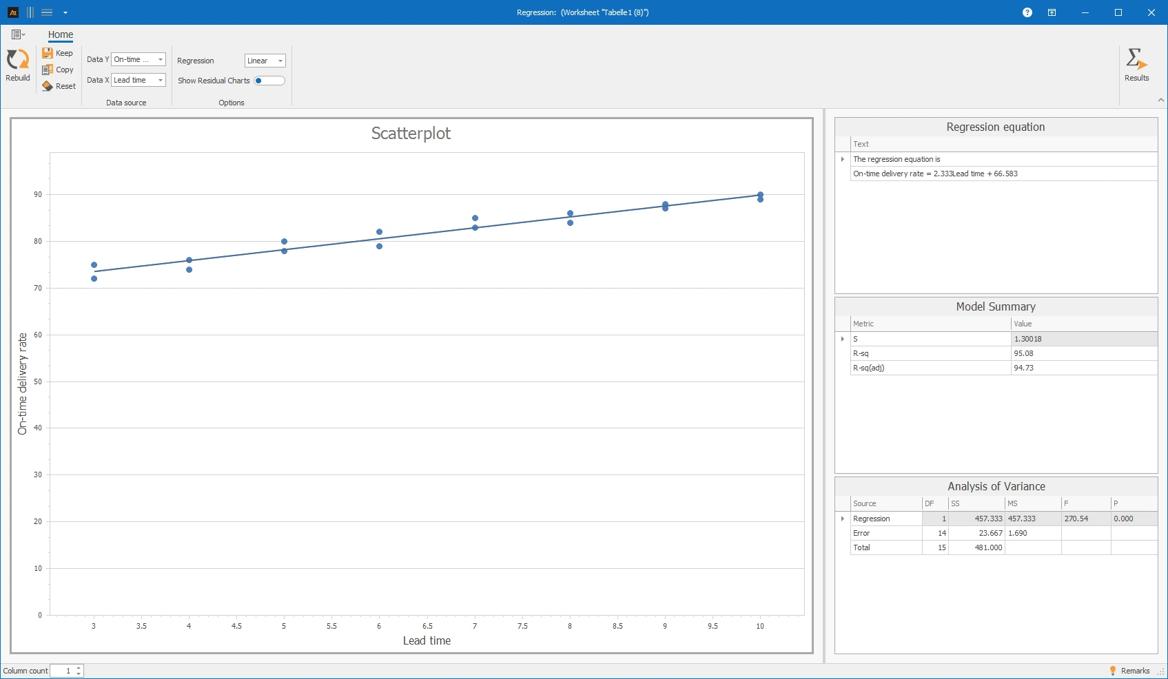
In purchasing, it is examined whether the length of the order lead time has an impact on on-time delivery. It is suspected that longer lead times improve planning and thereby increase the on-time delivery rate. For several orders, the lead time (time between order and planned delivery date) and the actual on-time delivery rate are recorded and documented as value pairs. Regression analysis is used to check whether a relationship between lead time and on-time delivery rate is discernible.
Interpretation
The regression analysis shows a positive linear relationship between lead time and on-time delivery rate. As lead time increases, the on-time delivery rate rises. The points are close to the regression line. The model summary shows a high explained variance, and the analysis of variance indicates a statistically significant model. In this representation, the residual plots were deliberately not displayed, as the linear relationship is already clearly visible in the main diagram and in the result tables.
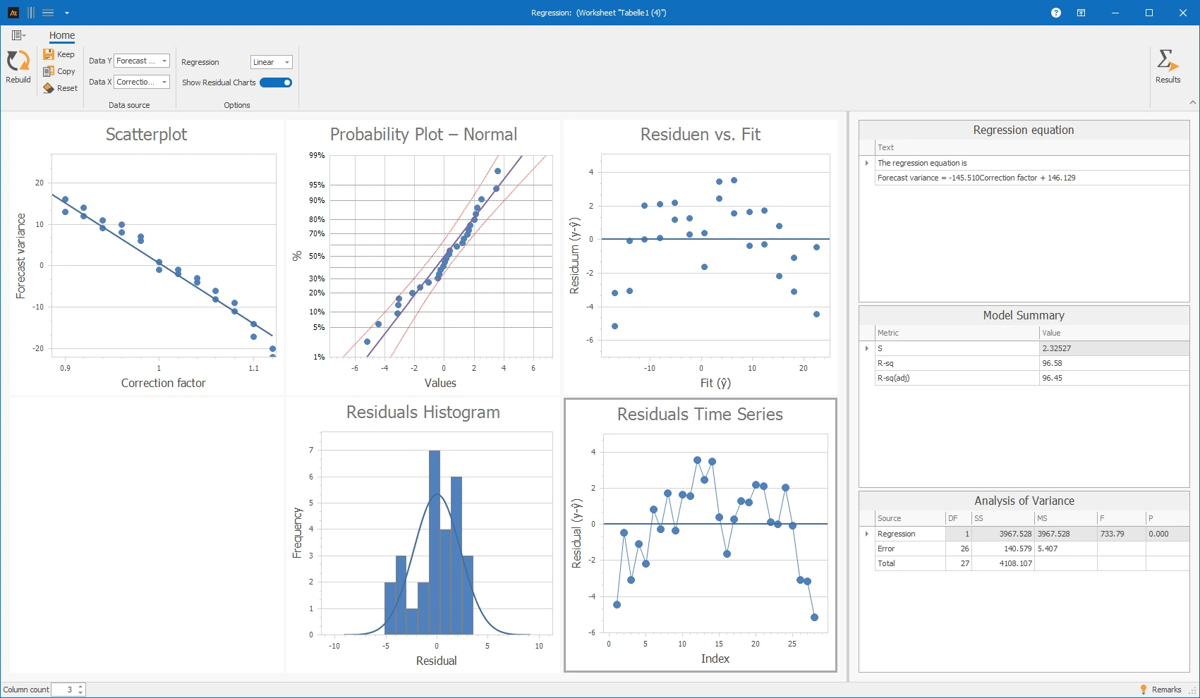
In production planning, forecasts are adjusted using a correction factor to compensate for systematic over- or under-forecasting. It should be examined how the level of the applied correction factor affects the remaining forecast deviation. For several forecasts, the correction factor used and the actual forecast deviation are recorded and documented as value pairs. Regression analysis is used to check whether a relationship between the correction factor and forecast deviation is discernible.
Interpretation
The regression analysis shows a clear negative relationship between the correction factor and forecast deviation. However, the residual plots show that the deviations are not completely randomly distributed. In the Residuals vs. Fit plot, a slight structure is recognizable, and in the residual time series, there are contiguous areas with positive or negative residuals. The model describes the fundamental relationship, but the residuals suggest that other influencing factors or systematic effects may play a role.
For the calculation, a regression model is used.