


The scatter plot is used for the graphical representation of the relationship between two variable quantities. It answers the question of whether, in which direction, and how strongly two variables are related to each other.
Each point in the diagram represents a pair of values from an influencing variable (x) and a target variable (y). Based on the distribution of points, it can be determined whether there is a positive, negative, or no relationship between the considered quantities.
The scatter plot is particularly suitable for examining influencing factors on a target variable (continuous measurement variable).
The scatter plot can be used in LSS projects in all DMAIC phases. The purpose of use varies depending on the phase.
Make connections in the initial situation visible
In the Define phase, the scatter plot is used to make initial indications of possible connections between influencing factors and the target variable visible. This provides a first impression of which factors might be relevant.
Measure and quantify connections
In the Measure phase, the scatter plot helps to graphically represent the connection between influencing factors and the target variable and to gain initial assessments of the direction and strength of the connection.
Graphically secure causes
In the Analyze phase, the scatter plot is used to graphically investigate possible cause-effect relationships. A recognizable connection between influencing factors and the target variable provides an indication of possible root causes.
Check change in connection
In the Improve phase, the scatter plot is used to check whether the connection between influencing factors and the target variable has changed after a measure.
Confirm stability of the improved connection
In the Control phase, the scatter plot confirms whether the improved connection between influencing factors and the target variable has remained stable.
The scatter plot is used to graphically represent the relationship between two variable quantities. It answers the question of whether, in which direction, and how strongly two variables are related.
Each point in the diagram represents a pair of values from an influencing variable (x) and a target variable (y). The distribution of points shows whether there is a positive, negative, or no relationship between the considered quantities.
Make relationships between an influencing variable and a target variable visible graphically
Suitable for continuous variables such as time, temperature, quantity, or viscosity
Identify possible relationships – without model assumptions and before further tests

In the development department for new tomato sauces, it is being investigated how the cooking time affects the viscosity of the product. For this purpose, tomato sauces with different cooking times are produced in several test series. For each test series, the cooking time and the resulting viscosity are measured and recorded as a pair of values.
Using a scatter plot, it is examined whether and how the relationship between cooking time and viscosity is shown in the measurement data. The basic relationship is known professionally: By cooking longer, water evaporates, which generally results in the tomato sauce having a higher viscosity.
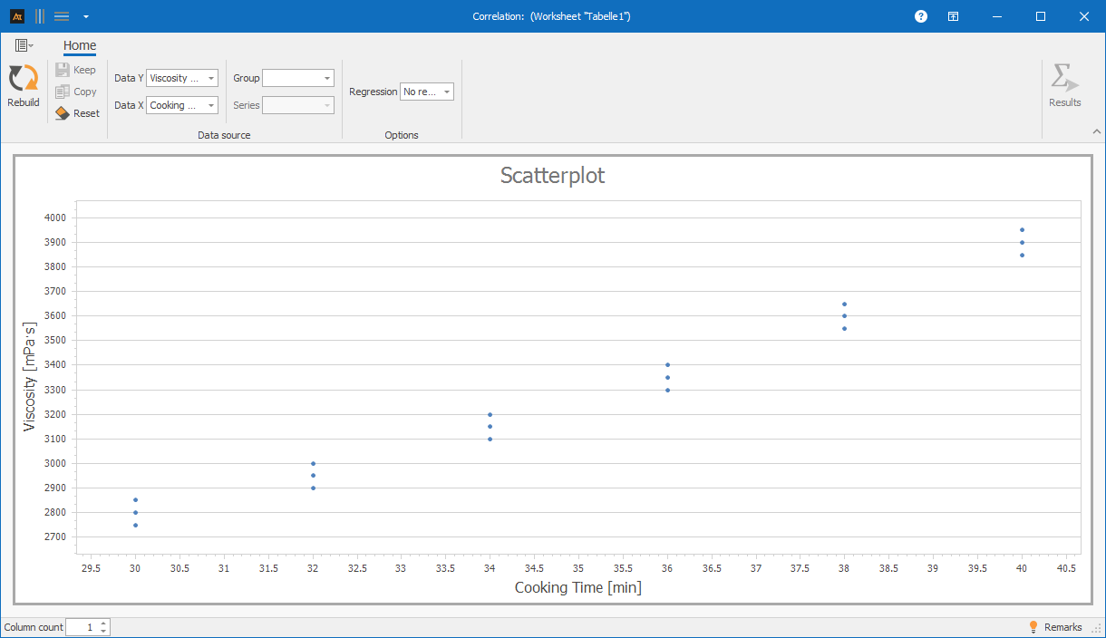
Explanations of the graphic:
The scatter plot shows the viscosity of the tomato sauce depending on the cooking time. As the cooking time increases, the measured viscosity increases. The points are approximately on a straight line, indicating a clear positive, almost linear relationship between cooking time and viscosity. For the same cooking times, a low scatter of the measured values is noticeable.
Preparation
- Define the target variable (y) (e.g., viscosity of the tomato sauce)
- Define the influencing variable (x) (e.g., cooking time)
- Ensure that both variables are quantitative measurable variables
- Collect data
 Use in AlphadiTab
- In the Measure phase select the scatter plot tool
- For data X select the column „cooking time“
- For data Y select the column „viscosity“
- Generate the diagram with the button „Create new“.
Interpretation
- Check if a relationship between the x- and y-axis is recognizable
- Assess whether the relationship is positive, negative, or non-existent
- Evaluate whether the relationship is approximately linear
- Compare the scatter plots between series or groups, if available
General Consideration
Can the trend be described by a line ?
If yes: Is the correlation positive or negative?
If no: Does the trend indicate a non-linear correlation ?
Is the scatter of the points small or large?
With Known Specifications
Are the measurements within the defined specification limits?
Are there areas of the influencing variable where the specification is not met?
Does the correlation change near the specification limits?
Note: A recognizable correlation does not necessarily mean that one variable is the cause of the other.
For scatter plots, various forms of representation are available. Depending on whether one or more data series as well as additional groups or series are selected, the representation in the diagram changes. All the following forms of representation are based on the same file, but differ in the selection of the columns used.
| Delivery time in days_Location A | Delivery time in days_Location B | Delivery time in days_Location C | Process status | Product |
|---|---|---|---|---|
| 4 | 9 | 3 | Before | Window |
| 5 | 4 | 6 | Before | Window |
| 6 | 7 | 4 | Before | Window |
| 4 | 9 | 2 | Before | Window |
| 2 | 4 | 2 | Before | Window |
| 8 | 9 | 6 | Before | Door |
| 6 | 4 | 6 | Before | Door |
| 8 | 9 | 5 | Before | Door |
| 5 | 8 | 3 | Before | Door |
| 8 | 3 | 5 | Before | Door |
| 3 | 4 | 3 | After | Window |
| 1 | 3 | 1 | After | Window |
| 2 | 2 | 2 | After | Window |
| 3 | 3 | 3 | After | Window |
| 2 | 4 | 1 | After | Window |
| 1 | 4 | 1 | After | Door |
| 3 | 2 | 2 | After | Door |
| 3 | 5 | 3 | After | Door |
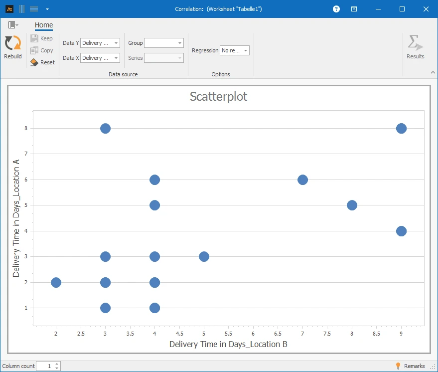
✓One data series per axis: Column A and B⌄
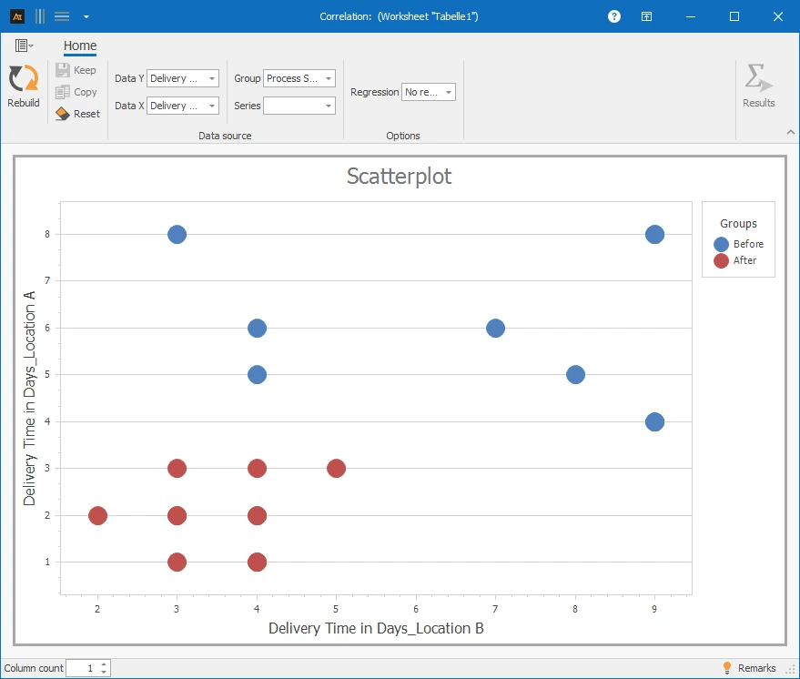
✓One data series per axis with group: Column A, B, and D⌄
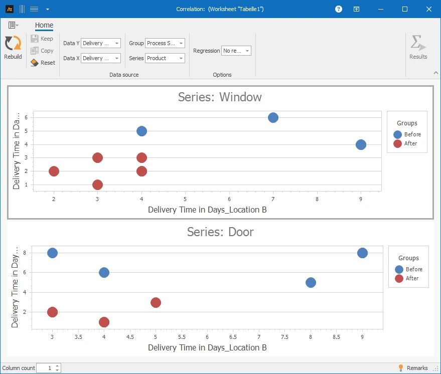
✓One data series per axis with group and series: Column A, B, D, and E⌄
- Two quantitative sizes
Cooling Time and Material Hardness
In the development of a new component, it is investigated how the cooling time after heat treatment affects the hardness of the material. It is suspected that a longer cooling time leads to a lower material hardness.
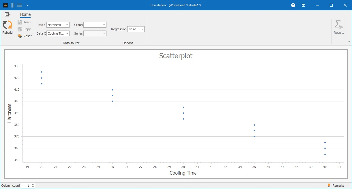
The scatter plot shows a negative correlation between cooling time and material hardness. As the cooling time increases, the measured hardness decreases.
Comparison of production and QA measurements
In production, a quality characteristic is measured inline, e.g., the filling quantity. In quality assurance, the same characteristic is checked again with a separate measuring device. To investigate whether the measurements from production and quality assurance are consistent with each other, both measurements are recorded as value pairs and displayed in a scatter plot.
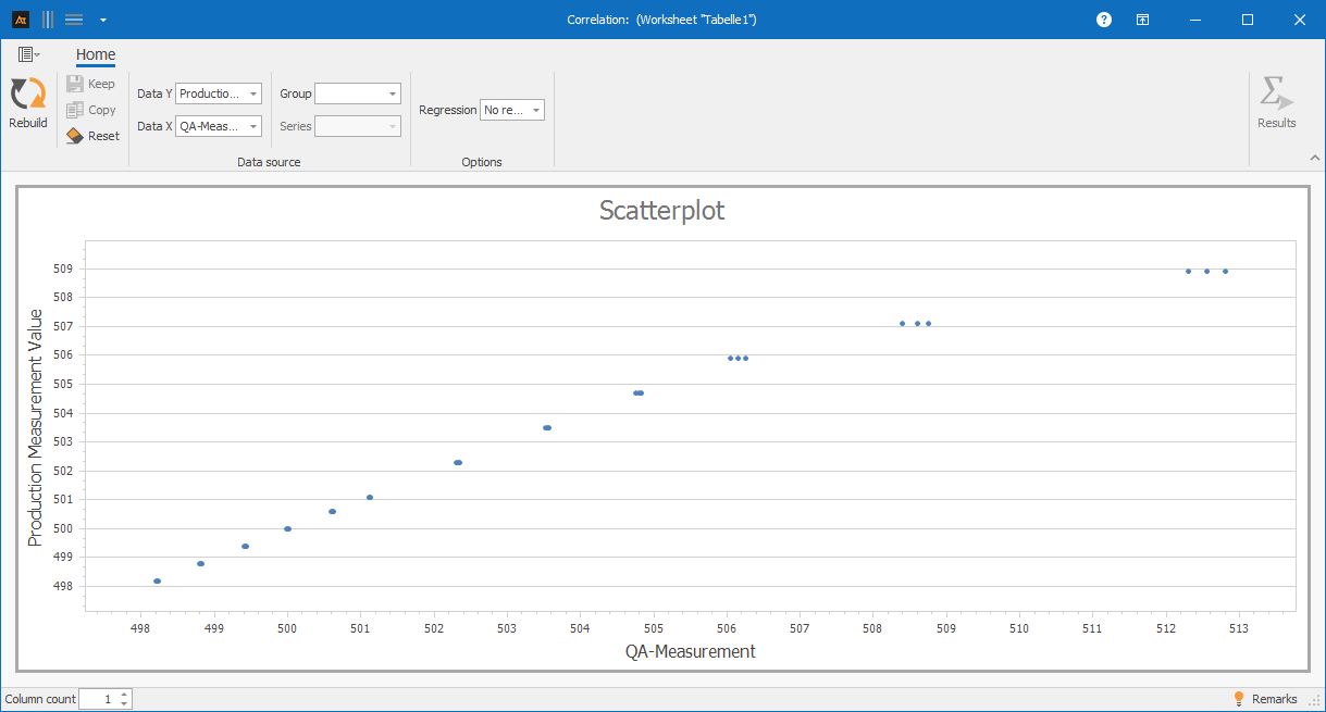
The scatter plot shows the relationship between QA measurement and production measurement of the filling quantity. In the lower measurement range, the production and QA measurements agree very well and are approximately on a straight line. However, at higher measurements, there is an increasing deviation, with the QA measurements being higher than the production measurements.
Impact of Maintenance Frequency on Downtime
In production, it is examined how the maintenance frequency affects the unplanned downtime of machines. It is assumed that regular maintenance reduces unplanned downtimes, but this effect decreases from a certain maintenance frequency. For several machines, the number of maintenances per month and the unplanned downtime in the same period are recorded and documented as value pairs. A scatter plot is used to check whether there is a connection and whether a saturation effect can be observed.
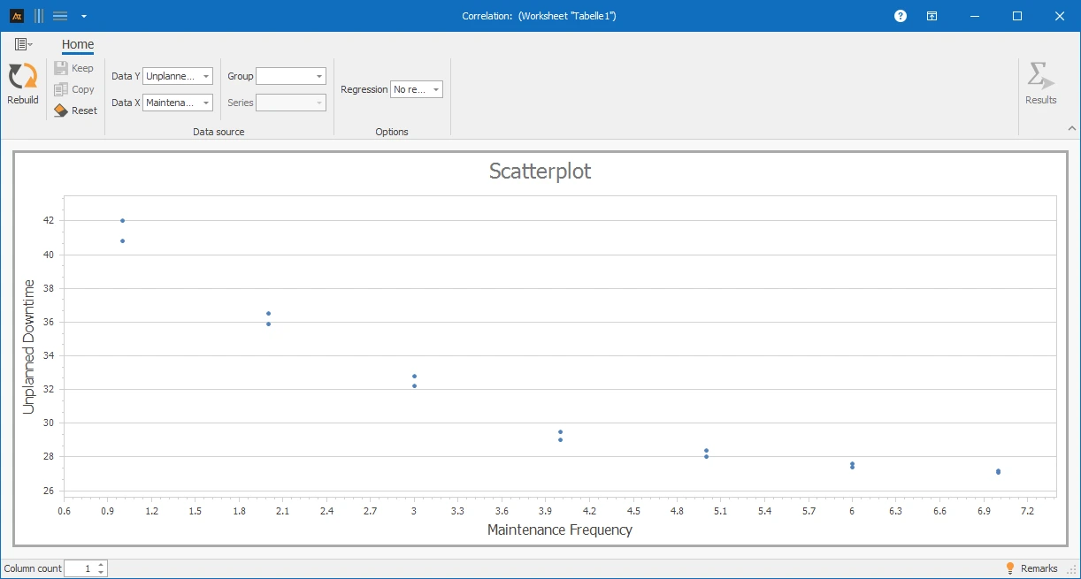
The scatter plot shows that with increasing maintenance frequency, the unplanned downtime initially decreases significantly. From a maintenance frequency of about 4–5 maintenances per month, the effect flattens out, and further maintenances lead to only slight additional improvements.
Processing Time for Tickets by Location
In the IT service desk, it is investigated whether the age of a ticket has an impact on the processing time. It is suspected that older tickets are often more complex or have been escalated multiple times and therefore cause longer processing times. For several tickets, the ticket age at the time of processing and the actual processing time are recorded and documented as a value pair.
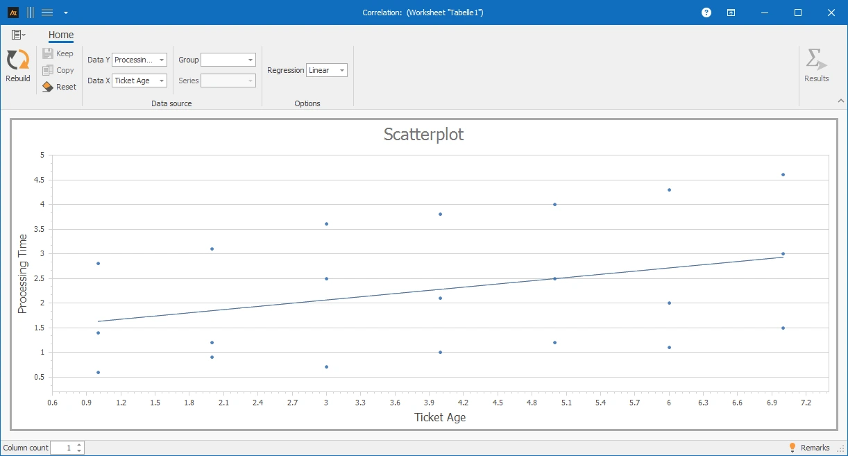
The scatter plot shows a strong dispersion of processing times across all ticket ages. A clear linear relationship between ticket age and processing time is not discernible.
Sales Rate vs. Offer Duration
In sales, sales offers are created for customers. It should be investigated whether the duration of the offer process has an impact on the sales rate. For several offers, the offer duration (time from offer creation to decision) and the resulting sales rate are recorded and documented as a value pair.
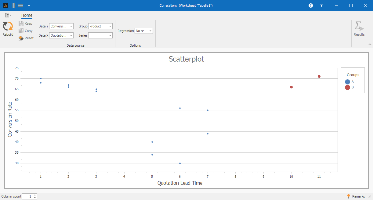
The scatter plot shows the relationship between offer duration and sales rate, separated by products A and B. For Product A, no clear linear relationship is discernible, as the sales rate varies greatly over the offer duration. Product B, on the other hand, shows higher sales rates with longer offer durations. The diagram illustrates that the relationship between offer duration and sales rate differs between the products.
Delivery time after logistics center
In logistics, customer orders are processed through multiple logistics centers. It should be investigated whether the delivery quantity has an impact on the delivery time. For several orders, the delivery quantity and the actual delivery time are recorded and documented as value pairs.
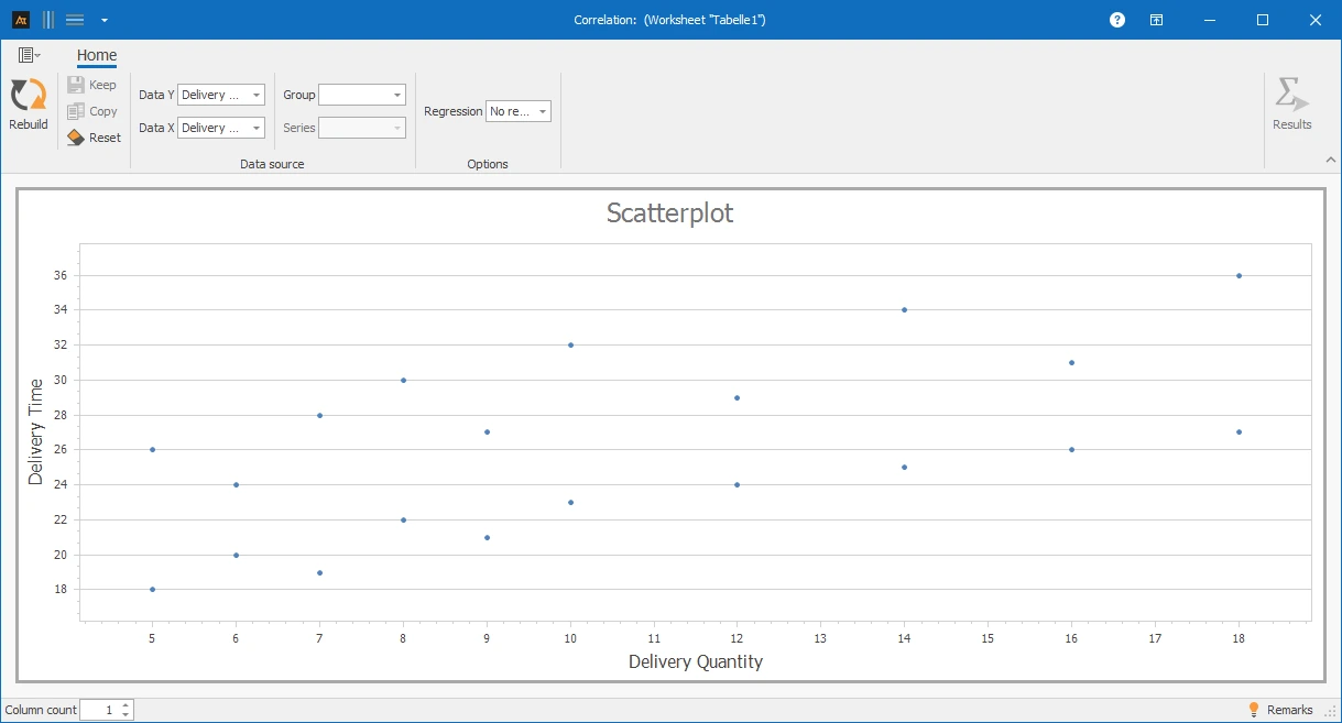
The scatter plot shows the relationship between delivery quantity and delivery time. The points show a clear dispersion. A relationship between delivery quantity and delivery time is not recognizable.
On-time Deliveries vs. Order Time
In purchasing, it is examined whether the length of the order lead time has an impact on on-time delivery. It is suspected that longer lead times improve planning and thereby increase the on-time delivery rate. For several orders, the lead time (time between order and planned delivery date) and the actual on-time delivery rate are recorded and documented as value pairs.
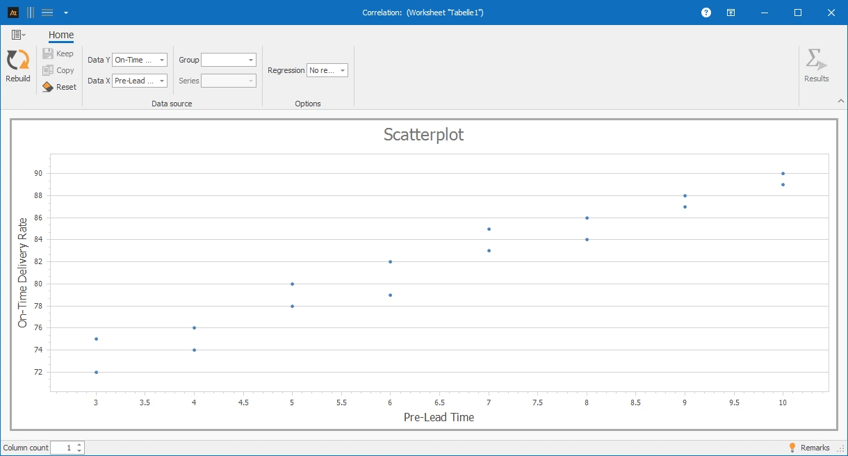
The scatter plot shows a positive correlation between lead time and on-time delivery rate. As lead time increases, the on-time delivery rate rises. The points show an upward trend, indicating an approximately linear relationship.
Forecast deviation
In production planning, forecasts are adjusted using a correction factor to compensate for systematic over- or under-forecasts. It is to be investigated how the level of the applied correction factor affects the remaining forecast deviation. For several forecasts, the used correction factor and the actual forecast deviation are recorded and documented as a value pair.
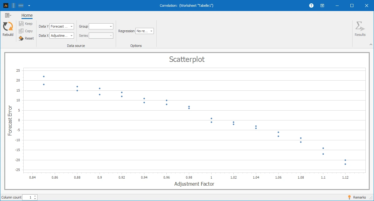
The scatter plot shows the relationship between the correction factor and the forecast deviation. With low correction factors, the forecast deviation is predominantly positive, indicating an overestimation of demand. As the correction factor increases, the forecast deviation decreases and is close to 0 % around correction factor = 1.00. With higher correction factors, the forecast deviation becomes increasingly negative, indicating an underestimation of demand.
Scatter plot: Diagram for graphically representing the relationship between two numerical variables.
Correlation diagram: Alternative term, where individual data points are displayed.
Independent variable (x): Variable whose influence on another variable is being studied.
Dependent variable (y): Variable that is supposed to be influenced by the independent variable.
Data pair: Associated measurements from the independent and dependent variables.
Linear relationship: Relationship where the values approximately align along a straight line.
Non-linear relationship: Relationship where the trend cannot be described by a straight line.
Dispersion: Measure of the distribution of points around a recognizable trend.
Positive relationship: As the x-value increases, the y-value rises.
Negative relationship: As the x-value increases, the y-value decreases.
Correlation: Measure of the strength and direction of a relationship between two variables.
Regression: Method for describing a relationship through a mathematical function.
Causality: Cause-effect relationship between two variables that cannot be derived from a scatter plot.