


A time series chart is a line chart that displays measurements in the order they occur – the x-axis is always time, and the y-axis is the measured value.
The time series chart can be used in LSS projects in all DMAIC phases. The purpose of use varies depending on the phase.
Show process behavior over time
In the Define phase, the time series chart is used to visualize the temporal progression of the target variable. Trends or jumps provide initial clues for the problem description.
Identify stability and outliers
In the Measure phase, the time series chart helps assess the temporal stability of the process. Outliers and jumps become visible before further statistical analyses are conducted.
Identify timing of changes
In the Analyze phase, the time series chart is used to identify the timing of changes in process behavior. Jumps or trend changes can be linked to external events.
Visualize before-and-after comparison
In the Improve phase, the time series chart is used to visualize the before-and-after comparison with step value. It shows whether the location and dispersion have changed permanently after the measure.
Confirm stability of improvement over time
In the Control phase, the time series chart confirms whether the process remains stable after the improvement. New trends or outliers become visible early.
The time series chart is used to display the progression of a measured variable over time. It allows for assessing whether the position and dispersion of the measured values remain constant over time or if anomalies such as trends, jumps, patterns, or outliers occur.

During the production of tomato sauce, viscosity measurements are regularly carried out. The measurements are continuously recorded and presented in chronological order. The time series chart is used to check whether the viscosity remains constant over time or if there are any time-dependent anomalies.
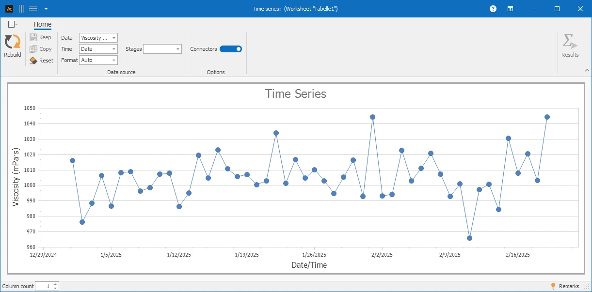
Explanations of the graphic:
In the time series chart, each measurement is displayed in the order it was recorded. The x-axis shows the time reference (e.g., measurement number or calendar week), and the y-axis shows the measured variable. The temporal representation allows for the detection of changes that are not visible in timeless charts.
Preparation
- Select a measurement that is collected regularly (e.g., viscosity).
- Define a clear time reference (e.g., measurement number or calendar week).
 Use in AlphadiTab
- Select the tool Time Series in the Measure phase.
- Select „Viscosity“ for data.
- Select „Date“ for time.
- Select „Auto“ for format.
- Generate the chart with the button „Create New“.
Interpretation
- Does the measurement run consistently over time?
- Are outliers detectable?
- Does a trend (rising or falling) occur?
- Is there a shift in the level of the measurements?
- Are regular patterns or periodic fluctuations visible?
General Consideration
With known specifications
With multiple time series
For time series charts, various forms of representation are available. Depending on whether one or more data series and additional step values are selected, the representation in the chart changes.
| Delivery time in days_Location A | Delivery time in days_Location B | Delivery time in days_Location C | Process status | Product |
|---|---|---|---|---|
| 4 | 9 | 3 | Before | Window |
| 5 | 4 | 6 | Before | Window |
| 6 | 7 | 4 | Before | Window |
| 4 | 9 | 2 | Before | Window |
| 2 | 4 | 2 | Before | Window |
| 8 | 9 | 6 | Before | Door |
| 6 | 4 | 6 | Before | Door |
| 8 | 9 | 5 | Before | Door |
| 5 | 8 | 3 | Before | Door |
| 8 | 3 | 5 | Before | Door |
| 3 | 4 | 3 | After | Window |
| 1 | 3 | 1 | After | Window |
| 2 | 2 | 2 | After | Window |
| 3 | 3 | 3 | After | Window |
| 2 | 4 | 1 | After | Window |
| 1 | 4 | 1 | After | Door |
| 3 | 2 | 2 | After | Door |
| 3 | 5 | 3 | After | Door |
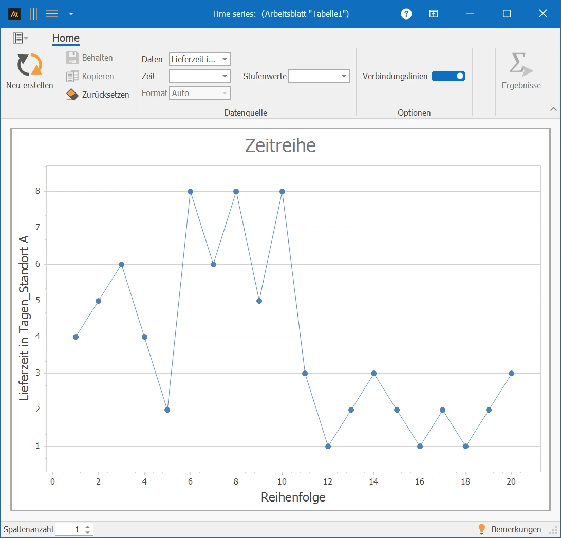
✓One data series: Column A⌄
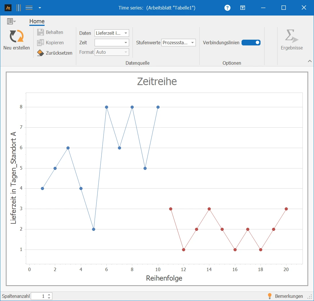
✓One data series with step values: Column A and D⌄
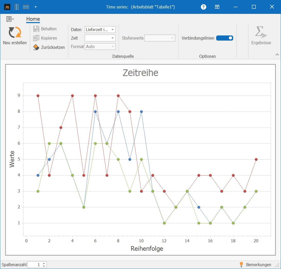
✓Multiple data series: Column A–C⌄
Quantitative data (countable or measurable data)
An appropriate measuring instrument, as outliers can often occur due to measurement errors.
Development old vs. new formulation
In development, a new formulation is being tested. The time series chart is now used to check whether the viscosity of the new formulation behaves similarly over time as the previous formulation.
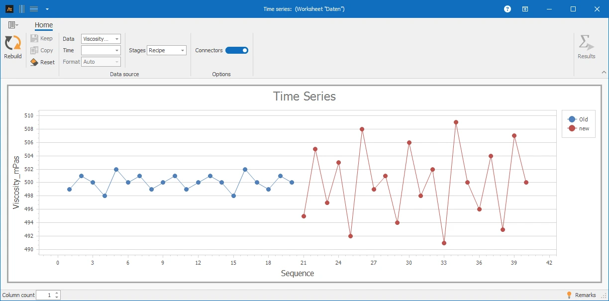
The time series chart shows a consistent course of viscosity in the old formulation. In the new formulation, a greater dispersion of the measured values is noticeable, without the position changing permanently. A trend or jump is not visible.
Production / Quality Assurance
In quality assurance, it was found that individual viscosity values were outside the expected range. It should now be checked whether this behavior occurs in all production lines or only in individual lines.
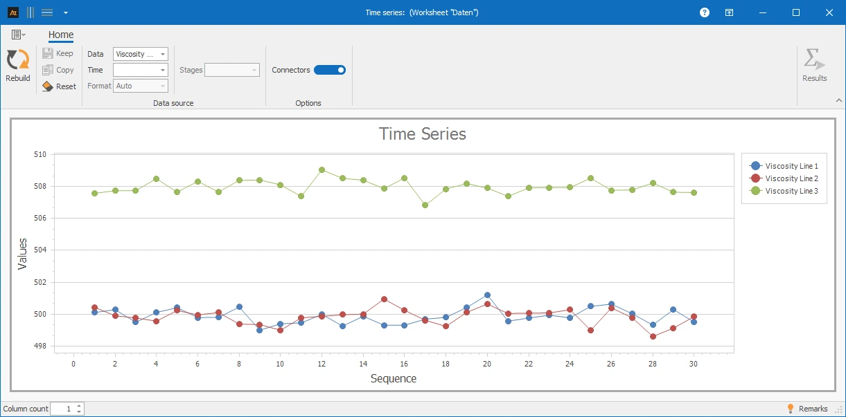
In one production line, a significant jump in the position of the measured values is noticeable from a certain point in time. This indicates a systematic change in the process, e.g., due to a material change or a new setting.
Processing Time IT Tickets Before/After
Incoming requests are systematically recorded and processed in the IT service desk. In particular, a before-and-after comparison should be conducted. The background is an organizational change: Responsibilities in the service process have been redefined. This comparison can be structured using a time series diagram and the stage value "Before/After".
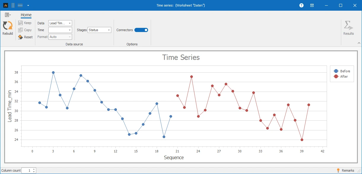
In the time series diagram, individual outliers and phases with several consecutive high or low values are recognizable. This indicates temporary special causes.
Sales Rate by Season
In sales, sales opportunities are examined by season. For this purpose, a data point was recorded per week in each season; additionally, the season was defined as a step value. A time series chart is used to analyze whether and how the sales rate has changed over time within the individual seasons.
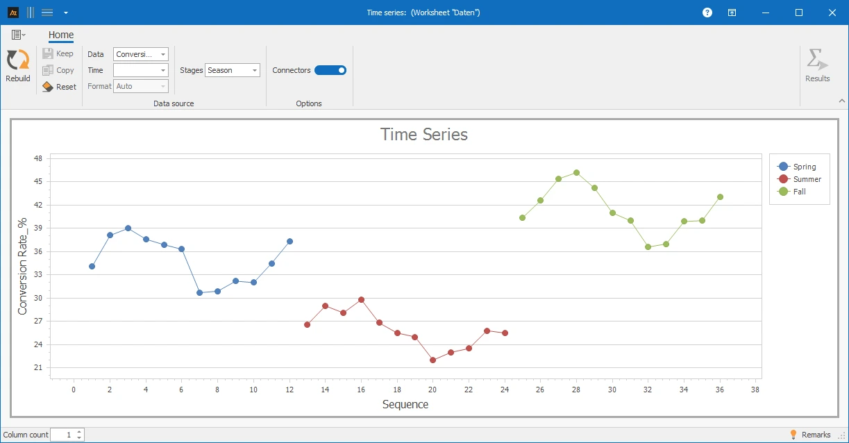
Over time, recurring fluctuations in the sales rate are noticeable. These periodic patterns may be attributed to cyclical market influences. It is also evident that the sales rate is highest in the fall and lowest in the summer.
Delivery time after logistics center
In logistics, customer orders are processed through multiple logistics centers. Although the same processes and systems are used, delivery times may vary due to different workloads, infrastructure, or regional conditions. The time series chart is intended to check whether the delivery time randomly scatters over time.
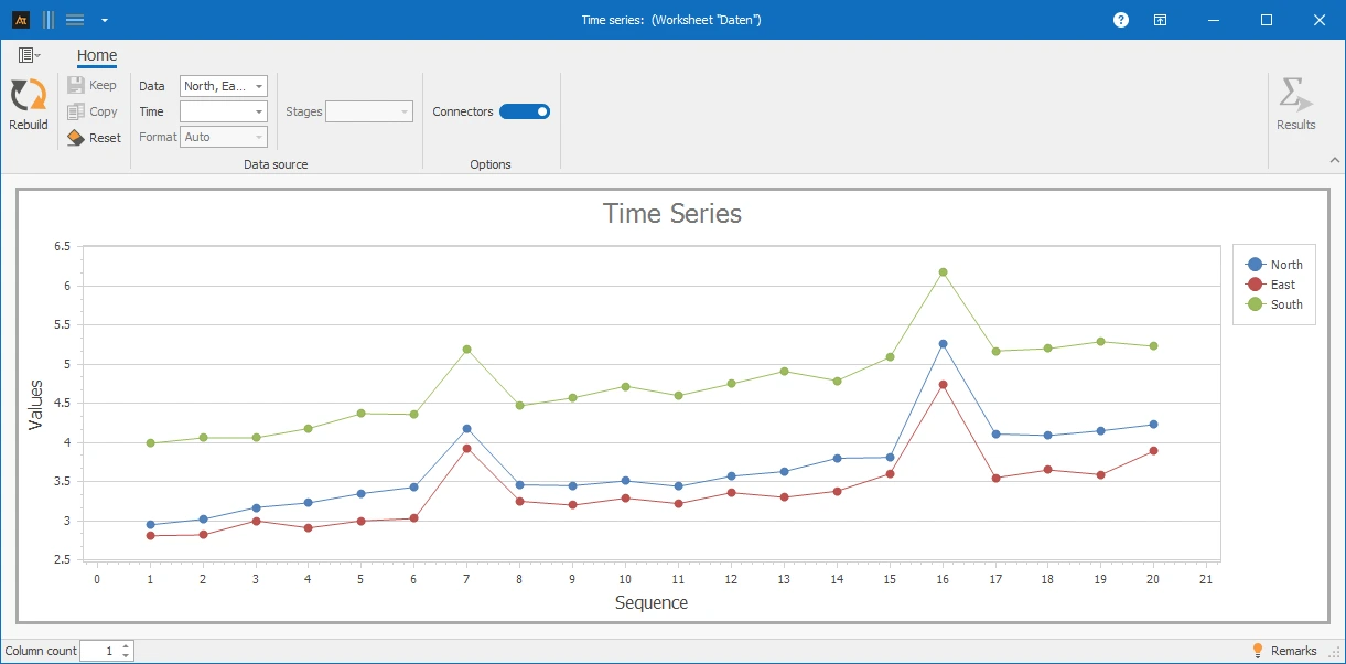
The time series chart shows an overall increasing trend in delivery times at all three locations. Two significant peaks are noticeable, occurring simultaneously at all locations.
Supplier Comparison
In purchasing, materials are sourced from various suppliers. A time series chart is used to examine whether the delivery reliability of different suppliers has changed over time.
Delivery Reliability [%] indicates how often deliveries are made on time. Delivery reliability is calculated for each week:
Delivery Reliability [%] = (on-time deliveries / total deliveries) × 100
For the time series chart, delivery reliability was calculated for several calendar weeks. Each data point corresponds to the delivery reliability of a supplier in a week.
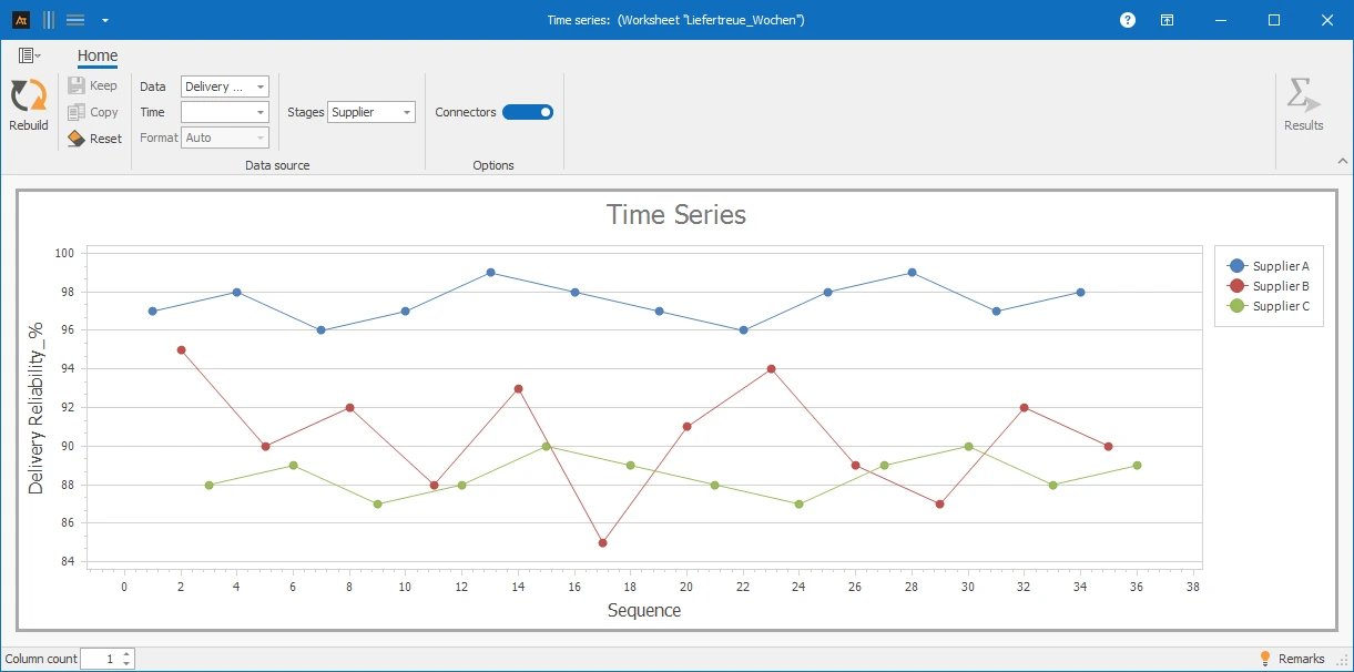
The time series chart shows significantly greater fluctuations in delivery reliability for one supplier, as well as individual weeks with very low values. Other suppliers show a more consistent trend.
Forecast deviation
In production planning, demand forecasts are created. A time series chart is used to analyze whether forecast deviations differ between different planning periods over time.
The forecast deviation results from the comparison between the planned demand and the actual demand.
Forecast deviation [%] = (planned demand − actual demand) / actual demand × 100
- A positive value means that the demand was overestimated.
- A negative value means that the demand was underestimated.
- A value close to 0 % indicates a very accurate forecast.
The percentage representation allows forecast deviations to be compared independently of absolute quantities.
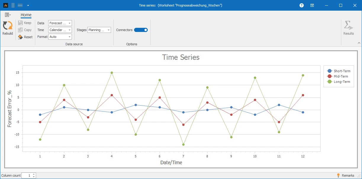
With an increasing planning horizon, the fluctuations in forecast deviation increase significantly. In long-term planning, both positive and negative outliers occur, indicating higher uncertainty.
Time series: Sequence of measurements with a temporal reference.
Outlier: Single measurement that significantly deviates from the rest of the trend.
Trend: Long-term increase or decrease in measurements.
Shift (location shift): Sudden and permanent change in location.
Stable process: Constant location and dispersion over time.