


The u-chart (also U Chart) is used to monitor a process over time based on the number of defects per unit (dpu). The process is described by a metric that indicates how many defects, complaints, or anomalies occur on average per unit.
This can be, for example, the number of label errors per glass, documentation deficiencies per ticket, or packaging defects per shipment. The goal is to detect changes early, systematically analyze possible causes, build process knowledge, and avoid unnecessary interventions.

In the filling of tomato sauce, it is recorded per shift how many label errors occur in total and how many jars were inspected. A jar can have multiple errors (crooked label, creases, incomplete batch labeling). The goal is to determine whether the average number of label errors per jar remains stable over time.
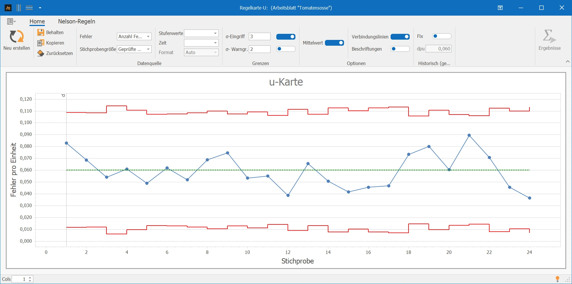
Interpretation of the results:
There are no points outside the control limits and no noticeable patterns are visible. The number of label errors per jar fluctuates randomly around the centerline – the process can be considered stable.
Explanations of the graphic:
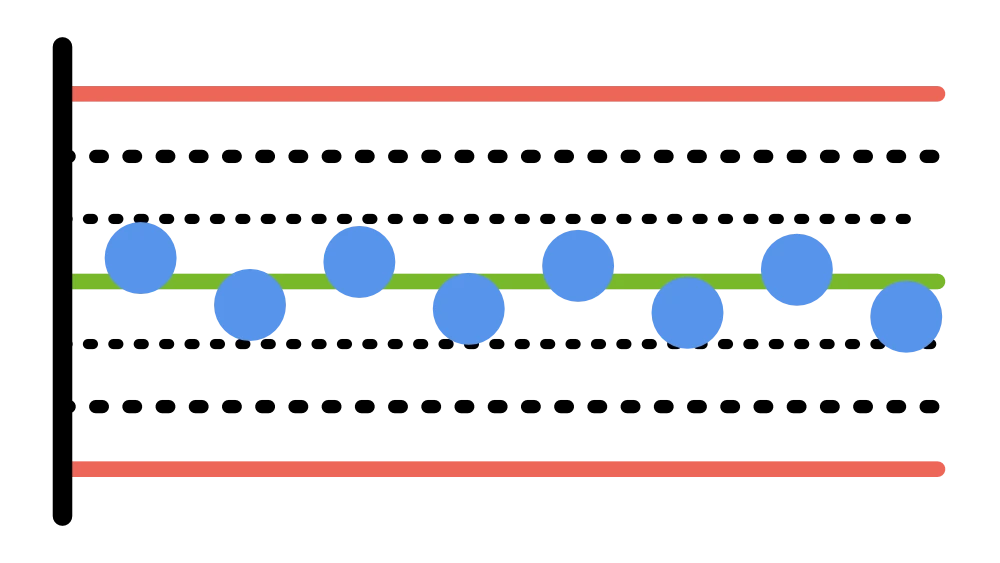
- The points show the errors per unit for each subgroup in chronological order.
- The centerline corresponds to the average number of errors per unit.
- The control limits are calculated for each subgroup from the subgroup size and average number of errors per unit. With different subgroup sizes, they often appear stepwise.
Preparation
- Clearly define which events are counted as errors or complaints.
- Ensure that for each data line, both the total number of units considered and the total number of errors that occurred are available.
- Determine whether the chart is created based on current data or historical reference values.
Usage in AlphadiTab
- Select the u-chart tool in the Measure Phase or Control Phase.
- Enter the number of errors and the number of units per subgroup.
- Generate the chart with “Create New”.
Interpretation
- Are points outside the control limits?
- Are non-random patterns recognizable?
Historical values
If historical reference values are known, they can be used as a fixed basis. The centerline and control limits then remain constant.
Sections
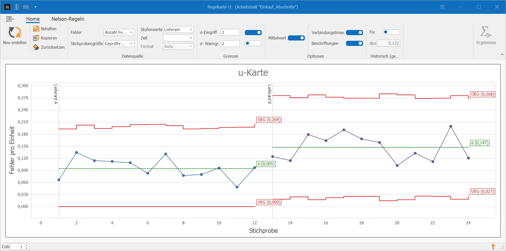
Sections are useful if the process has deliberately changed, e.g., after a supplier change or a process adjustment. Separate centerlines and control limits are calculated for each section.
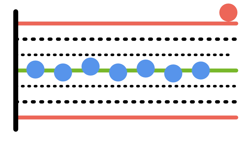
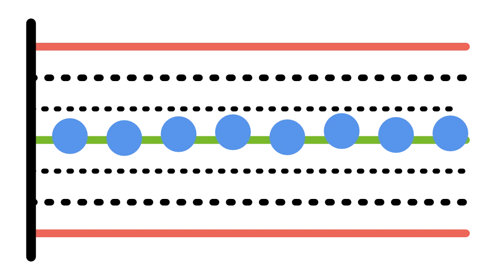
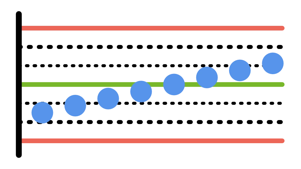
Tests are used to detect non-random patterns in the number of errors per unit. The following tests are available for the u-chart:
Documentation deficiencies per ticket
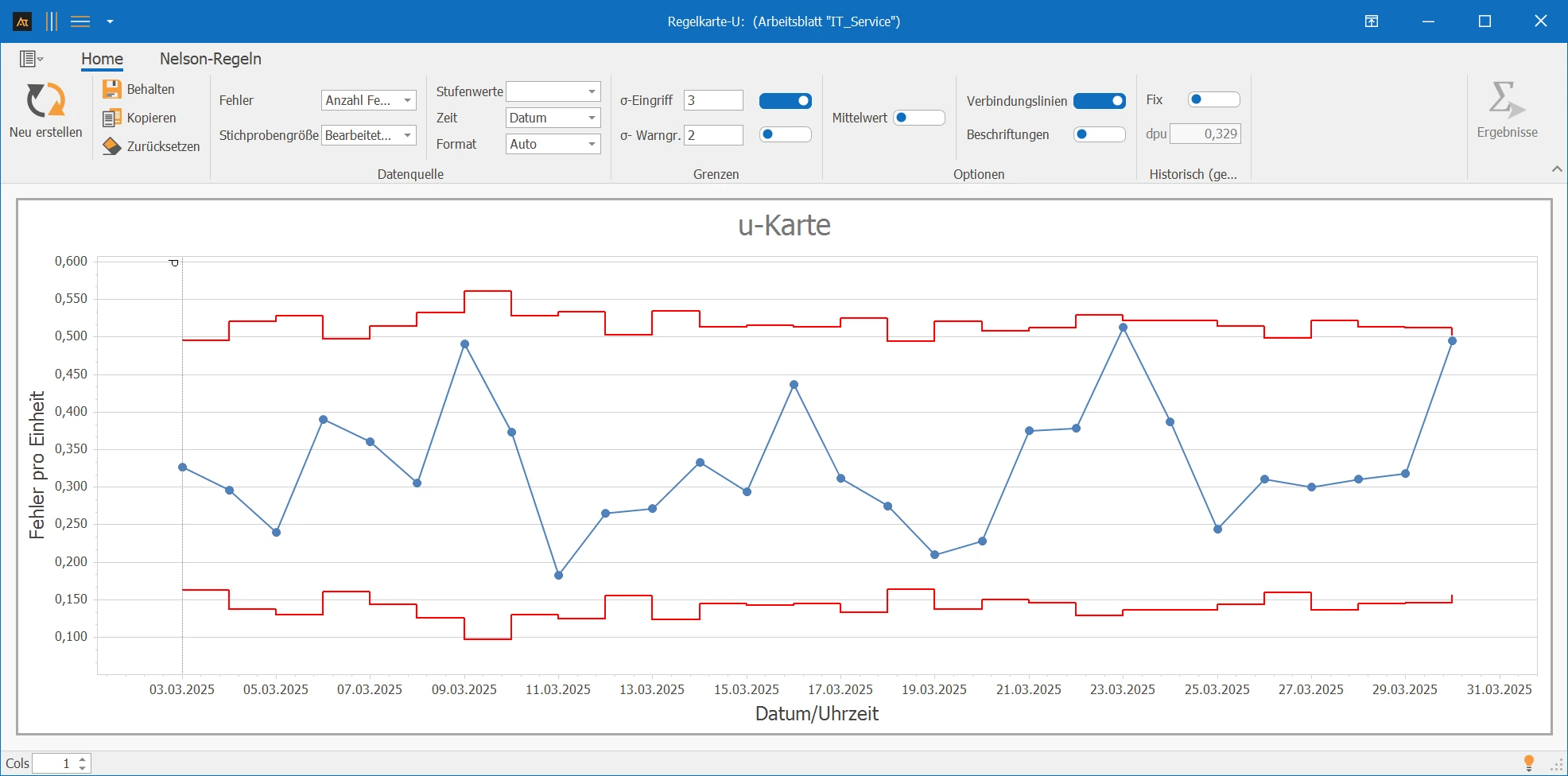
In IT-Service, it is evaluated daily how many documentation deficiencies occur in completed tickets in total and how many tickets were processed. A ticket can have several deficiencies (missing mandatory field, unclear category, missing closing note). The u-chart helps to assess whether the average number of deficiencies per ticket remains stable.
Interpretation
No point outside the control limits and no Nelson test triggers. At the same time, a recurring pattern is recognizable: every seven days the values are higher.
→ Statistically inconspicuous, but 7-day pattern – possible weekday effect to check.
Formal Defects per Offer
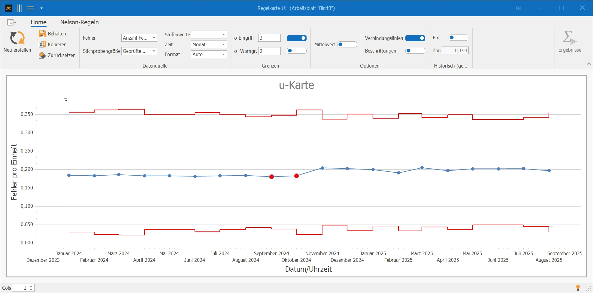
In sales, it is checked monthly how many formal defects occur in offers in total (missing price validity, incomplete delivery conditions, missing approvals). This allows tracking whether the average number of defects per offer is permanently stable.
Interpretation
The values are close together over a longer period; additionally, nine points in a row are on the same side of the centerline. The pattern is not random.
→ Noticeably close values + 9 points on one side – question the inspection system.
Packaging defects per shipment
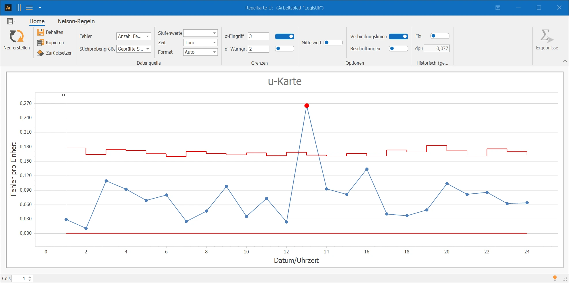
In the logistics sector, it is recorded per tour how many packaging defects occur in total and how many shipments were checked (damaged corners, faulty labels, insufficient securing). The goal is to detect extraordinary loads early.
Interpretation
An outlier is recognizable; the 13th tour is affected. A rear-end collision was reported for this tour – the deviation can be explained by a known special cause.
→ Outlier due to known special cause (accident) – no new basic pattern.
Complaints per Goods Receipt
In purchasing, the number of complaints per goods receipt is monitored. During the observation period, there was a switch from Supplier A to Supplier B, so two sections are useful.
Interpretation
After the supplier change, the number of complaints per goods receipt is at a noticeably higher level. The separate consideration of the sections shows a change in the process level.
→ Level shift after supplier change – evaluate sections separately.
Planning warnings per position
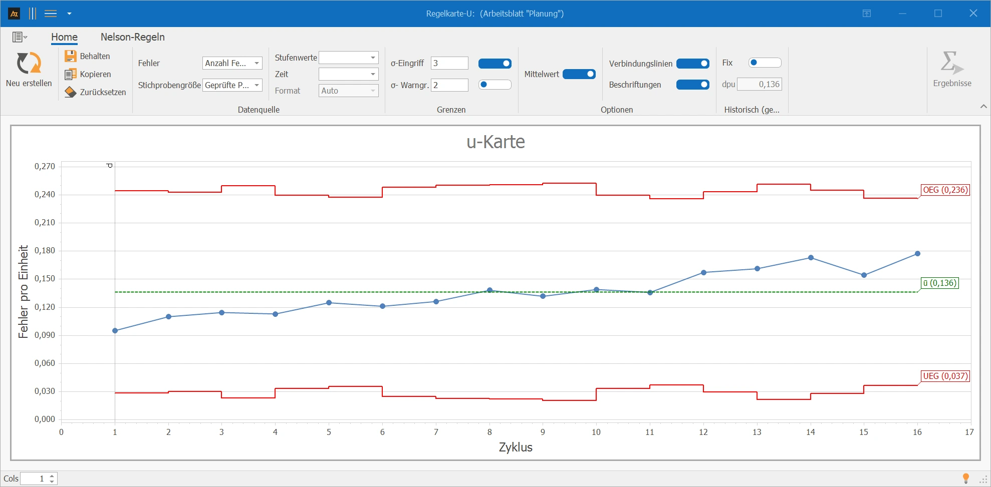
In production planning, each planning cycle evaluates how many planning warnings occur in total and how many positions were considered. The u-chart shows whether the average number of warnings per position changes over time.
Interpretation
A rising trend is noticeable over the period. Since the values decrease in between, no trend is signaled according to the Nelson rules.
→ Slightly rising trend, but no Nelson rule violated – continue to observe.
With historical reference, ū is replaced by the specified reference value dpu.