

The X-bar chart is used when multiple continuous measurements are available per inspection point or when large data sets can be meaningfully grouped into subgroups. It monitors the means of these subgroups and makes it visible if the average process level shifts over time.

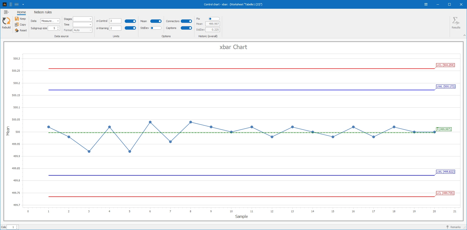
In the production of tomato sauce, five jars are checked every 30 minutes. The five measurements each form a subgroup; for each subgroup, the mean value is calculated and displayed in chronological order on the mean value chart (x̄-chart). The goal is to check whether the average filling quantity remains stable over time or if the process position shifts.
Interpretation of the results:
There are no mean values outside the control limits, and no noticeable patterns are recognizable. The process position remains stable; the variation within the subgroups is also unremarkable.
Explanations of the graphic:
- The points show the mean values of the individual subgroups in chronological order.
- The center line corresponds to the mean of the subgroup means.
- The control limits are calculated from the variation and the mean of the subgroups.
Preparation
- Select a suitable continuous measurement.
- Determine a meaningful subgroup size (e.g., 5).
- Ensure all subgroups are the same size and in chronological order.
 Use in AlphadiTab
- Select the X-bar chart tool in the Measure Phase or Control Phase.
- Enter data, set subgroup size.
- Generate chart with the "Create New" button.
Interpretation
- Are averages outside the control limits?
- Are non-random patterns visible (trends, shifts)?
Subgroup size
The subgroup size affects the calculation of control limits. The larger the subgroup, the smaller the random variation of the subgroup means. Ideally, all subgroups are the same size.
Historical values
If historical reference values are known, they can be used as a fixed basis. The center line and control limits then remain constant.
Sections
Sections are useful when the process has deliberately changed, e.g., after a supplier change or a process adjustment. Separate center lines and control limits are calculated for each section.
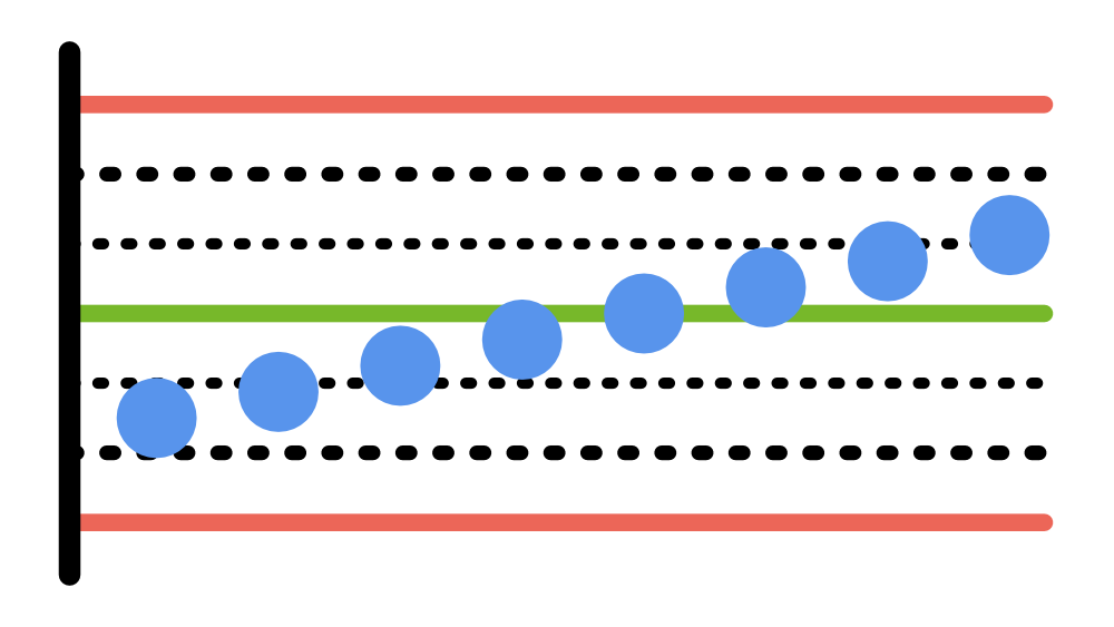
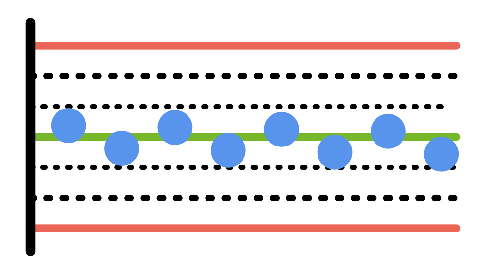
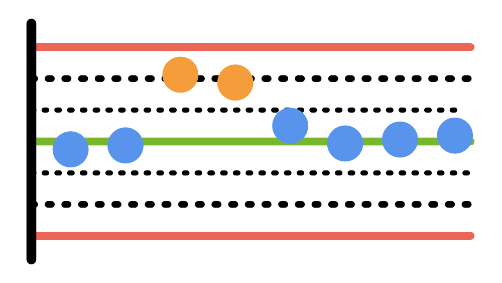
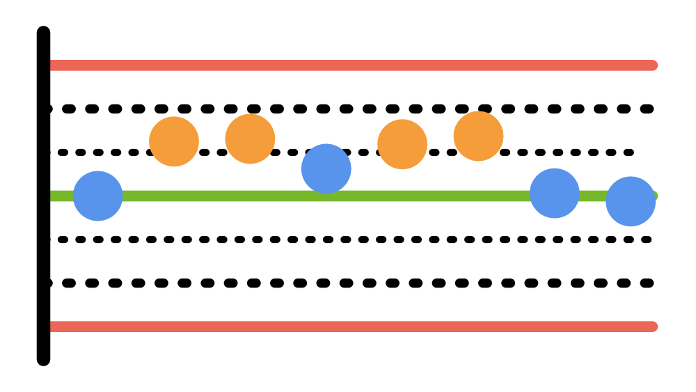
Non-random patterns are detected with the tests:
Torque after tool change
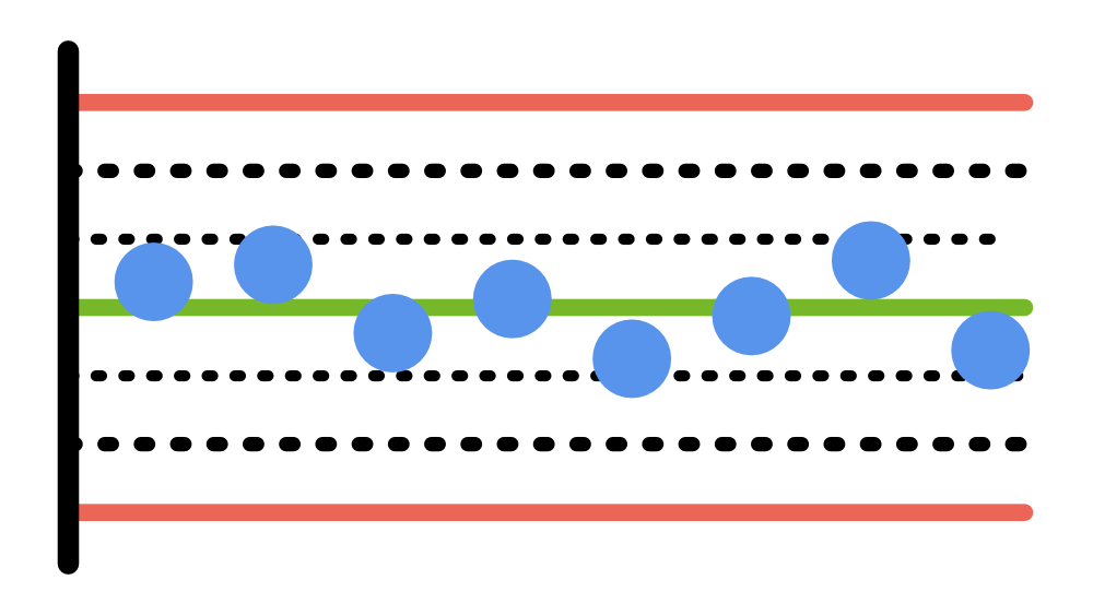
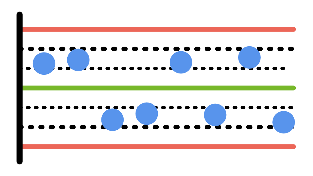
In the assembly process, five screw connections are measured per hour and grouped into subgroups. After a tool change, it should be checked whether the average torque has changed.

Interpretation
After the tool change, the level of the subgroup means shifts significantly upwards. The change is systematic.
→ Level shift after tool change – analyze in context.
pH value per batch
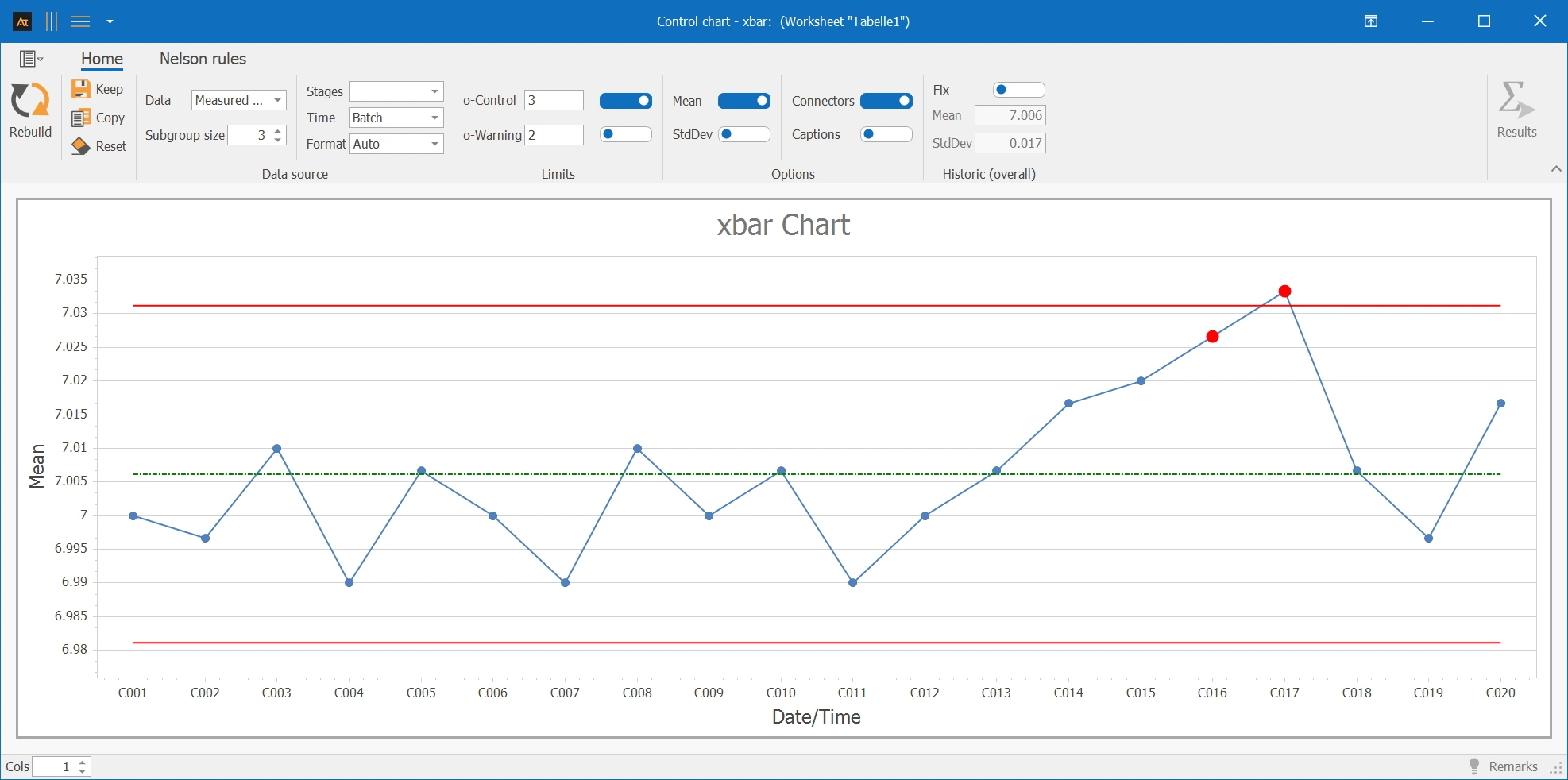
In the laboratory, three pH measurements are taken per batch. The average value per batch is monitored with the X-bar chart. Over time, it should be assessed whether the process situation is gradually changing.
Interpretation
An increasing trend over several subgroups is recognizable. This indicates a systematic change – the process is not stable.
→ Increasing trend – process unstable, investigate.
Engagement of a Key Account
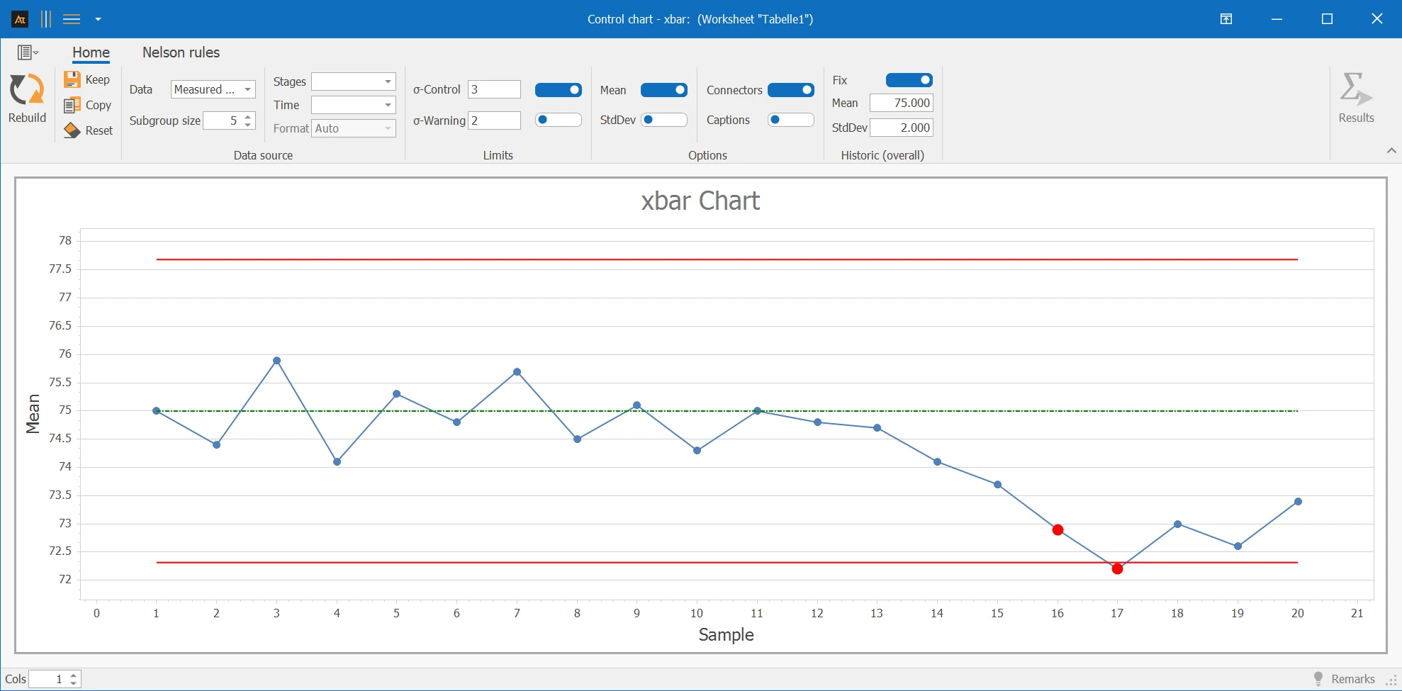
In the Key Account Cockpit, a customer's engagement is monitored based on several individual evaluations per period. Each week, five engagement values are summarized into a subgroup. Fixed reference values are used for the evaluation: Mean value 75 and standard deviation 2 (determined by the team).
Interpretation
Initially, the subgroup means fluctuate inconspicuously around the reference value of 75. As time progresses, a decreasing trend is noticeable – the values increasingly deviate from the expected engagement level.
→ Decreasing trend below reference 75 – customer engagement is declining, check in KAM.
Picking time per shift
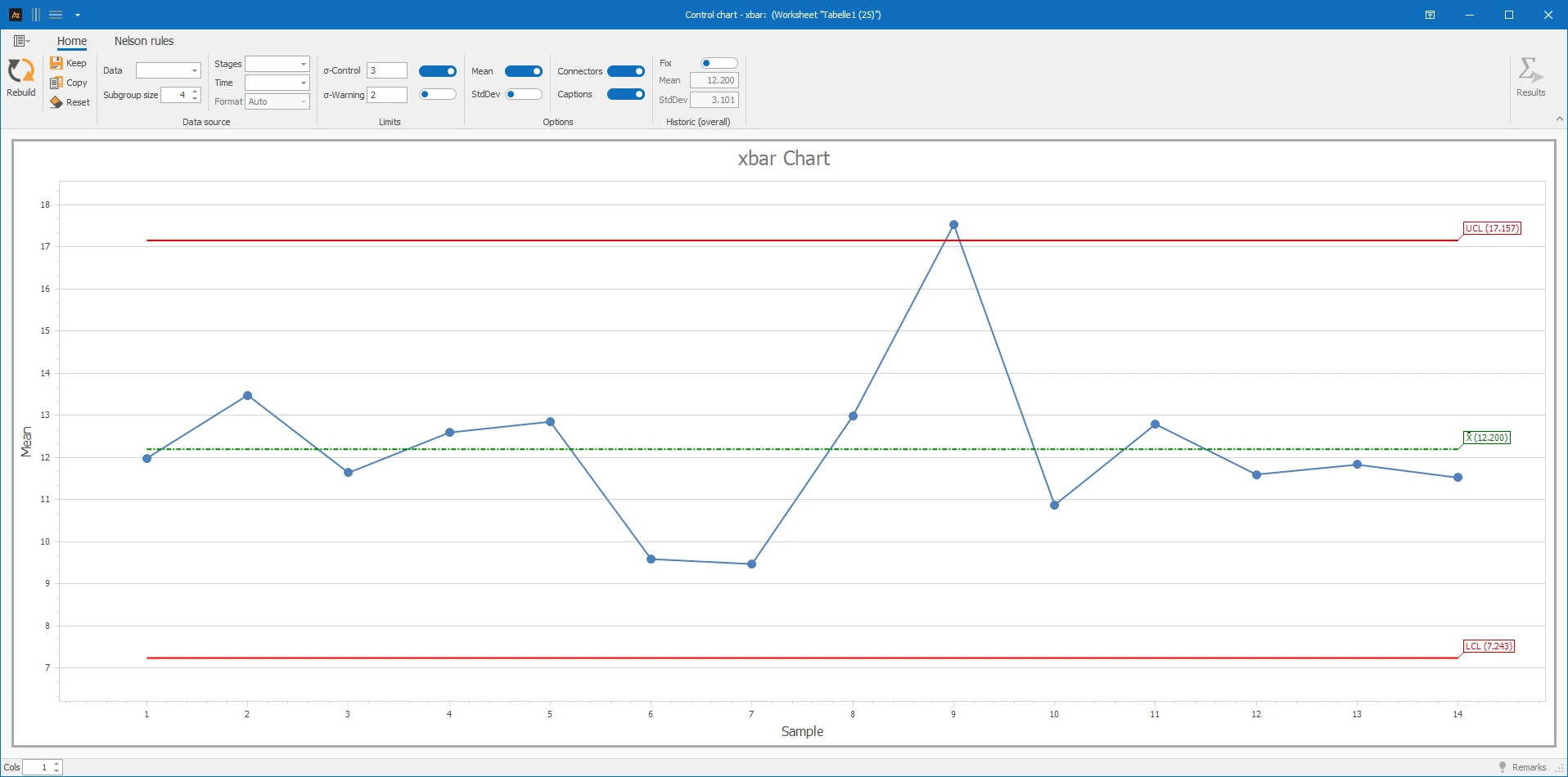
In the logistics sector, four picking orders are measured per shift and evaluated as a subgroup. The goal is to determine whether the average picking time changes unusually.
Interpretation
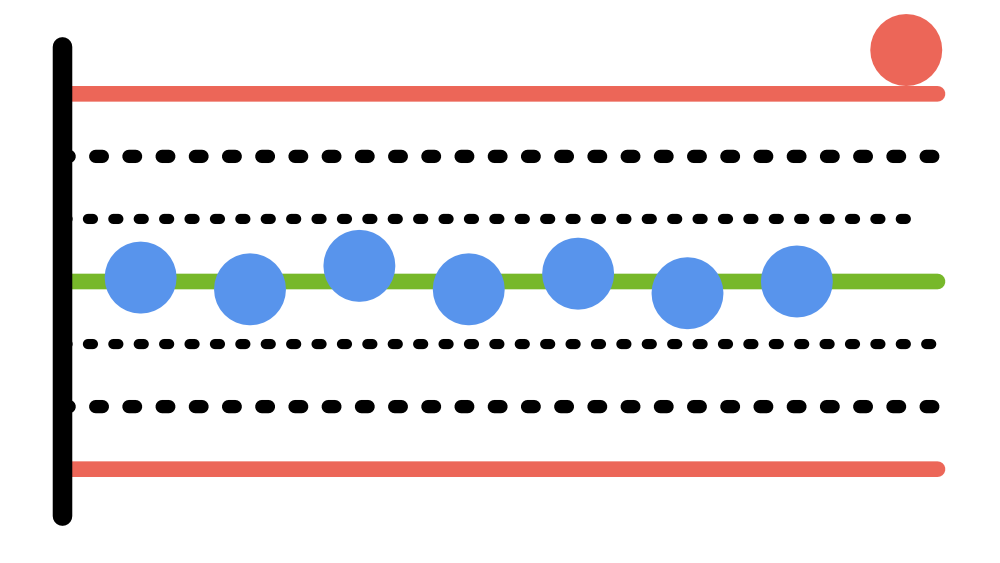
A subgroup mean is significantly outside the control limits. A system malfunction is known for this period – the anomaly can be explained as a special cause.
→ Outlier due to known system malfunction – special cause.
Rejection Rate After Supplier Change
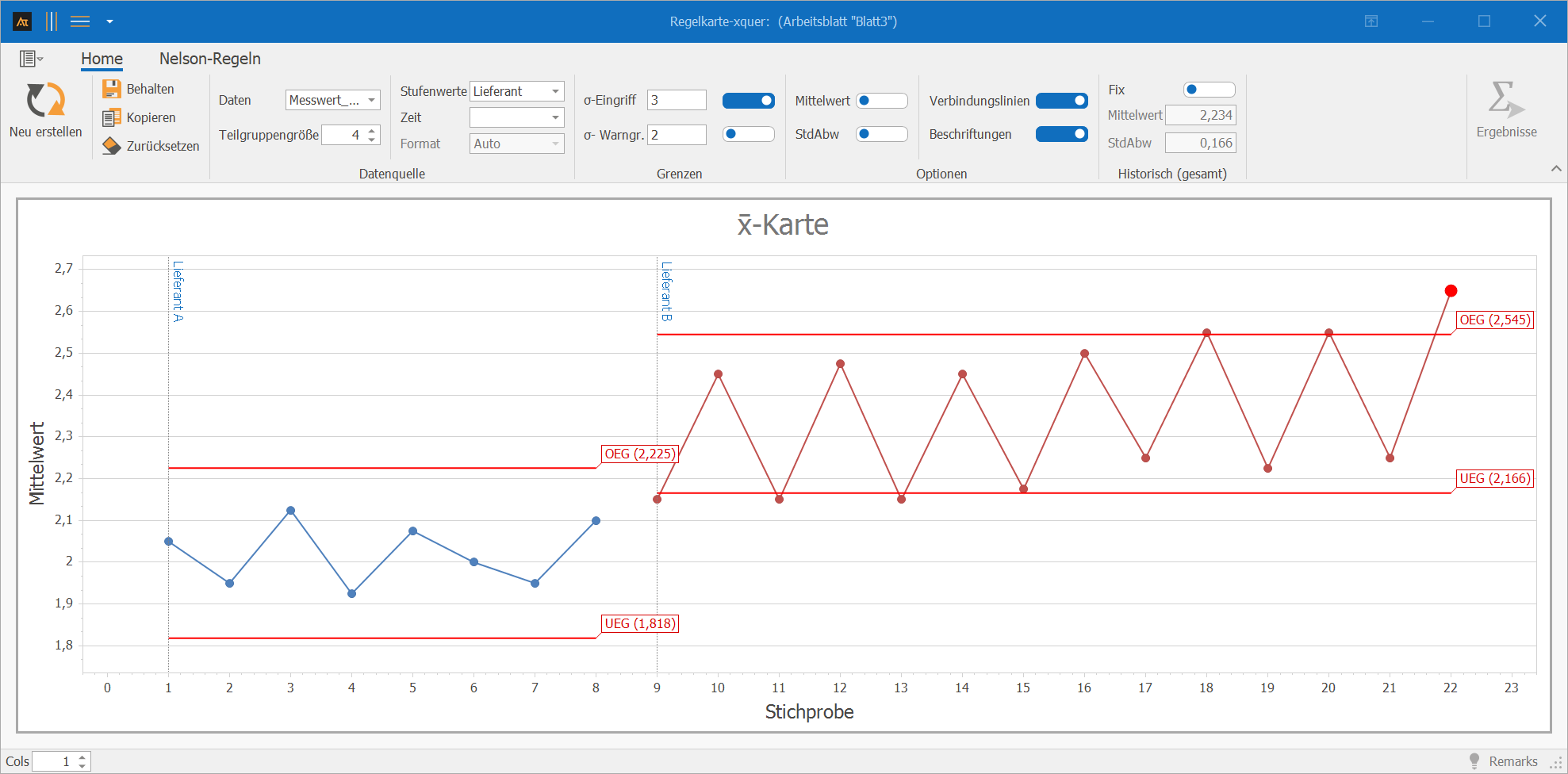
In purchasing, the rejection rate per goods receipt is summarized in subgroups from multiple inspection results. During the observation period, there was a switch from Supplier A to Supplier B. The rejection rate is considered a continuous percentage value per inspection unit.
Interpretation
After the supplier change, a level change in the subgroup means is noticeable. Additionally, an alternating pattern with alternating higher and lower means is evident – this may indicate two differently operating tools at the supplier.
→ Level shift + alternating pattern – analyze in connection with the change.
Forecast Deviation
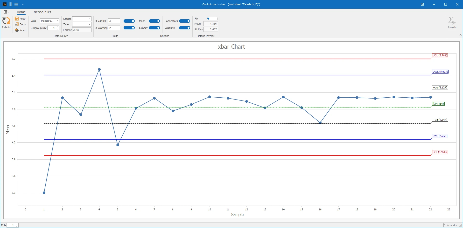
In production planning, the forecast deviation is regularly summarized in subgroups to monitor the quality of demand planning. Over time, it should be checked whether the behavior of the process changes.
Interpretation
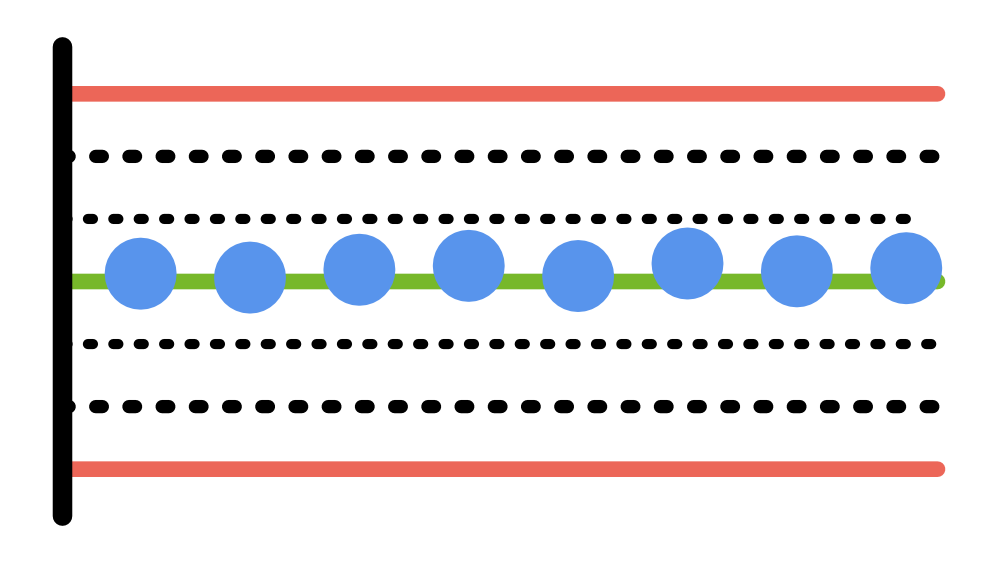
Across several subgroups, the means are unusually close to the centerline – the variation is significantly lower than before. This indicates a changed process behavior (e.g., adjusted forecast logic or changed input data).
→ Unusually low variation – check changed process behavior.
Subgroup Mean
With i = subgroup, j = observation within the subgroup, and ni = subgroup size
Overall Mean of Subgroup Means
With k = number of subgroups
Formulas for Control Limits
If “Historical Fix” is selected, the specified mean and standard deviation are used to calculate the control limits.